Brand marks are simple symbols that help people recognize a brand quickly without using words. They are powerful because they can communicate what a brand stands for in a clear and memorable way. A great brand mark is easy to remember, looks good at any size, and represents the brand’s personality.
Finding the right brand mark idea means thinking about what makes a business unique and how to show that through a simple image. Some famous examples, like the Nike swoosh or McDonald’s golden arches, show how a strong brand mark sticks in people’s minds.
Choosing the right idea takes creativity but also focuses on clarity and simplicity. When done well, a brand mark becomes the face of a company and helps make a lasting impression.
What Is a Brand Mark?
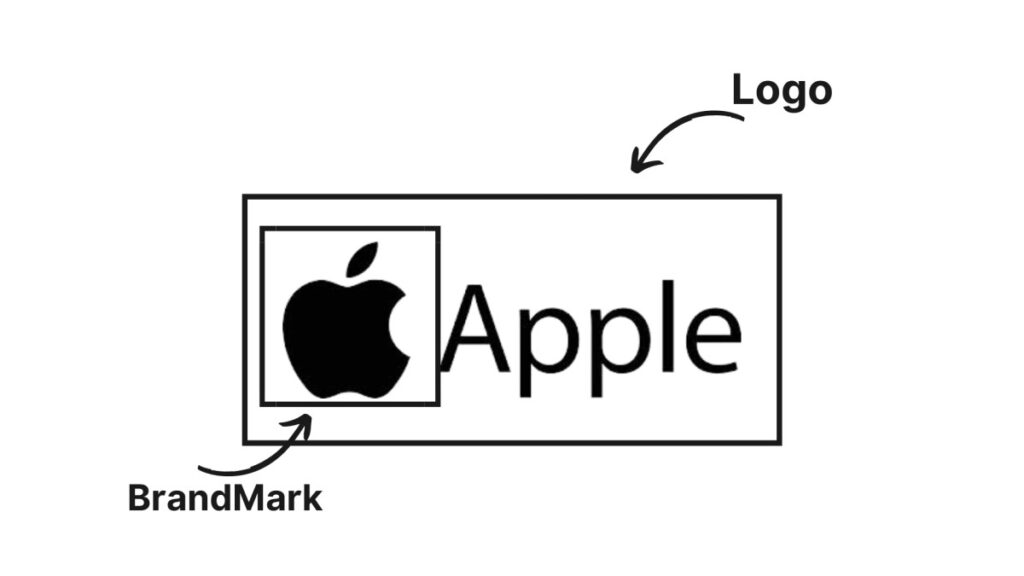
A brand mark is a simple image or symbol that shows what a brand stands for. It helps people quickly recognize a company and remember its values. Brand marks are different from other parts of branding because they focus mainly on visual symbols instead of words.
Definition and Core Elements
A brand mark is a unique symbol that represents a brand without using its name. It can be an icon, an illustration, or a simple design. Some brand marks use just images, while others mix pictures with stylized text.
The key parts of a brand mark include:
- Simplicity: It should be easy to recognize.
- Memorability: It sticks in people’s minds.
- Uniqueness: It stands out from other brands.
- Relevance: It connects to the brand’s personality and values.
This symbol tells a story about the brand’s character and what makes it special.
Brand Mark vs Logo
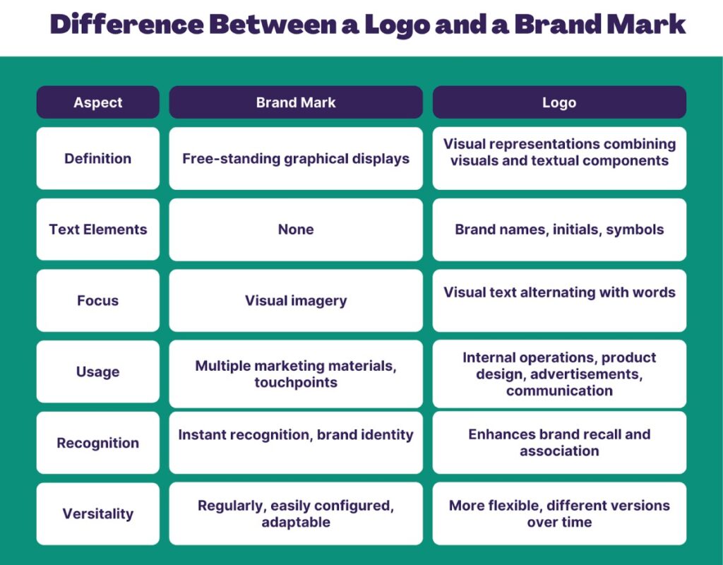
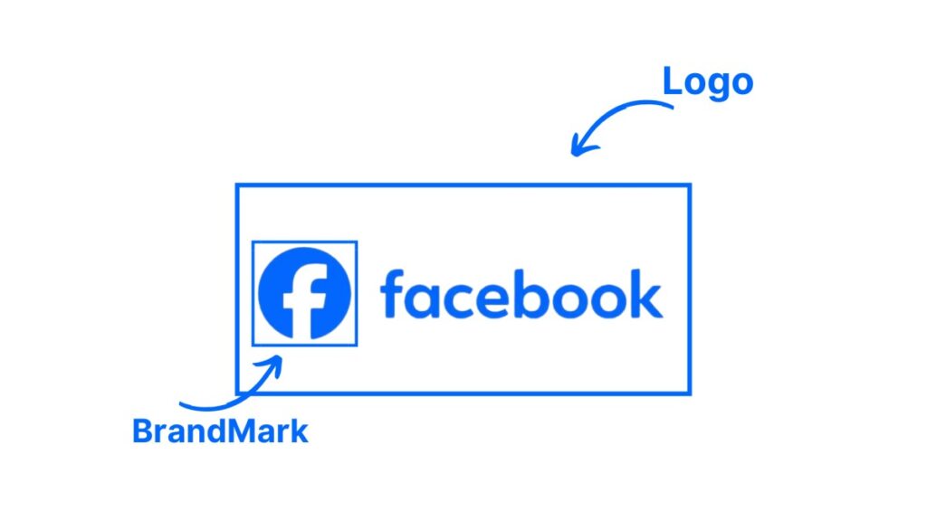
A brand mark is one part of a logo. While many logos combine text and images, a brand mark is focused only on the visual symbol. For example, the Nike “swoosh” is a brand mark that can stand alone without the company’s name.

A logo often uses words to show the brand name, called a wordmark. A brand mark, however, tries to connect with people just through the image. This makes brand marks useful because they can be recognized even without language.
Purpose of a Brand Mark
The main goal of a brand mark is to create quick and clear recognition. It helps people remember the brand and feel connected to it. A strong brand mark shows the company’s values and personality in a small symbol.
Brand marks make it easier for customers to spot the company on products, ads, or online. They build trust and loyalty by always reminding people of what the brand represents. A well-made brand mark helps a brand stand out in crowded markets and keeps its image consistent across different places.
Popular Brand Mark Ideas
Brand marks come in different shapes and styles that help make a company easy to recognize. Some use clear images or letters while others use shapes or characters that connect with the brand’s personality.
Icon-Based Brand Marks

Icon-based brand marks use simple pictures to show what a brand stands for. These icons are often easy to spot and remember because they represent something related to the business. For example, a camera icon can work well for a photography brand.
The key here is clarity. Icons should be clean and not too detailed so they can be seen clearly at any size. Many companies choose symbols that show their products, services, or values directly.
Using bold shapes and minimal colors helps these icons stand out. This style works well for brands wanting a quick visual that people link back to their business fast.
Abstract Symbols


Abstract brand marks are shapes or designs that don’t show a clear object but still represent the brand. These can be geometric forms, unusual lines, or patterns.
They let brands be creative and unique without copying something too obvious. Because they are not tied to specific images, abstract marks can express deeper ideas or feelings like innovation, motion, or strength.
Brands that want to look modern and different often use these. Abstract marks usually rely on color and shape balance to create impact. They can be simple or complex but must still be easy to remember.
Monogram and Lettermarks

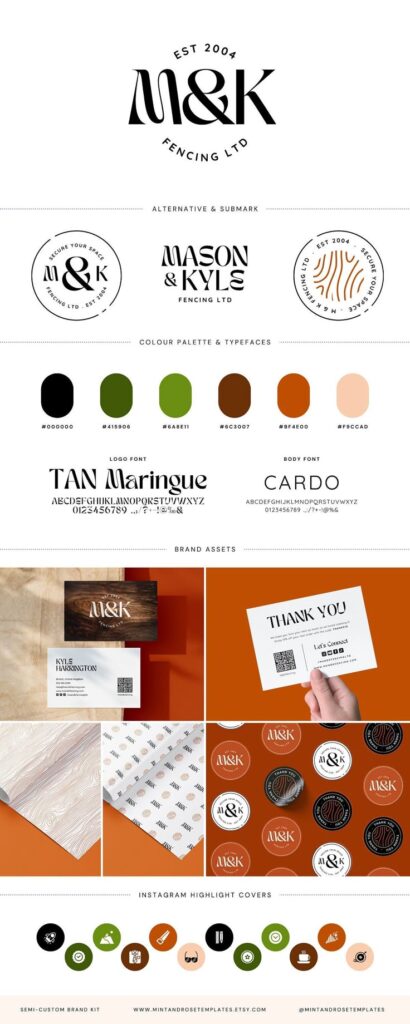
Monogram and lettermark brand marks use initials or letters to represent the brand name. This style is great for long or hard-to-remember names, turning them into simple sets of characters.

These logos are often styled with unique fonts or custom lettering to make them stand out. Brands want the letters to be readable and attractive, sometimes adding small graphic elements.
This type of mark is common among fashion brands, law firms, and corporations. It gives a classy and professional look while helping customers remember the brand through a fast visual cue.
Mascot Designs

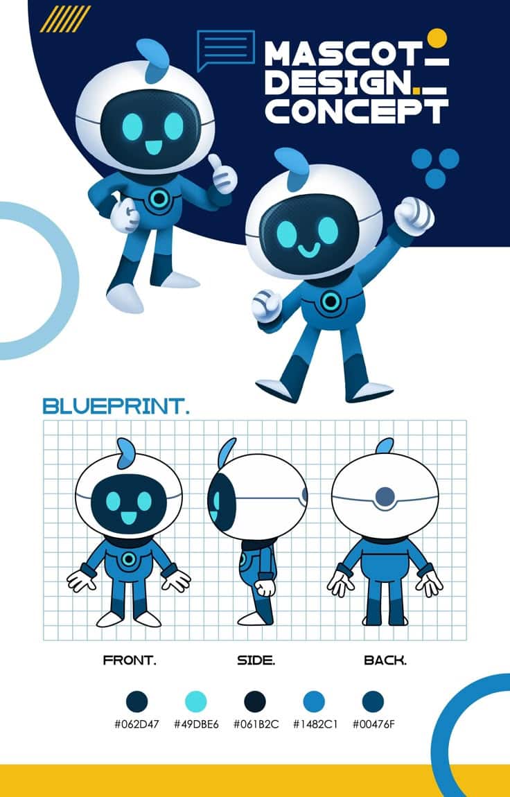
Mascot brand marks include characters or figures that represent the brand’s personality. These can be animals, people, or imaginary creatures.


Mascots work well to create a friendly, approachable image. They often tell a story or show the brand’s tone and values with fun and emotion. This makes the brand feel more personal.
Many sports teams, food companies, and kids’ brands use mascots to build a strong connection with their audience. Mascots are also useful for marketing because they can be used in many different ways, like in ads or packaging designs.
How to Create Unique Brand Mark Ideas
Creating a unique brand mark means coming up with original concepts that show what a brand stands for. It also involves picking colors and fonts that match the brand’s style. This process uses smart brainstorming, finding fresh inspiration, and making careful color and typography choices.
Brainstorming Techniques
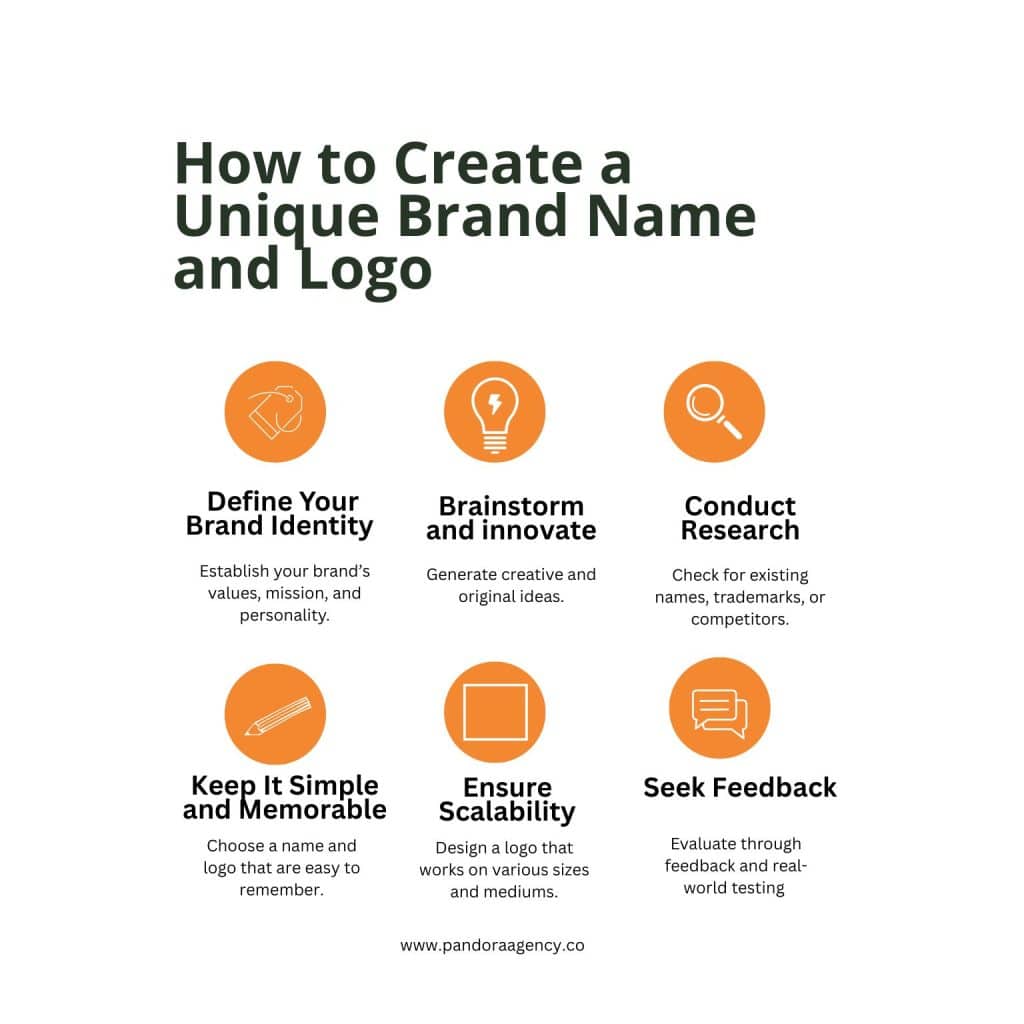
He can start with simple brainstorming methods. Writing down all ideas without judging them helps. Mind mapping can organize ideas visually to see connections.
Another good technique is to focus on the brand’s personality and values. Asking questions like “What feeling should this brand mark give?” or “What symbols represent our mission?” can guide ideas.
It’s useful to limit ideas by thinking about what will look clear small. Simplifying early prevents complex designs that don’t work well on small screens or products.
Inspiration Sources

Looking at other successful brand marks in the same industry shows what works and what to avoid. He can explore design websites, logo galleries, and social media pages for fresh ideas.
Nature, architecture, or everyday objects are great real-world inspiration. Sometimes shapes or patterns seen in these places can spark unique concepts.
It’s also smart to study cultural symbols, but he should avoid clichés. Fresh ideas come from mixing different sources, not copying one style.
Color and Typography Choices
Colors should match the brand’s message and feelings. For example, blue often shows trust, while red can feel bold or exciting.
Choosing 2 or 3 colors keeps the mark clean and easy to remember. Too many colors can confuse viewers.
Fonts need to be easy to read and reflect the brand’s character. A strong brand marks uses fonts that look good at any size.
Pairing simple shapes with matching fonts and colors makes the brand mark unique and consistent.
Tips for Choosing the Perfect Brand Mark
Choosing the right brand mark means finding a design that fits the business’s values, looks good everywhere it appears, and works well with the audience. It should clearly show what the company is about and stand out in different places.
Evaluating Brand Relevance
The brand mark should connect to the business’s mission and core ideas. It needs to reflect the products, services, or personality of the brand. For example, a tech company might want a modern, sleek symbol, while a bakery could use something warm and inviting.
Colors, shapes, and styles matter here. The mark should feel natural for the brand’s industry and target audience. If it looks out of place, it might confuse customers or fail to make a strong impression.
Consistency Across Channels
A great brand mark works well on all platforms. Whether it’s on a website, business card, social media, or packaging, the design should look clear and recognizable.
It helps to test the mark in different sizes and backgrounds. For example, a simple design often holds up better on small screens or printed materials. Using the same colors and fonts every time also builds trust and makes the brand easier to remember.
Testing Brand Mark Effectiveness
Before finalizing a brand mark, testing is key. Showing the design to real customers or team members can give useful feedback. They might notice if the mark is confusing or hard to read.
Online surveys, A/B testing, or focus groups are good ways to test. The goal is to see if the mark creates the right feeling and is easy to recognize. Fixing any weak spots early saves time and money later.
- 2.0Kshares
- Facebook0
- Pinterest2.0K
- Twitter1
- Reddit0


