A car logo has an unusually hard job. It has to read across a car park, survive years of car-wash brushes, look expensive in chrome, glow behind a lit grille and still work as a tiny app icon. Few graphic marks have to cover that many scales and surfaces.
That’s what makes car logos so rewarding to study. Most of them were drawn before anyone talked about brand systems. They were borrowed from city flags, war planes, saw blades, fountains and star clusters, then redrawn for a century. Some of the best-loved origin stories are also shakier than the brochures suggest.
- 1. Mercedes-Benz: a star with a postcard backstory
- 2. BMW: the propeller that never was
- 3. Audi: four companies in one band
- 4. Ferrari: a war ace's horse with its tail up
- 5. Lamborghini: a tractor maker's bull
- 6. Alfa Romeo: Milan in a circle
- 7. Porsche: a city's name in a crest
- 8. Toyota: three ellipses and a lucky stroke count
- 9. Mazda: wings, a god and a founder
- 10. Subaru: a star map on the grille
- 11. Volvo: an iron symbol, not a gender sign
- 12. Peugeot: a lion that started on saw blades
- 13. Citroën: a gear tooth turned into a logo
- 14. Maserati: Neptune's trident, drawn by the painter
- 15. Škoda: a winged arrow with a disputed muse
- What these 15 car logos have in common
- Car logos FAQ
My background is industrial design and academic drawing, so I read a badge the way I’d read a product or a figure. Silhouette comes first, then proportion, then the material doing the work. Below are 15 marque symbols read that way, each with its documented origin, a visual reading, one surprising fact and a takeaway.
Where a story rests on company lore rather than solid records, I’ll flag it.
1. Mercedes-Benz: a star with a postcard backstory
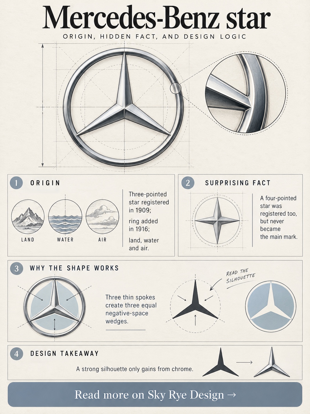
Mercedes-Benz tells the three-pointed star’s story as beginning with a postcard. Gottlieb Daimler had marked a star over his home in Deutz on a card to his wife, and his sons Paul and Adolf later proposed it as a trademark. The postcard is family lore. The documented part is that Daimler-Motoren-Gesellschaft registered the star in 1909.
The three points are usually explained as engines for land, water and air. The star went inside a ring in 1916. After the 1926 merger with Benz & Cie, it was paired with the Benz laurel wreath before being pared back again.
Visually, it’s ruthlessly efficient. Three thin spokes inside a circle make three equal wedges of negative space, so the mark still reads when chrome reflections swallow half the line weight. On a bonnet star, that thinness is the whole personality.
Here’s the odd bit: DMG registered a four-pointed star in 1909 as well, and it never became the main mark.
Takeaway: a symbol that works as a silhouette at thumbnail size only gains from chrome.
2. BMW: the propeller that never was
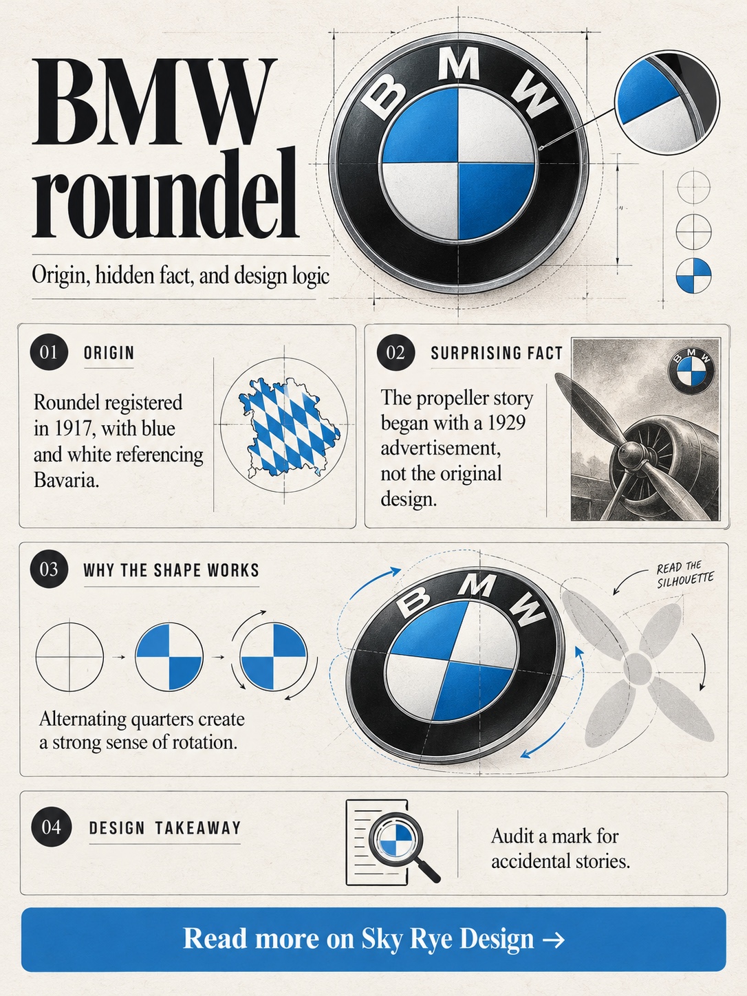
No myth about car logos has run longer than BMW’s propeller. The roundel was registered in 1917. Its ring structure came from Rapp Motorenwerke, the aero-engine maker BMW grew out of, and its blue and white quarters reference Bavaria.
The propeller arrived 12 years later. A 1929 BMW advertisement showed the roundel inside a spinning aircraft propeller to promote aero engines, and the image stuck for generations. BMW has since said plainly that the logo wasn’t designed as a propeller.
As geometry, it’s a quartered circle, about as old as heraldry gets. The black ring carries the letters and the centre carries the colour. Because the quarters alternate, the eye reads rotation, which probably explains why the propeller story felt so convincing.
The surprise is the colour order. It’s reversed compared with Bavaria’s arms, commonly explained by trademark rules of the time that restricted the use of state emblems.
In 2020 BMW added a flat version with a transparent outer ring for communications.
Takeaway: audit your mark for accidental stories, because a good image can outsell the facts.
3. Audi: four companies in one band
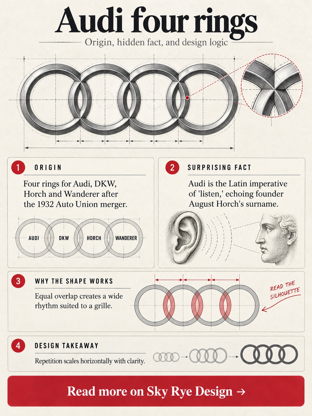
Audi’s four rings look like one company. They’re four. In 1932 Audi, DKW, Horch and Wanderer merged into Auto Union, and the interlocking rings represented the group. The rings passed to the Audi name after the company became Audi AG in 1985.
The name is its own small puzzle. August Horch left the firm carrying his surname and couldn’t take the name with him. His new company used “Audi,” the Latin imperative of “listen,” which is roughly what “horch” means in German. Company history credits the idea to the Latin-studying son of an associate, though the exact scene is lore.
Visually, the rings are a lesson in rhythm. Four identical circles with equal overlap form a horizontal band that sits naturally across a wide single-frame grille. The 2009 redesign made them heavily chrome and three-dimensional; later versions flatten them for screens and lighting.
The surprise: the brand name is effectively its founder’s surname translated into Latin.
Takeaway: repetition is strong geometry, and it scales horizontally better than almost anything.
4. Ferrari: a war ace’s horse with its tail up
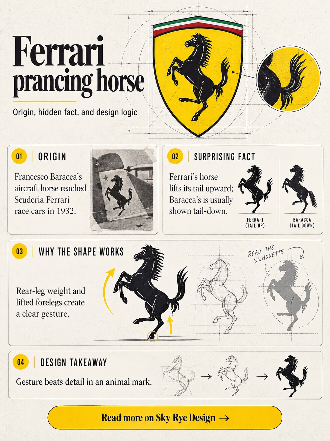
The prancing horse flew before it drove. Francesco Baracca, Italy’s leading fighter ace of the First World War, carried a black horse on his aircraft. In 1923, after a race win at Ravenna’s Savio circuit, Enzo Ferrari met Baracca’s parents, and Countess Paolina suggested he use the horse for luck. That account comes from Enzo himself.
Ferrari added the canary yellow of Modena. The horse first ran on Scuderia Ferrari’s Alfa Romeo race cars at the 1932 Spa 24 Hours. Why Baracca chose a horse is less settled, with theories pointing to his cavalry regiment or a downed enemy plane.
I read the horse the way I’d read a life drawing: weight on the hind legs, forelegs lifted, head high. Baracca’s horse is usually shown with its tail pointing down, while Ferrari’s flicks upward, which gives the whole silhouette lift.
The surprise: the famous shield is mostly a racing mark, while road cars usually wear the rectangular badge.
Takeaway: a figure with clear gesture beats a detailed one every time.
5. Lamborghini: a tractor maker’s bull
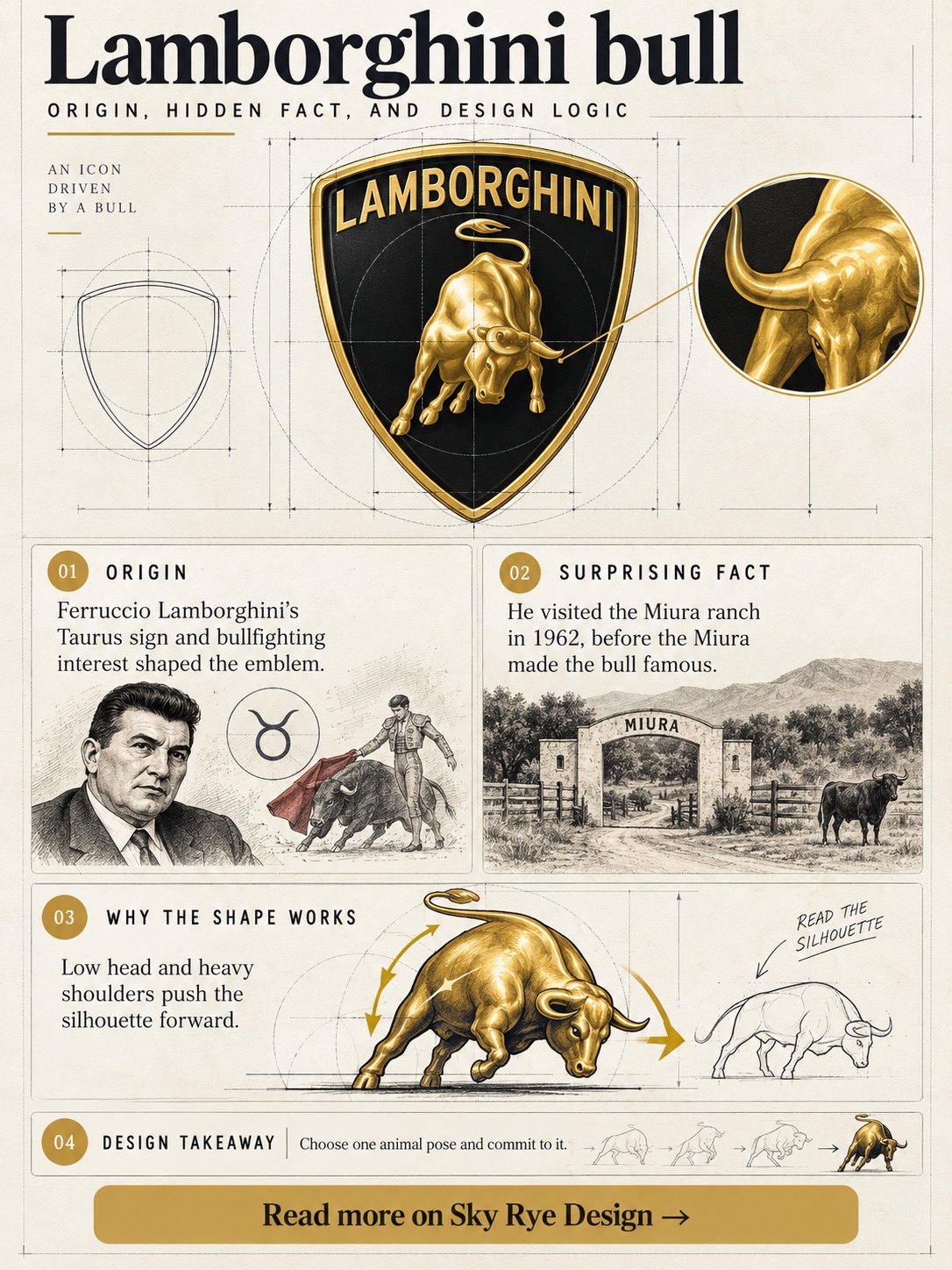
Ferruccio Lamborghini was born on 28 April 1916, under Taurus, and he was fascinated by bullfighting. Those two facts are the documented core of the bull. He built tractors before he built cars, which makes a charging bull feel less like vanity and more like farm machinery with attitude.
The legendary origin story is a row with Enzo Ferrari over a clutch. Versions differ wildly, so treat it as lore. The bullfighting link is firmer: Lamborghini named the Miura after the Spanish breeder Don Eduardo Miura, and many later models took the names of famous bulls.
The badge is a gold bull on black inside a tapering shield. The bull is all shoulder mass and lowered head, so the silhouette reads as forward pressure even when standing still. In 2024 Lamborghini introduced a flatter, cleaner version for digital and new applications.
The surprise: Lamborghini dates Ferruccio’s visit to the Miura ranch to 1962, a few years before the Miura made the bull famous.
Takeaway: with an animal mark, choose one pose and commit to it.
6. Alfa Romeo: Milan in a circle
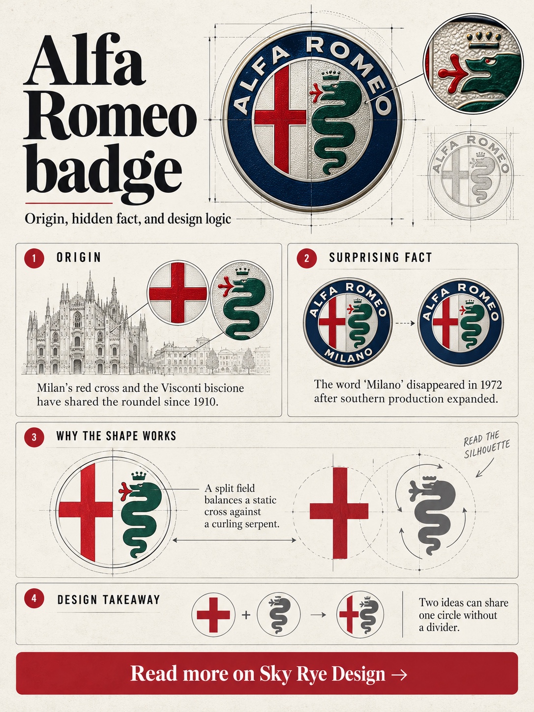
Alfa Romeo’s badge is a portrait of Milan. The company began in 1910 as A.L.F.A., and its emblem joined two civic symbols: the red cross of Milan and the Visconti family’s biscione serpent. Company lore says draughtsman Romano Cattaneo spotted the Visconti emblem at Castello Sforzesco while waiting for a tram.
The serpent is the uncomfortable part. Heraldically it’s a crowned snake with a human figure in its mouth, and readings swing between devouring and emerging. Alfa has favoured the gentler version, which owes more to marketing than heraldry.
A laurel wreath arrived after the P2 won the first automobile world championship in 1925. In 1972 “Milano” was dropped as production expanded to the Alfasud plant near Naples. The 2015 redraw removed the central dividing line and simplified the palette.
The surprise: a badge that celebrated Milan lost the city’s name because of a factory in the south.
Takeaway: a split field can carry two ideas, but the dividing line is optional.
7. Porsche: a city’s name in a crest
Porsche’s crest is often traced to American importer Max Hoffman telling Ferry Porsche the cars needed a proper emblem. The napkin sketch in a New York restaurant is the romantic version and should be read as lore. The documented part is that the crest appeared in 1952, first on the steering wheel hub.
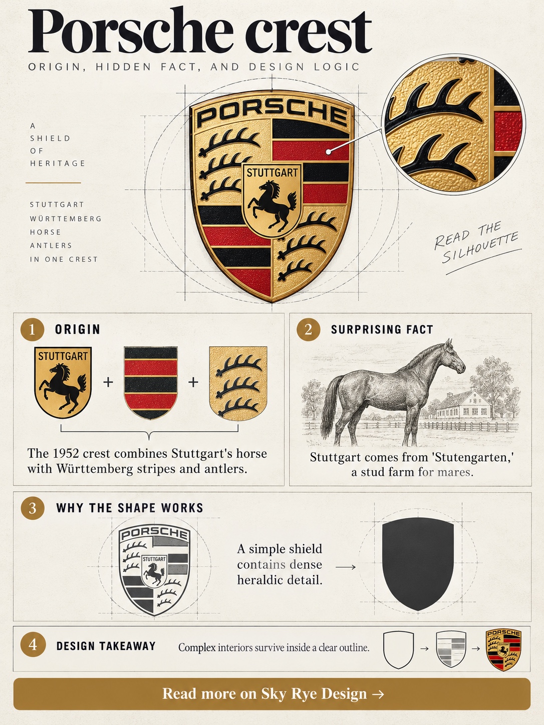
It’s a stack of regional heraldry. At the centre sits the black horse from Stuttgart’s coat of arms. Around it are the red and black stripes and stag antlers of the former Free People’s State of Württemberg, with “Porsche” across the top.
Design credit usually goes to Franz Xaver Reimspiess, though accounts differ. The 2023 update kept the structure and refined everything else, from the brushed-metal finish to the honeycomb texture.
The surprise: Stuttgart’s name comes from “Stutengarten,” a stud farm for mares. The horse is the city’s name drawn as a picture.
Takeaway: a dense crest survives if its outer silhouette stays simple.
8. Toyota: three ellipses and a lucky stroke count
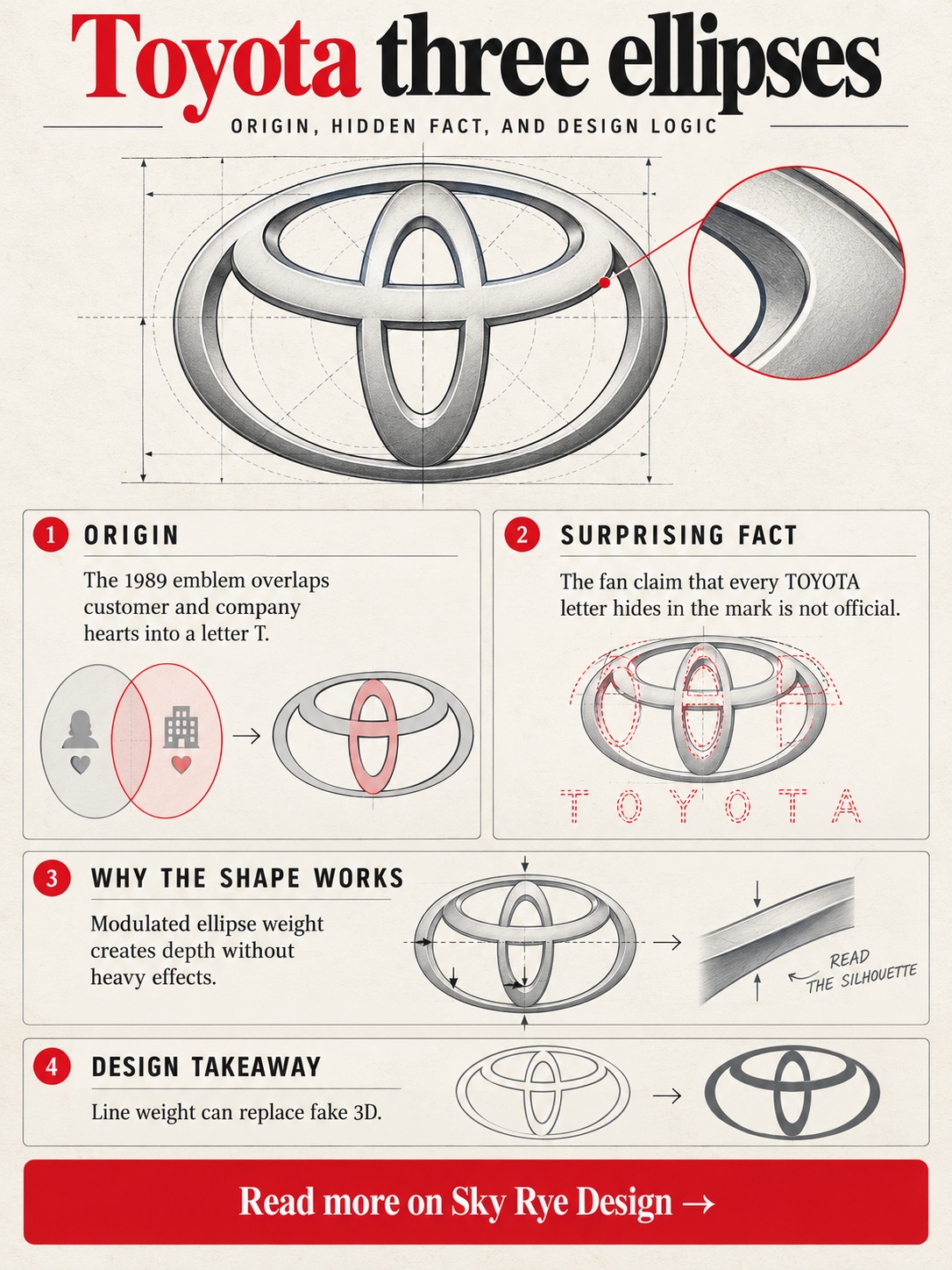
Toyota introduced its three-ellipse emblem in 1989. The company describes the two inner ovals as the hearts of the customer and the company, overlapping to form a “T,” with the outer ellipse representing the world. The claim that every letter of “TOYOTA” hides inside the mark is a fan discovery, not an official brief.
Look at the line weight. The ellipses swell and thin as they curve, so a flat mark gains a sense of rotation, a bit like something turned on a lathe. That modulation is why it never needed heavy chrome to look three-dimensional.
The surprise is in the name. The founding family was Toyoda, and the company adopted “Toyota” around 1936 alongside a public logo contest. The usual explanation is that the katakana spelling takes eight strokes, a lucky number in Japan, and sounds cleaner.
In 2020 Toyota’s European arm moved to a flatter version for communications.
Takeaway: modulated line weight can do the work of depth.
9. Mazda: wings, a god and a founder
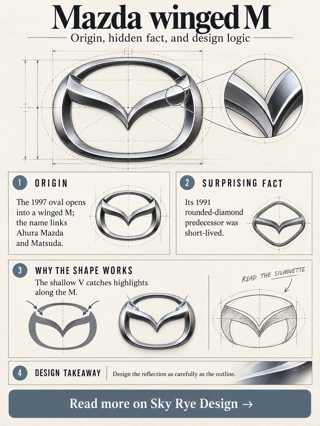
Mazda’s name pairs Ahura Mazda, the Zoroastrian god of wisdom and harmony, with the founder’s family name, Matsuda. The symbol has changed several times. Mazda’s early 1930s mark reportedly drew its curves from Hiroshima’s city emblem.
The current emblem arrived in 1997: a stylised “M” that opens into wings inside an oval. Its 1991 predecessor was a rounded diamond-like form, and it’s widely reported that it was revised partly because it sat too close to Renault’s diamond. That’s plausible, but I’d call it industry chatter rather than a documented brief.
I see the 1997 mark every time I walk up to my CX-5, and what strikes me is how much it relies on reflection. The wing is a shallow V with soft shoulders, so the chrome catches light along the “M” instead of across the whole oval.
The surprise: the brand name hides the founder’s surname inside a deity’s.
Takeaway: design the highlight lines, not just the outline.
10. Subaru: a star map on the grille
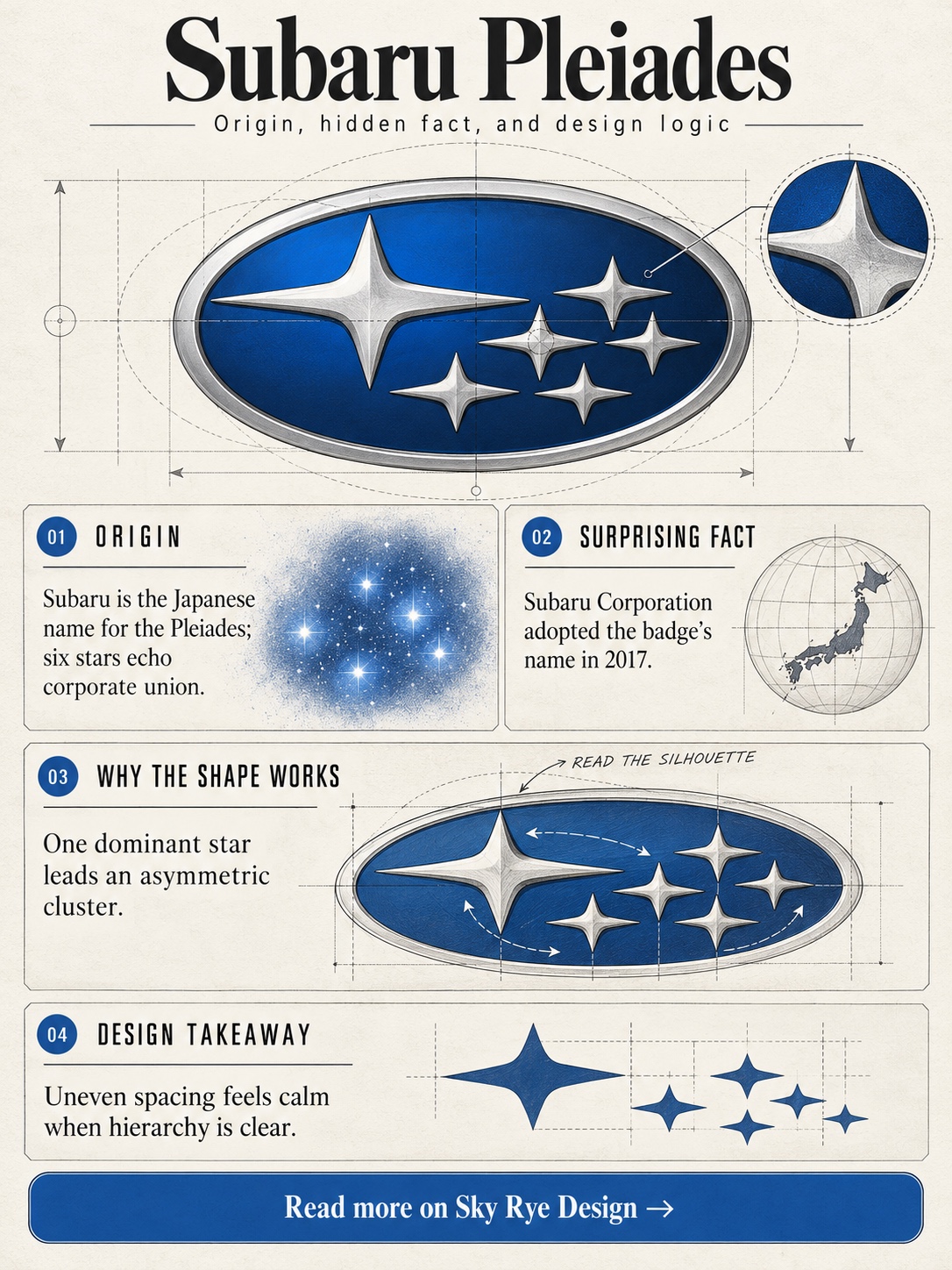
Subaru is the Japanese name for the Pleiades, the star cluster in Taurus. The common explanation is that the large star represents Fuji Heavy Industries and the five smaller stars represent the companies that merged to form it.
That’s the corporate reading. Astronomically, the Pleiades is often called the Seven Sisters, yet around six stars are typically visible to the naked eye. That happens to match the badge neatly.
The design is all about spacing. The stars aren’t placed on a grid; they sit in a loose cluster with one dominant star, and the dark blue oval plays the night sky. It’s one of the few car logos where negative space literally represents space.
The surprise: the company eventually took the name of its own badge, renaming itself Subaru Corporation in 2017.
Takeaway: an asymmetric arrangement can feel calm if one element clearly leads.
11. Volvo: an iron symbol, not a gender sign
Volvo means “I roll” in Latin. Ball-bearing maker SKF originally registered the name, and Volvo began in 1927 as an SKF venture, so the word fit the product perfectly.
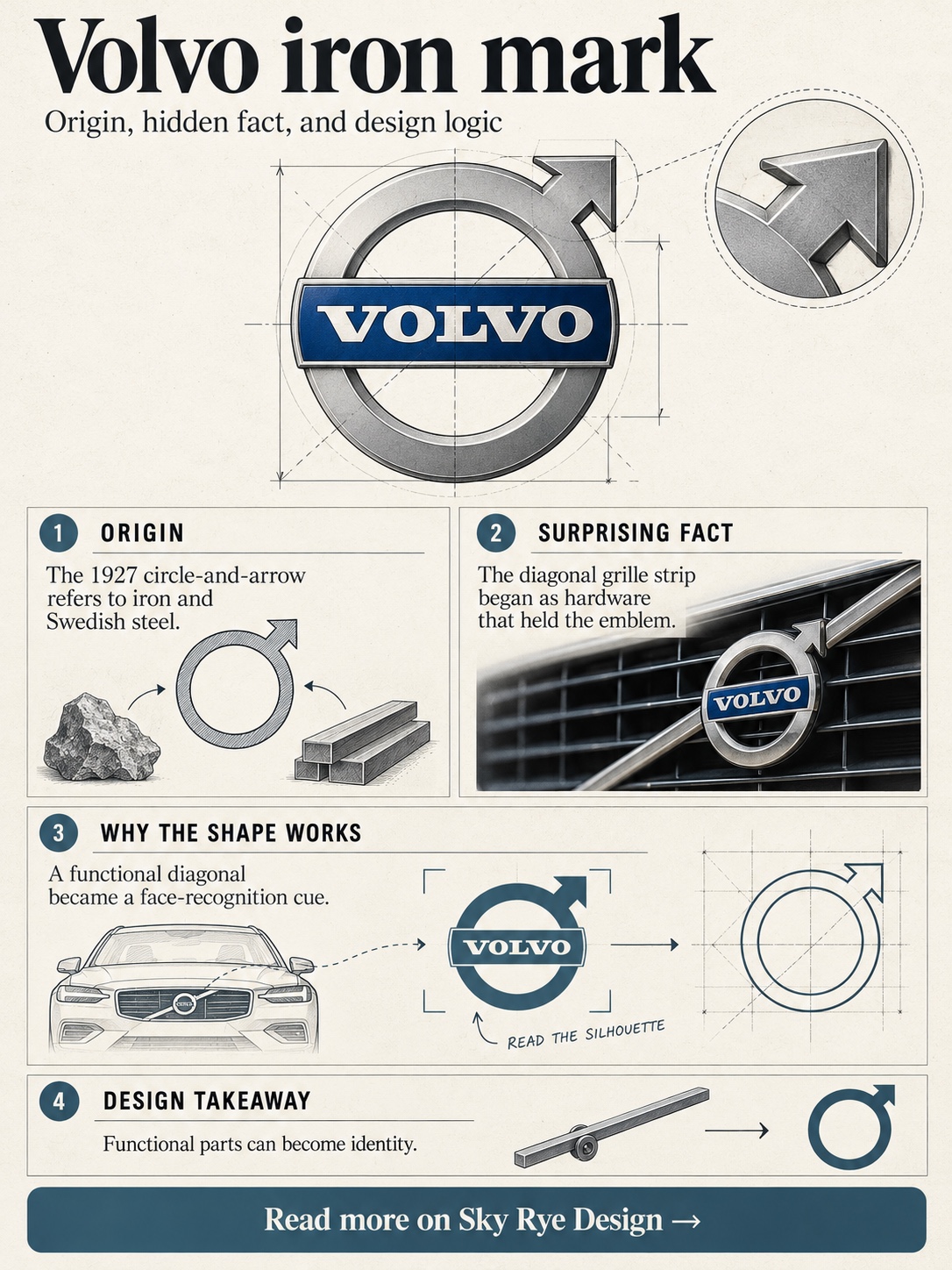
The emblem is the ancient chemical symbol for iron: a circle with an arrow pointing up and to the right. People often call it the male symbol. It is the same glyph, but Volvo’s intent was iron and Swedish steel, so reading it as a gender sign misses the point.
The diagonal strip across the grille began as hardware, a way to hold the emblem in place. It became so recognisable that it outlived its job. In 2021 Volvo flattened the mark for digital and lit applications, keeping that diagonal logic alive.
The surprise: Volvo’s most famous grille detail started as a mounting solution.
Takeaway: watch the functional parts of a front end. Some of them become the identity.
12. Peugeot: a lion that started on saw blades
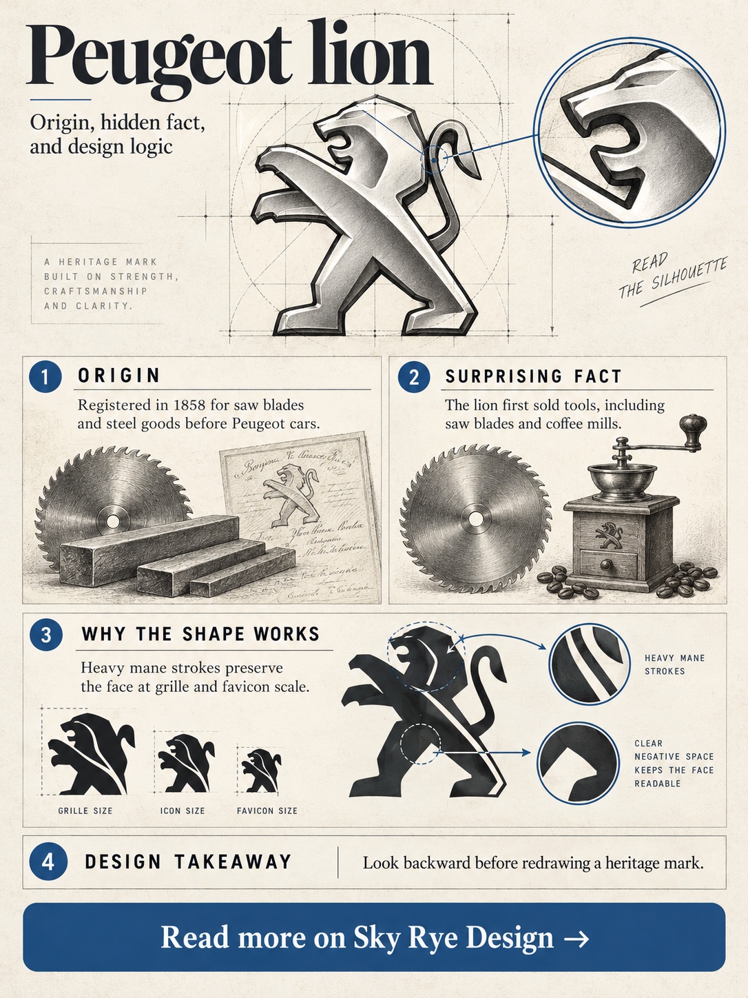
Peugeot’s lion is older than the car. The family business made steel goods, including saw blades and coffee mills, and the lion was registered in 1858 for those tools. Peugeot’s history says the animal stood for the qualities of its saw teeth: toughness, flexibility and speed of cut. The first drawing is credited to Montbéliard goldsmith Justin Blazer.
Since then the lion has walked on an arrow, reared up, turned into a wireframe outline in 1975 and become a shield-framed head. The 2021 redesign returned to a lion’s head in a shield, clearly nodding to the 1960s mark.
What I like about the 2021 version is the line weight. The mane is built from a few heavy strokes rather than fur detail, so the face holds at grille scale and at favicon scale.
The surprise: before it sold a single car, the lion was selling hand tools.
Takeaway: when a mark has lived this long, look backward before inventing something new.
13. Citroën: a gear tooth turned into a logo
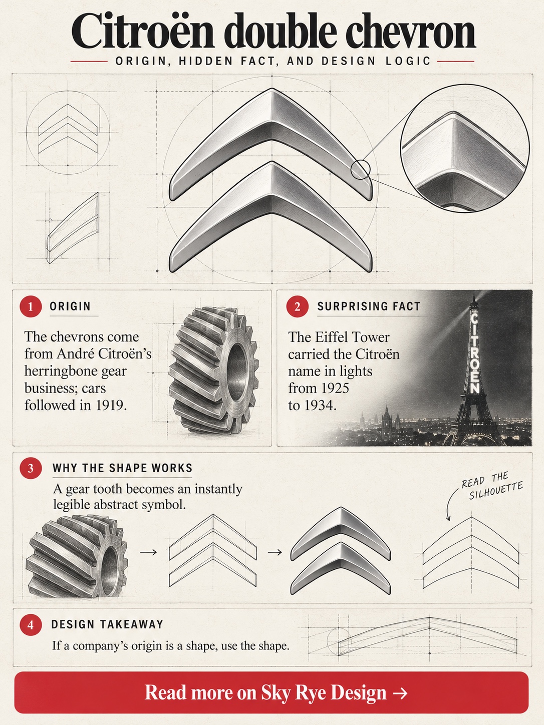
Citroën’s double chevron is a gear. In 1900 André Citroën came across a method for cutting herringbone gears, whose teeth form a V, reportedly while visiting relatives in Poland, and he bought the patent. He built a gear business first. When the car company launched in 1919, the logo was two chevrons in an oval.
That makes it one of the most honest automotive emblems around. It looks abstract, but it’s a technical drawing reduced to its most legible element.
Over the decades the chevrons grew bolder, moved into a box and went chrome and three-dimensional in 2009. In 2022 Citroën returned to a vertical oval inspired by the 1919 original, with crisp outlines and lighter strokes.
The surprise: from 1925 to 1934, the Eiffel Tower carried the Citroën name in lights.
Takeaway: if your company’s origin is a shape, use the shape.
14. Maserati: Neptune’s trident, drawn by the painter
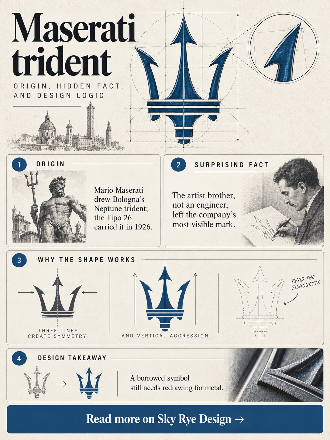
Maserati’s trident comes from Bologna’s Piazza Maggiore, where the Fountain of Neptune holds one aloft. Mario Maserati, the artist among the brothers rather than one of the engineers, drew it for the badge. The idea is often attributed to family friend Diego de Sterlich.
The company was founded in Bologna in 1914. The first car to carry the trident was the Tipo 26 of 1926.
The trident is a strongly vertical mark, which suits a narrow, upright grille opening. Three tines on a central shaft give it symmetry and aggression at once. The redraw that came with the MC20 era in 2020 sharpened and simplified it further.
The surprise: of all the Maserati brothers, the painter left the most visible mark on the company.
Takeaway: borrowing from a public monument borrows its authority, but the shape still has to be redrawn for metal.
15. Škoda: a winged arrow with a disputed muse
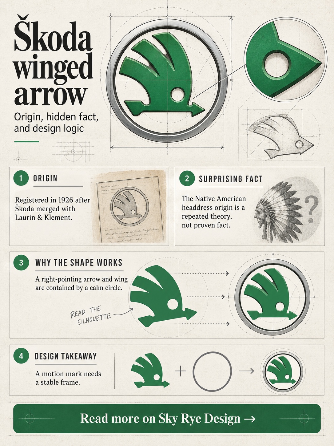
Škoda’s winged arrow was registered in 1926, shortly after the Škoda industrial group merged with Laurin & Klement. That Mladá Boleslav firm had started out with bicycles. Who actually drew the arrow isn’t documented with certainty.
The most repeated story links it to the feathered headdress in a profile portrait of a Native American, said to have hung in a company director’s office after a trip to America. Škoda’s own heritage material has discussed the theory, but it isn’t proven. Read it as lore.
As geometry, it’s a circle holding a single wing and an arrowhead, both pointing right, the conventional direction of “forward” for left-to-right readers. The round frame keeps all that drama contained.
The surprise: Škoda’s 2022 identity puts the full wordmark across the bonnet and keeps the arrow for other uses.
Takeaway: a motion mark needs a calm frame, or it reads as noise.
What these 15 car logos have in common
Put the marks side by side and a pattern appears. Hardly any were designed as brand identities in the modern sense. They came from city arms, fountains, fighter planes, steel tools, gear patents and the night sky, then spent decades being redrawn by people who mostly kept the silhouette and changed the surface.
The surface is where the recent shift is happening. Heavy chrome and faux-3D renders from the 2000s have given way to flat, thinner marks that light up, work on screens and survive at tiny sizes. That’s less a fashion than a practical response to where badges now live.
My advice is simple. Protect the silhouette, document the real story and keep myths clearly labelled. A strong mark doesn’t need invented legends to hold the front of a car.
Car logos FAQ
Is the BMW logo a propeller?
No. The roundel was registered in 1917, taking its ring structure from Rapp Motorenwerke and its colours from Bavaria. The propeller reading comes from a 1929 advertisement, and BMW has since said the logo wasn’t designed that way.
Are the Ferrari and Porsche horses the same horse?
Not by any documented route. Porsche’s horse comes from Stuttgart’s coat of arms, while Ferrari’s comes from Francesco Baracca’s aircraft. Theories that Baracca adopted a Stuttgart-linked German emblem remain unproven.
Why do so many car logos use animals?
An animal gives a mark posture: a rearing horse, a charging bull, a standing lion. That gesture reads instantly as a silhouette, which matters on a badge seen at speed or at small size.
Why are car brands switching to flat logos?
Badges now have to work on screens, in apps and as illuminated elements on electric cars. Flat, thinner marks scale down cleanly and light evenly, which faux-3D chrome renders struggle to do.
Which of these car logos is the oldest?
Peugeot’s lion, registered in 1858 for the family’s steel tools. Mercedes-Benz’s star followed in 1909, and BMW’s roundel in 1917.
- 15shares
- Facebook0
- Pinterest15
- Twitter0
- Reddit0