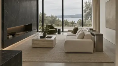
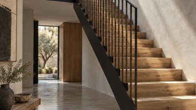
I learned to distrust perfect reference images the hard way. In industrial design, a beautiful side view can lie to you. A car silhouette may look sharp in a sketch, then fall apart once you check wheelbase, cabin height, door cuts, mirrors, and how a real person gets in.
Architecture has the same trap. A saved house photo can feel like the whole answer, but the architectural design process starts only after you ask what that image is doing and whether those decisions can survive a real site.
- Why a reference image is not an architectural brief
- Start with the site before choosing the look
- Translate inspiration into spatial planning
- Design from the inside out and the outside in
- Circulation is the hidden test of a good home
- Natural light should be designed, not added later
- Materials need to work beyond the rendering
- Budget and buildability belong in the design process
- Design for the life after the photos
- How to brief an architect with inspiration images
- The best homes feel inevitable
- FAQ
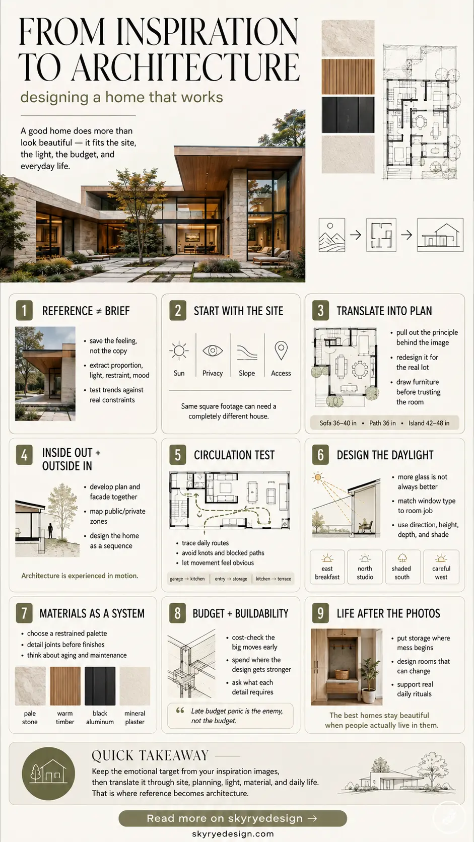
Home design inspiration gives you direction. It tells you that you like low rooflines, quiet stone, warm timber, deep overhangs, courtyards, glass corners, or rooms that open toward a garden. But a livable home has to do more than repeat a mood. It has to handle sun, privacy, structure, storage, budget, rainwater, noise, furniture, permits, and ordinary Tuesday mornings with shoes by the door and groceries on the counter.
I like beautiful houses. I also like houses that make sense.
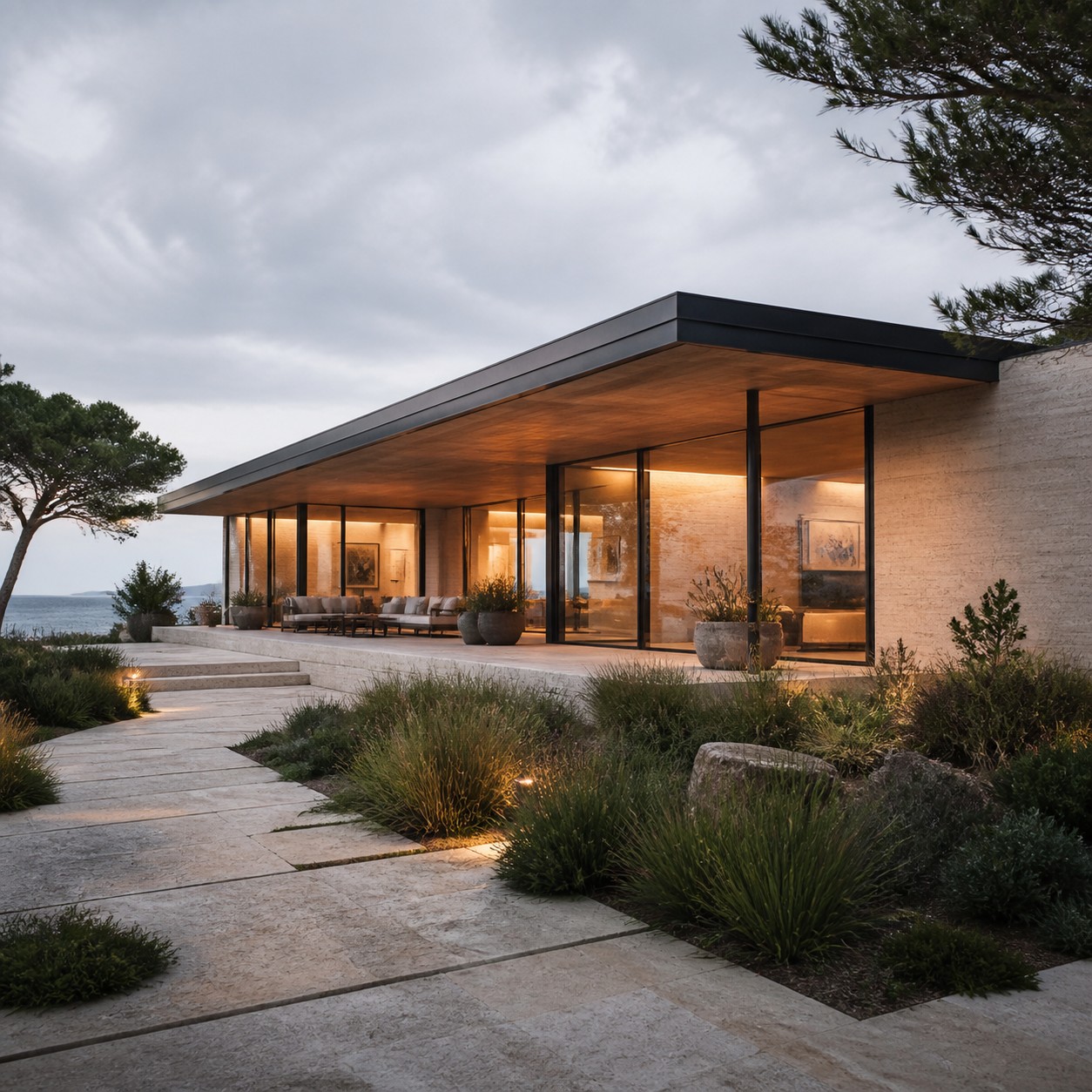
This is where a design reference becomes architecture: you take the visual quality you admire, then translate it into a plan that fits the land, the climate, and the people who will live there.
Why a reference image is not an architectural brief
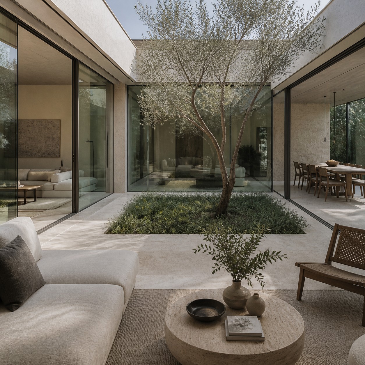
A reference image is a clue, not a set of instructions.
Translate the feeling before copying the form
Most homeowners save images for the surface qualities: the long window, the open living room, the concrete stair, the thin roof edge, the pale stone kitchen. Those things matter. But the reason a house works is usually buried in decisions you cannot see in the photograph.
A glass wall in a coastal house might look calm because the site has soft light, breezes, and a view worth opening to. Move that same wall to a west-facing inland lot and it can become a heat problem by late afternoon. A courtyard that feels effortless in a dry climate may need drainage, shade, and different planting somewhere wetter.
So I would never ask, “How do we copy this house?”
I would ask, “What makes this image feel good?”
Maybe it is the low horizontal proportion. Maybe it is the way daylight washes across a plaster wall. Maybe the facade feels expensive because the material palette is calm, not because the materials are loud.
That is the first useful translation. Name the quality before you copy the form.
If a homeowner loves a house by John Pawson, the answer is rarely “make every wall white and remove all belongings.” The lesson is proportion, restraint, shadow, and detailing. If someone loves Glenn Murcutt, the lesson is climate, section, breeze, shade, and a building that pays attention to its place.
Test trends against real constraints
The same applies to 2026 home trends. The AIA Home Design Trends Survey keeps pointing back to home and property decisions, while NAHB’s climate responsive design guidance puts orientation and planning near the start of resilient home design. The strongest houses do not begin with decoration. They begin with constraints handled well.
Start with the site before choosing the look
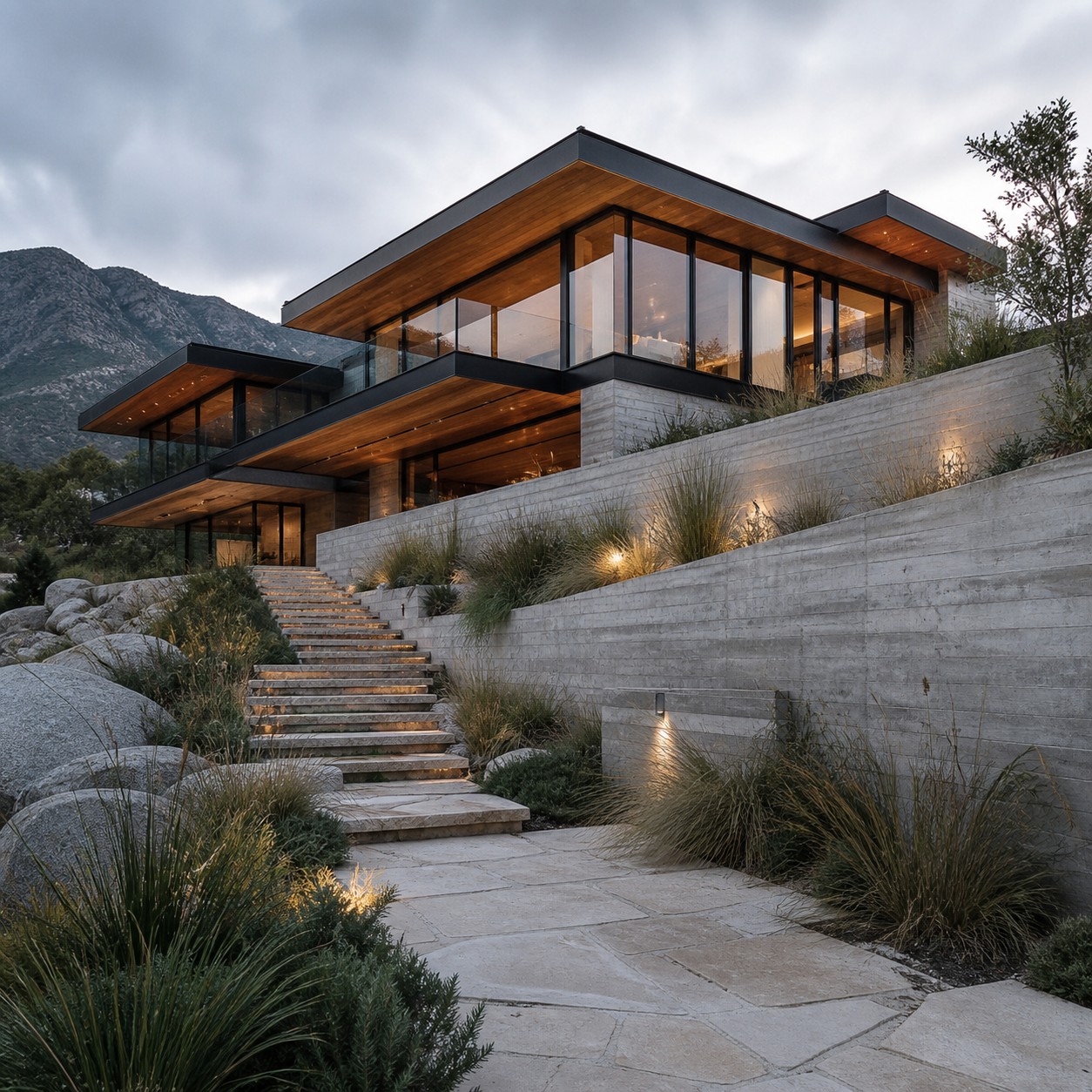
Before you refine the shape of the house, study the ground under it.
Let the lot change the plan
Two lots can have the same size on paper and need completely different architecture. One has morning light, a gentle slope, and privacy from the street. Another has harsh western sun, a narrow driveway, and a view that only appears from the second floor. Same square footage. Different house.
This is why site planning architecture belongs early. It affects the footprint, orientation, glazing, outdoor rooms, roof shape, entry sequence, and sometimes the entire character of the design.
Read sun, privacy, slope, and access
Look at sun first. In the Northern Hemisphere, east and west glazing can create glare and heat if it is not shaded carefully. South-facing openings can be useful when overhangs, roof depth, and climate are handled intelligently. North light can be soft and steady, which is why artists love it in studios.
Then look at privacy.
A room can have a large window and still feel exposed if the sightline is wrong. Sometimes the best design move is not a bigger opening, but a higher sill, a side window, or a small courtyard that catches light without inviting the street inside.
Slope matters too. A sloped site can give you a split-level plan, a tucked garage, or a terrace that feels natural. It can also add excavation, retaining walls, drainage complexity, and awkward stairs if you force a flat-house idea onto it.
Keep access in the drawing from day one. Where does the car arrive? Where do muddy shoes go? How do groceries reach the kitchen? These tiny routes are easy to ignore in a glossy exterior image.
Translate inspiration into spatial planning
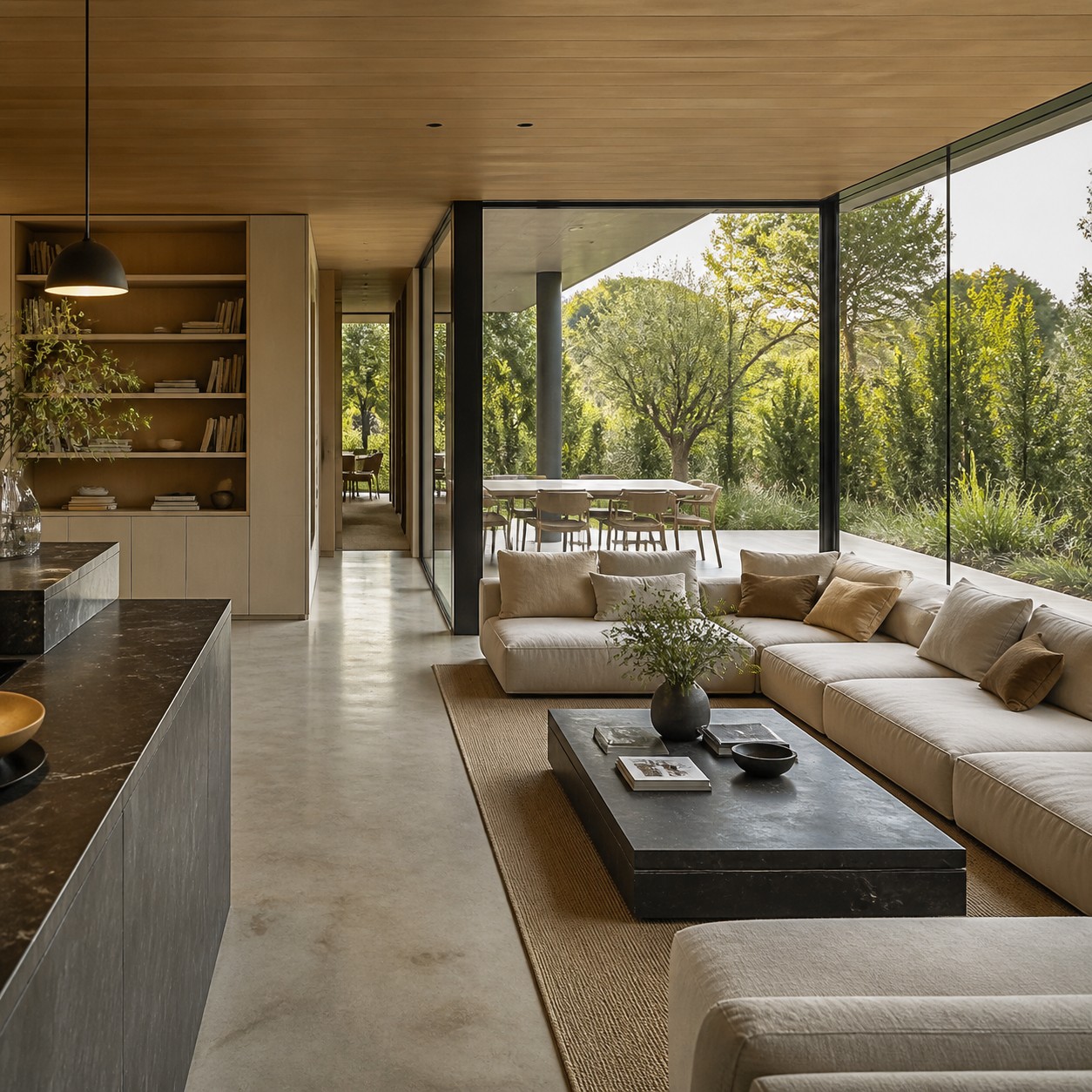
Good residential architecture design usually starts with editing.
Extract the principle behind the image
Take a reference image and strip away the obvious surface. If the photo shows a calm open room, maybe the value is not “open plan.” Maybe it is a clean path from kitchen to terrace, low furniture, and daylight from two directions. If the image shows a stone facade, maybe the value is weight at the base and lighter volumes above.
This is close to how I thumbnail a product or a car concept. I block the mass, the silhouette, the main lines, and the proportion first. If those are wrong, finish quality will not save the object.
Architecture works the same way.
A reference photo freezes one condition: one time of day, one camera angle, one styling pass, one cleaned room. The house has to work from every angle and in every season.
Pull out the principle. A deep overhang might mean shade and a lower visual line. A courtyard might mean protected outdoor space. A long window might mean a horizontal view or a way to stretch a compact room.
Once you know the principle, you can redesign it.
Maybe the glass wall becomes a series of narrower openings because the site needs privacy. Maybe the courtyard becomes a side garden because the lot is narrow. Maybe the double-height space becomes a stair with a skylight, because the budget cannot support a huge volume of unused air.
That is not compromise in the weak sense. It is design doing its job.
Draw furniture before trusting the room
An empty floor plan is seductive. Everything looks larger before furniture arrives.
A living room that seems generous may shrink fast once you draw a real sofa, chairs, side clearance, and a path to the terrace. A bedroom may fit a king bed but leave no comfortable route to the closet. A kitchen island can look impressive and still be irritating if the clearances are tight.
I like to test rooms with real dimensions early. A common sofa depth is around 36 to 40 inches. A comfortable path wants roughly 36 inches, more if it is a main route. Around a kitchen island, 42 inches can work for one cook, but 48 inches feels better if two people move through the space. These numbers are not glamorous. They save the house.
Outdoor areas need the same honesty. A 5-foot balcony can hold a chair and a view. A 10-foot terrace can hold a table, chairs, circulation, and maybe a planter without feeling pinched.
Design from the inside out and the outside in
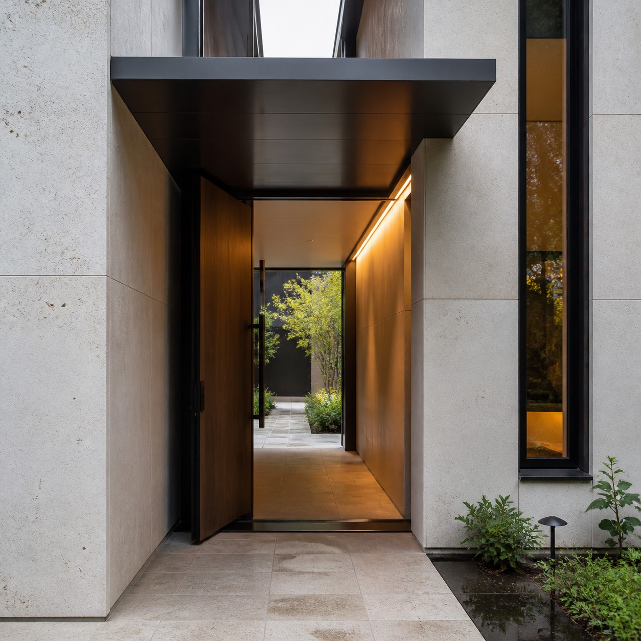
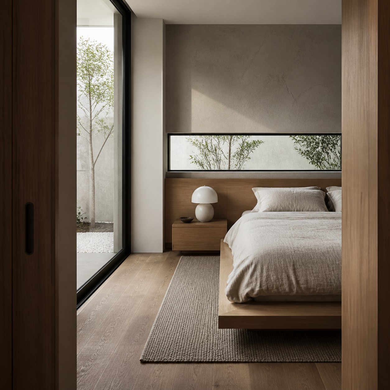
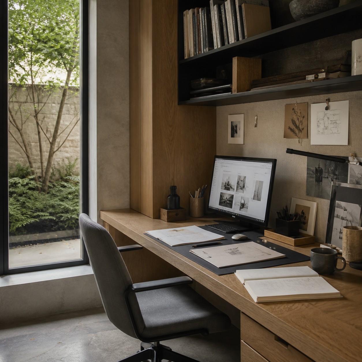
Floor plans and facades should develop together.
Keep plan and facade in conversation
If you design the exterior first, the rooms behind it can become prisoners of the elevation. Windows land in awkward places. Bedrooms get strange proportions. The house photographs well from one angle and annoys everyone who lives inside.
If you design only from the plan, the opposite problem appears. The rooms function, but the building looks assembled rather than composed. The roof has no discipline. Openings feel random. Materials change without a reason.
Inside, you check room relationships, daylight, privacy, storage, furniture, and the small rituals of the household. Outside, those same choices become massing, rooflines, shadows, openings, and materials. A window is rarely just a window. It lights a room, frames a view, sets the rhythm of a wall, affects heat gain, and changes furniture placement.
That is why I prefer simple diagrams early: public and private zones, light direction, views, noisy edges, wet areas, storage spines, entry points. A clean diagram can save weeks of decorative guessing.
Design the home as a sequence
There is also a very human reason to work both ways. People experience a house in motion.
You arrive from the street. You step under cover. You enter, turn, see light, find the kitchen, notice the garden, sit, move upstairs, carry laundry, answer the door. Architecture is not a still image. It is a sequence.
This is where working with an architect can help, especially if you have a lot of visual references but do not yet know what they mean. A studio such as Ataman Studio Architects can translate mood boards into site-aware planning, permitting logic, structural coordination, and construction-ready decisions rather than treating the reference as something to trace.
The prettiest concept in the world still has to meet gravity, weather, regulations, labor, materials, and budget.
Circulation is the hidden test of a good home
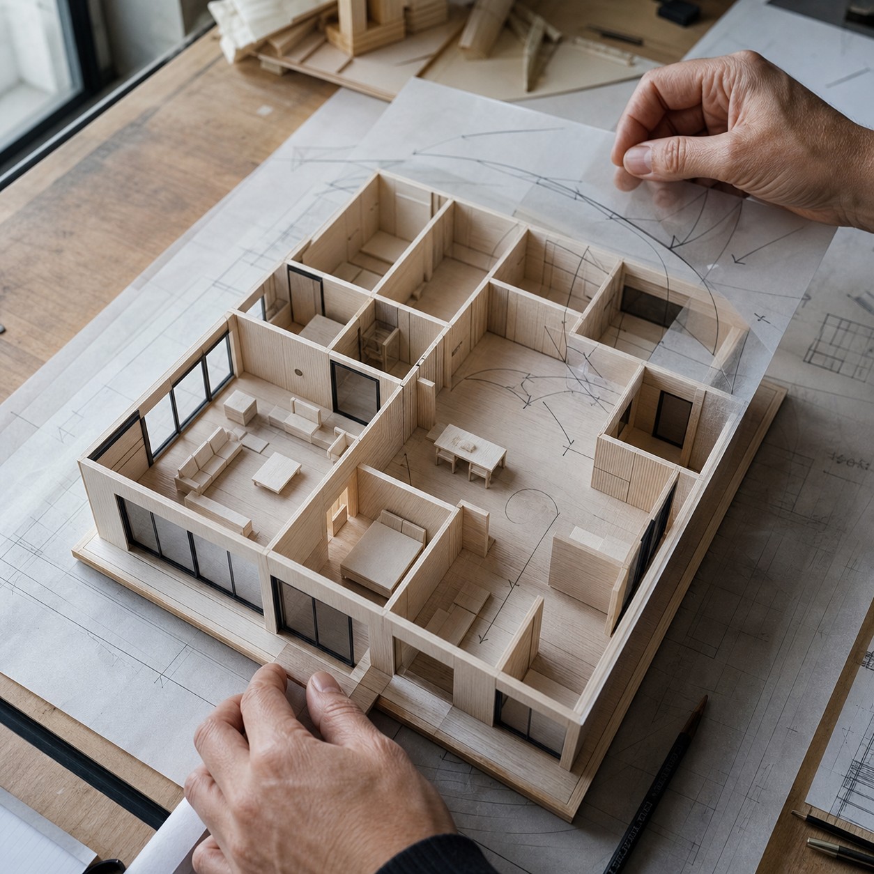
People rarely save hallway photos. They should still care about circulation.
Make everyday routes visible
Bad circulation can make a large home feel wasteful and a small home feel cramped. You see it in long corridors, doors that fight furniture, kitchens that become passageways, bedrooms with no quiet threshold, and entries where coats, shoes, keys, and bags have nowhere to land.
A good plan does not remove movement. It makes movement feel obvious.
Think about the routes you repeat every day. Garage to kitchen. Entry to coat storage. Bedroom to bathroom. Kitchen to outdoor table. Laundry to bedrooms. Guest room to bathroom without crossing the most private part of the house.
Now draw those paths as lines.
If the drawing becomes a knot, the plan needs work. If the paths cut through the center of furniture groups, the room will never feel settled. If the kitchen island blocks the fridge-to-sink route, someone will curse that island daily.
In automotive design, we used to obsess over ingress and egress: how the body enters and leaves the car. It sounds technical until you hit your knee on the steering column. Homes have the same physical truth.
One practical test: add furniture, then trace daily routes with a thick marker. The marker should move smoothly. It should not squeeze between a dining chair and a wall or dodge a door swing.
Good circulation is quiet. You notice it only when it is missing.
Natural light should be designed, not added later
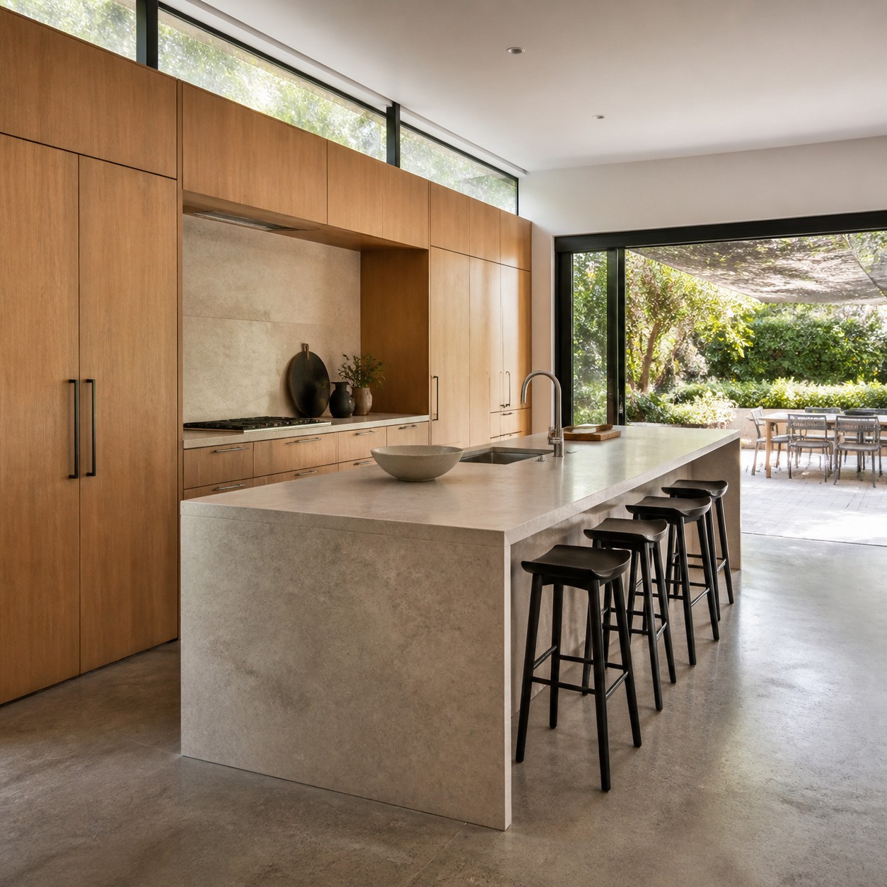
More glass does not automatically mean better light.
Plan windows around light quality
This is one of the easiest mistakes to make when looking at modern home design ideas. Big windows photograph well. They also create glare, heat gain, privacy issues, faded floors, awkward furniture placement, and rooms that feel exposed at night.
Natural light in architecture is about direction, height, depth, reflection, and shadow.
Morning light is gentle and quick. West light can be beautiful for an hour and brutal for three. North light is steady in many climates. South light can be generous if shading is planned well. A high window can pull light deep into a room while keeping privacy. A courtyard can turn an interior room into a place with a sky view.
Light also depends on surfaces. Matte plaster, pale oak, limestone, limewash, and warm white walls reflect daylight differently from black stone, dark timber, or glossy tile. A room with modest windows can feel bright if the surfaces carry light well. A room with huge glass can still feel harsh if the contrast is wrong.
Life painting made me fussy about this. In a studio, you learn that light is not simply brightness. It has direction, edge, temperature, and bounce. The same logic applies to rooms.
Match daylight to the room’s job
Before deciding how many windows a room needs, ask what kind of light belongs there.
A breakfast area may want east light. A reading nook wants soft light without glare on the page. A bedroom may need darkness and privacy more than spectacle. A studio or home office needs steady light and careful screen placement.
And remember night. Large glass turns reflective after sunset. The view disappears, and the interior becomes visible from outside, so privacy needs a plan before move-in.
Materials need to work beyond the rendering
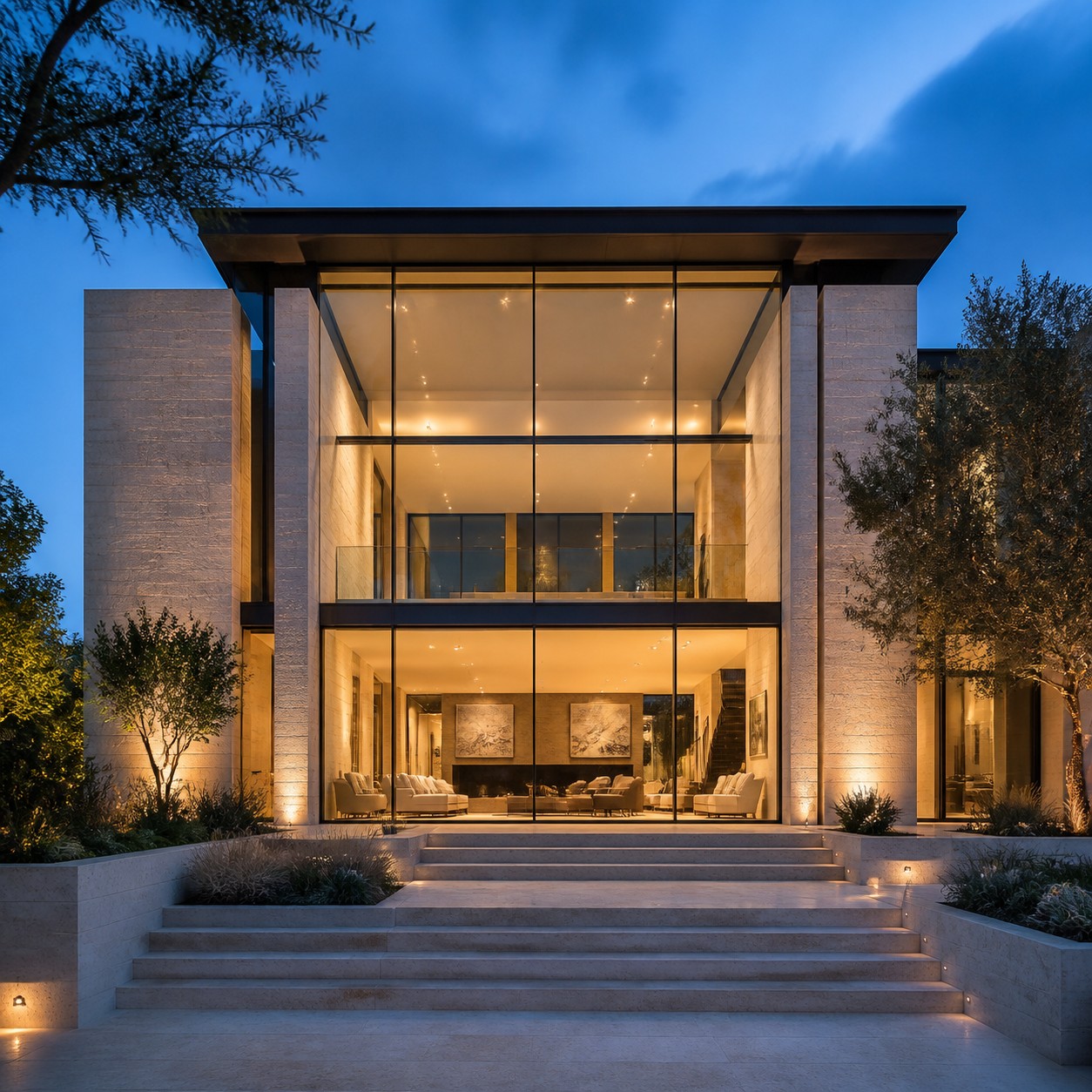
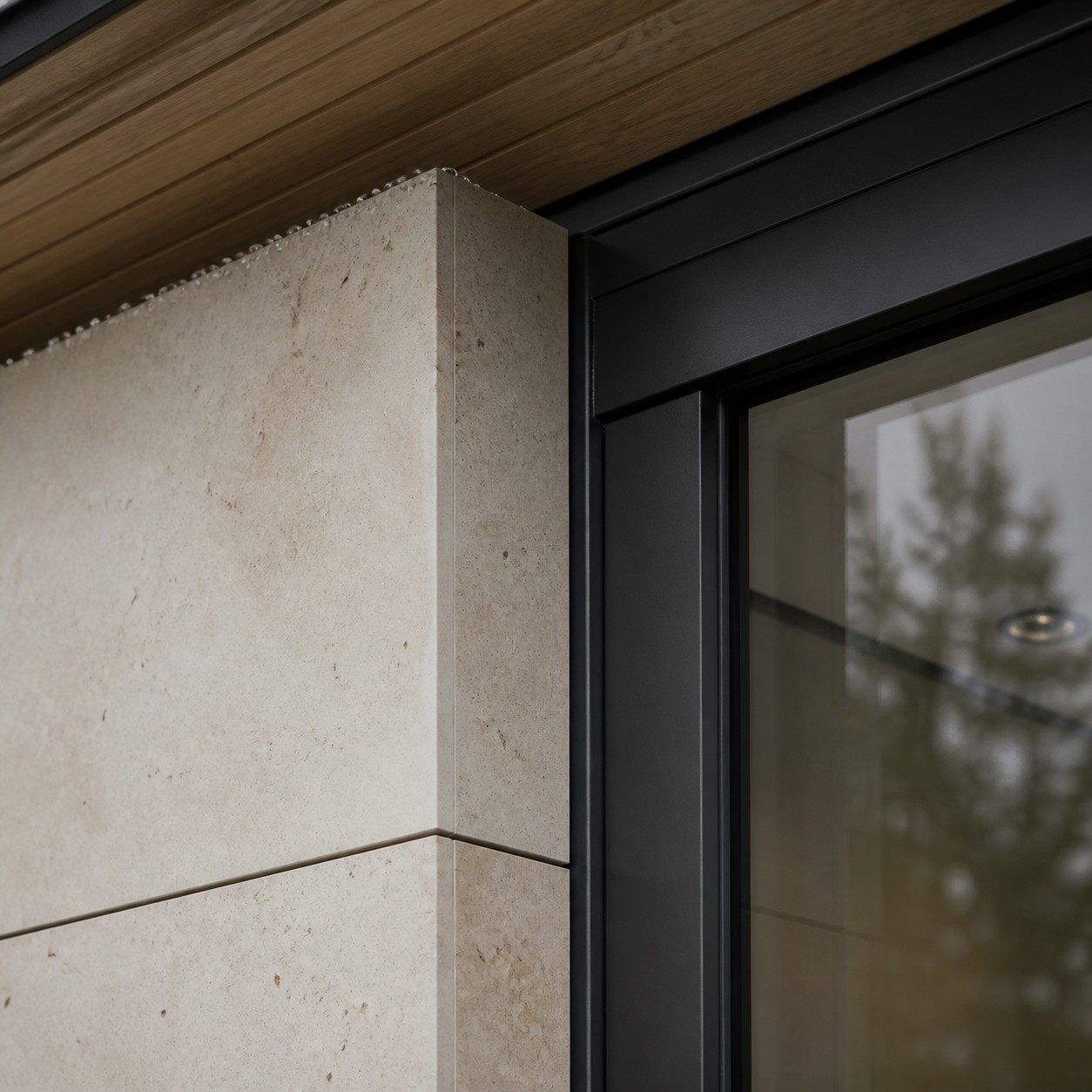
Renderings make materials look obedient.
Choose materials as a system
Real materials have weight, joints, texture, variation, maintenance, lead times, and bad days. Stone needs edges. Timber moves. Metal scratches. Stucco stains. Concrete cracks. Glass reflects things you did not expect.
That does not make materials less beautiful. It makes them more interesting.
A restrained palette usually ages better than a house full of unrelated finishes. Think of a simple mix: pale stone outside, warm timber inside, black aluminum frames, mineral plaster, one strong floor material, and a few careful accents.
But restraint only works when details are strong.
Detail the joints before the finish
How does the stone meet the window? Where does rainwater go? Does the timber siding have a shadow gap? Does the floor transition happen at a doorway or in the middle of an open space?
I am not against bold material choices. I love a dark stone kitchen when the light is right. I love travertine when the veining feels natural rather than over-polished. But every material has to earn its place in the system.
Ask six questions before you commit.
How will it age? What does maintenance look like? Does it suit the climate? Can the builder detail it well? Is it available on the project timeline? Will it still make sense when the room is full of furniture, art, cables, bags, and people?
The last question is underrated. A material that looks perfect in an empty rendering may become too loud once people arrive.
Budget and buildability belong in the design process
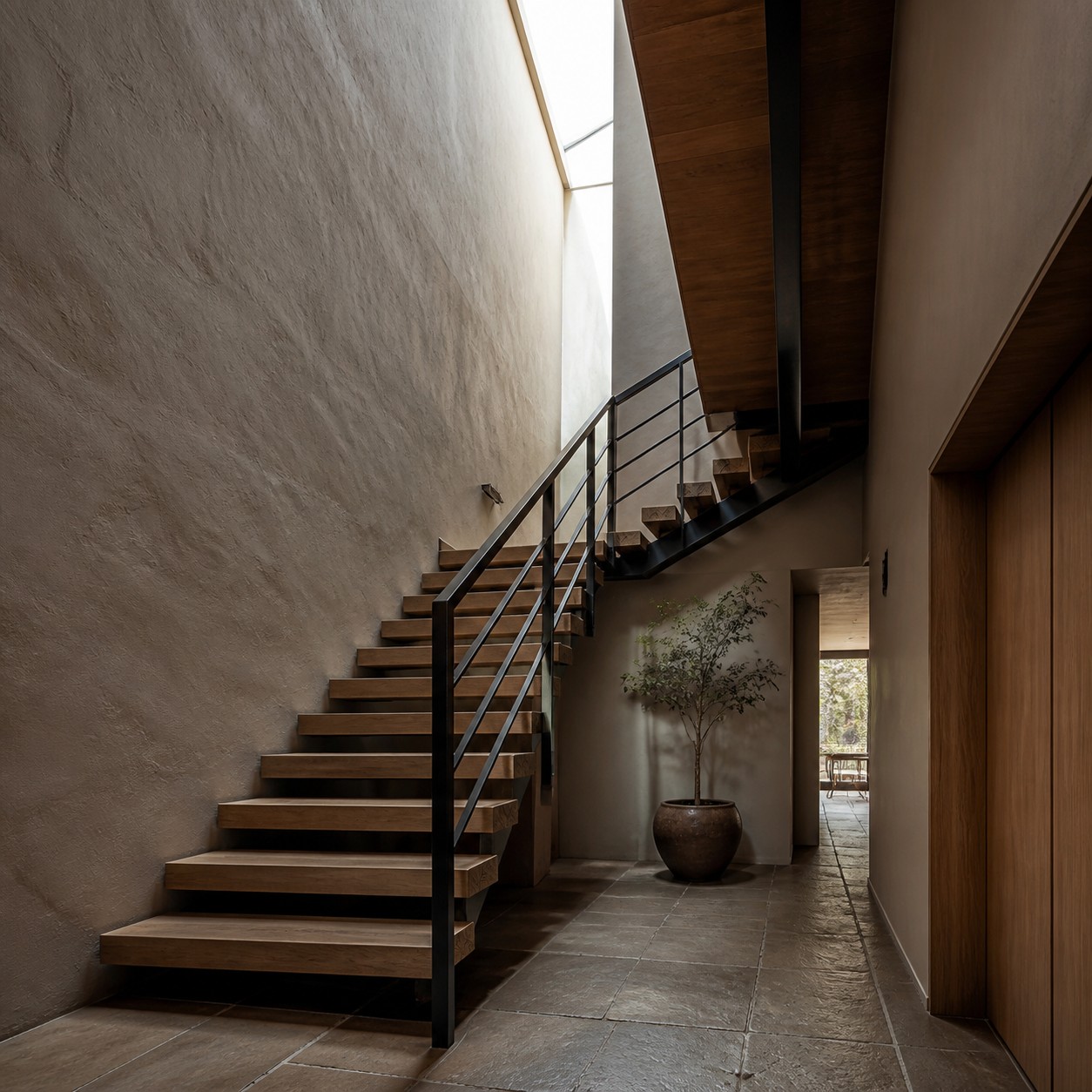
Budget is not the enemy of design. Late budget panic is.
Cost-check the big moves early
Many homeowners treat cost as something that gets checked after the design is “done.” That is how a promising project becomes a painful round of deletions. By then, the expensive decisions are already embedded: structural spans, roof geometry, glazing area, excavation, custom millwork, and mechanical systems.
Design and budget need to grow together.
A dramatic window toward the best view may be worth protecting. A complicated roof over a secondary room may not be. A smaller footprint with better daylight and storage can feel better than a larger plan full of leftover space.
This is not about choosing the cheapest option. It is about spending where the design gets stronger.
Buildability sits beside budget. A clean ceiling may require early coordination between structure, lighting, HVAC, and speakers. If those conversations happen late, the ceiling fills with compromises. A crisp facade may depend on flashing details and window alignment that nobody will notice when they are done correctly.
Ask what each detail requires
One useful question for every striking design move: what has to be true for this to work?
If the answer is “perfect execution, rare material, tight tolerance, unusual contractor skill, and no budget movement,” be careful. Some details deserve that control. Most do not.
I would rather see one or two excellent moments than a house trying to be special everywhere. A framed view from the entry. A morning-light kitchen. A protected terrace that gets used. A stair that brings light down into the plan.
That is enough.
Design for the life after the photos
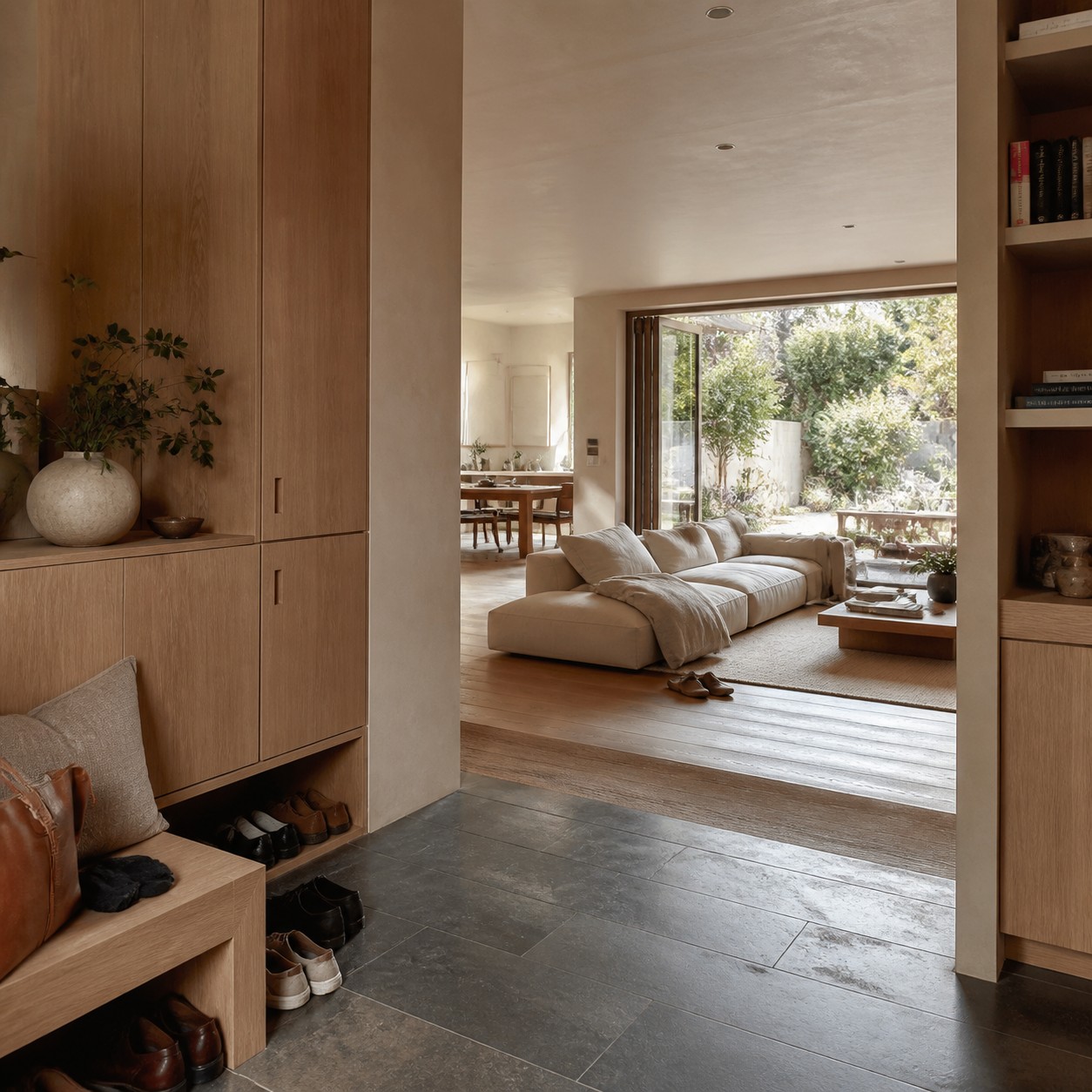
Architectural photography catches a house at its quietest.
Put storage where life starts
Real homes are noisier. Groceries arrive. Shoes pile up. A laptop lands on the dining table. Guests need towels. Laundry waits. Life edits the design whether you like it or not.
A good home expects this.
Storage should live where mess begins, not where a plan has leftover space. The entry needs a landing zone. The kitchen needs room for the way the household actually cooks. A guest room should have a bag surface and a plug near the bed.
Flexible rooms matter more than trend rooms.
Design rooms that can change
A room that can shift from office to nursery to guest room to studio over ten years has real value. The bones should allow change: sensible proportions, good light, accessible power, storage, and enough privacy.
This is also where current design culture is becoming more honest. Recent Architectural Digest trend coverage points toward personal, layered homes rather than showroom perfection. I like that shift. Perfect rooms can be cold. Lived-in rooms carry memory.
But personality still needs editing.
If everything is a feature, nothing rests. If every surface has texture, the eye gets tired. If every room has a different concept, the house stops feeling like one place. The trick is to design a strong enough framework for life to soften it.
Think of a gallery wall on a calm plaster surface. A vintage chair beside a clean built-in. A tea tray on a low table near a window. For me, even a cup of Shu Pu-erh beside a sketchbook changes how I read a room.
How to brief an architect with inspiration images
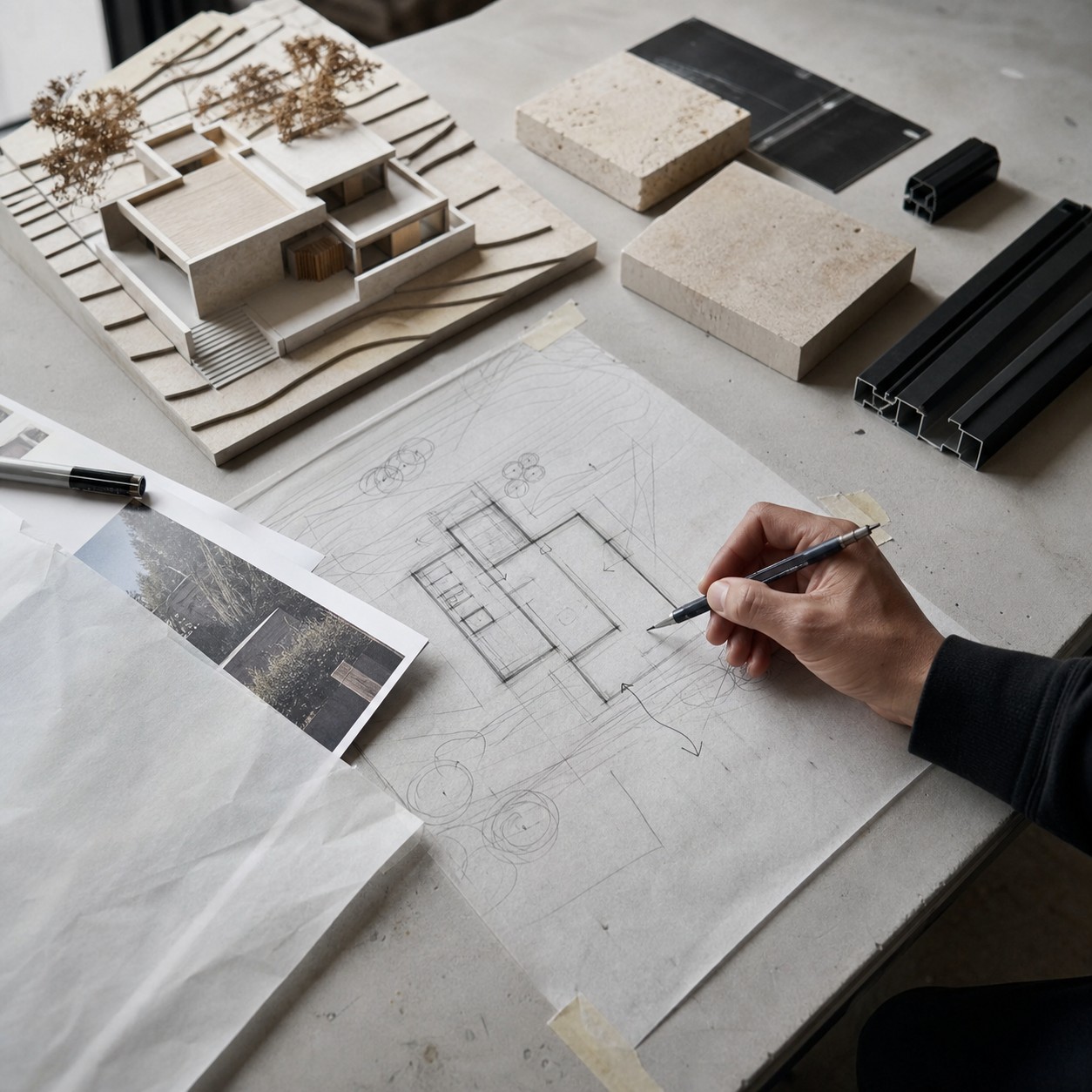
Most people bring too many images and too little explanation. That is normal. Saving references is easier than naming why you like them.
Sort references by job
Make three groups.
First, collect mood images. These show atmosphere: calm, bright, earthy, sharp, warm, airy, private, open. Second, collect function images: a kitchen connected to a terrace, a quiet desk by a window, a mudroom with storage. Third, collect detail images: materials, window frames, stairs, handles, shelving, lighting, or roof edges.
Then annotate them in plain language.
Annotate what the image means
Write “I like the low roof and shadow line,” not just “nice.” Write “I like that the kitchen can see the garden.” Write “I dislike the exposed neighbors even though the glass is beautiful.” Negative references help too. They stop the design team from guessing.
Be honest about daily life.
How many people cook? Do you work from home? Do you host big dinners or avoid them? Do you need a quiet room for music, painting, calls, or fitness? Where does the morning sun matter? What part of your current home irritates you every week?
Those answers shape better architecture than a folder of perfect kitchens.
Also bring budget reality early. Not as a mood-killer. As a design tool. If the team knows what must be protected, they can spend intelligence there.
A strong brief does not tell the architect exactly what to draw. It gives them the right problem.
The best homes feel inevitable
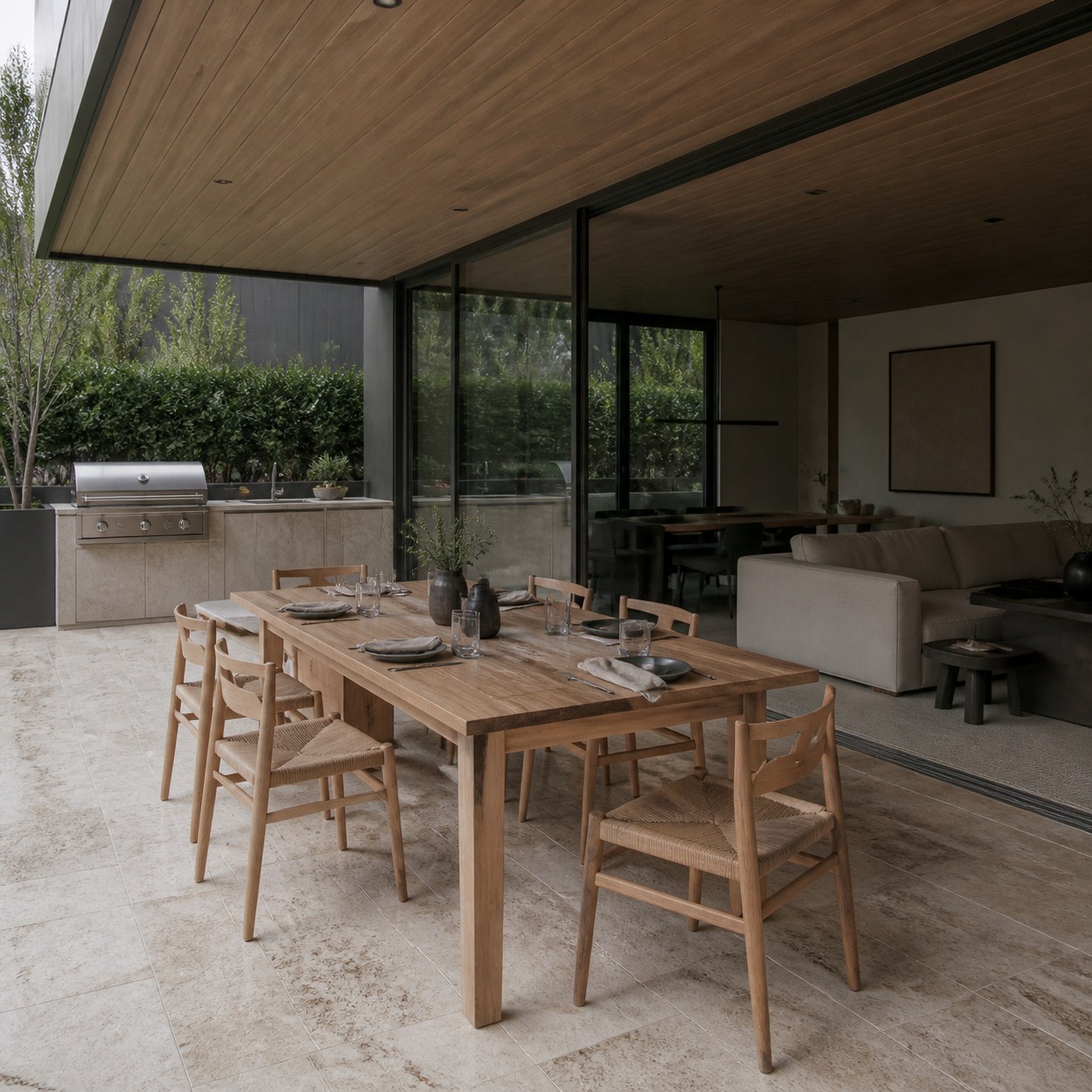
When a home works, it often feels obvious. The entry lands in the right place. The kitchen catches the right light. The living room opens without feeling exposed. The terrace is deep enough to use. Storage appears where life gets messy. You move through the house without thinking about the plan.
Keep the emotional target, not the copy
That easy feeling takes work.
The architectural design process is a long act of translation. Inspiration becomes intention. Intention becomes site strategy. Site strategy becomes plan, section, structure, light, materials, and details. Then those choices get tested against budget, rules, weather, and daily habits.
The reference image still matters. It keeps the emotional target alive. But it should not bully the project. Use inspiration to identify what you love. Use design to make it livable.
That is the difference between a house that looks good in a saved image and a home that keeps making sense after the camera leaves.
FAQ
What is the architectural design process for a home?
The architectural design process turns a goal, site, budget, and set of references into a buildable home. It usually moves from brief and site analysis to concept sketches, floor plans, exterior massing, material studies, technical drawings, permitting, and construction coordination. The best version is not a straight line. You test, edit, and adjust as the design meets real constraints.
Can you design a house from a reference photo?
You can use a reference photo as a starting point, but copying it rarely works. The original house was shaped by a specific site, climate, budget, structure, and client. A better approach is to identify why you like the image, such as the light, proportions, material palette, or indoor-outdoor connection, then reinterpret that quality for your own property.
Why does site planning matter in residential architecture?
Site planning affects sunlight, views, privacy, access, drainage, outdoor space, and the basic footprint of the house. A plan that ignores the site can create overheated rooms, exposed bedrooms, awkward entries, or wasted outdoor areas. Good site planning lets the home feel natural on the land instead of forced onto it.
How early should furniture planning happen?
Furniture planning should happen while the floor plan is still flexible. You do not need to choose the final sofa, but you should test realistic dimensions for beds, seating, tables, circulation paths, and storage. Empty plans often look bigger than they are. Furniture exposes whether a room will work.
How do architects balance design and budget?
Architects balance design and budget by deciding where complexity matters and where simplicity is stronger. A major window, courtyard, stair, or material moment may deserve investment. Other areas can be quieter. The earlier cost is discussed, the easier it is to protect the design’s best ideas without cutting randomly later.
What makes a home feel well designed?
A well-designed home feels clear, comfortable, and specific to its place. Rooms connect naturally. Light arrives where it is useful. Storage sits near real mess. Materials age well. The plan supports daily habits without constant workarounds. You may notice the beauty first, but the deeper value is how little friction the house creates.
- 100shares
- Facebook0
- Pinterest100
- Twitter0
- Reddit0