A practical anatomy guide for artists, illustrators, and character designers
- Introduction: This Is Not a Biology Lesson
- Body Proportions in Head Units (The Artist’s Measuring System)
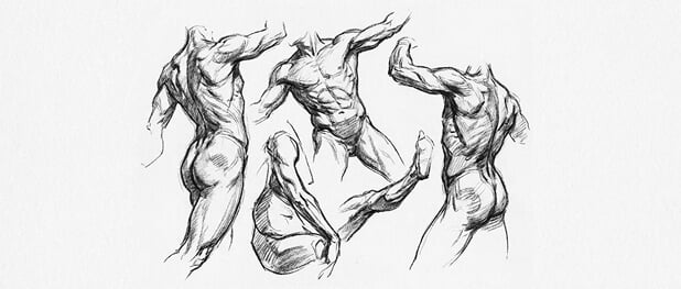
- The Skeleton: The Hidden Structure Behind the Drawing
- Shoulders vs Hips: The Core Proportional Contrast
- Ribcage and Pelvis: How the Torso Is Built
- Muscle Distribution (What Actually Changes Visually)
- Fat Distribution → Flow of Lines (Very Important)
- Waist-to-Hip Relationship (Silhouette Design)
- Legs vs Torso Length
- Center of Gravity (Critical for Gesture Drawing)
- Joint Mobility and Pose Design
- Common Drawing Mistakes (And How to Fix Them)
- Visual Reference Suggestions (For This Article)
- Final Thoughts for Artists
Introduction: This Is Not a Biology Lesson
If you’re an artist, you don’t need medical terminology to draw convincing human body drawing base.
What you do need is a clear understanding of proportions, balance, and visual rhythm.

Male and female bodies are built from the same basic parts — the difference lies in how those parts are proportioned, connected, and simplified into shapes. These proportional differences affect:
- Gesture and line of action
- Silhouette readability
- Weight distribution and balance
- Whether a figure feels stiff, soft, powerful, or elegant
This guide explains male vs female body proportions in a way artists actually use — through head units, shape language, and drawing logic. Every section includes a “For Artists” block with direct, practical advice you can apply immediately.

Body Proportions in Head Units (The Artist’s Measuring System)

Before we talk about shoulders, hips, or muscles, we need a shared measuring tool.


In academic figure drawing, proportions are measured in head units, not centimeters.
Standard Academic Proportions
- Male figure: ~ 8 heads tall
- Female figure: ~ 7.5 heads tall
This half-head difference might seem small, but visually it changes the entire impression of the figure.
Shoulder width is also measured in heads:
- Male shoulders: ~ 2.0–2.3 head widths
- Female shoulders: ~ 1.5–1.8 head widths
For Artists
- If your male figure looks soft or adolescent, check if the body is closer to 7–7.5 heads.
- If your female figure looks bulky or masculine, the shoulders are often too wide relative to the head.
- Always block in the head first, then build the body outward using head units as your ruler.

The Skeleton: The Hidden Structure Behind the Drawing
You don’t need to draw skeletons every day — but you do need to understand what they imply.

The skeleton determines:
- Width vs height
- Where curves appear
- How weight is supported
Key Skeletal Differences (Simplified)


- Male skeleton
- Broader shoulders
- Narrower pelvis
- Larger ribcage
- Female skeleton
- Narrower shoulders
- Wider pelvis
- Slightly shorter ribcage
These differences affect the overall shape language of the figure.

For Artists
- Think of the male torso as a tapered box (wide top → narrow bottom).
- Think of the female torso as a soft hourglass or two offset ovals.
- Don’t copy details — simplify the skeleton into basic volumes before adding anatomy.
Shoulders vs Hips: The Core Proportional Contrast

This is one of the most important visual differences.
Average Proportional Relationship
- Male: Shoulders wider than hips
- Female: Hips wider than shoulders (or roughly equal)
This contrast alone can define gender readability even in a stick figure.

For Artists
- When blocking a male figure, exaggerate the shoulder width early.
- When blocking a female figure, establish the hip width first.
- If a pose feels unclear, check this relationship — it’s often the problem.
Ribcage and Pelvis: How the Torso Is Built


The torso isn’t one shape — it’s two masses:
- Ribcage
- Pelvis
Structural Differences
- Male
- Larger ribcage
- Ribcage and pelvis align more vertically
- Female
- Smaller ribcage
- Ribcage often tilts relative to the pelvis
This tilt creates natural curves and rhythm.
For Artists
- Draw the ribcage and pelvis as separate forms.
- In female figures, allow more twist and offset between them.
- In male figures, keep them more stacked and aligned for solidity.
Muscle Distribution (What Actually Changes Visually)


Muscle isn’t just about size — it’s about where mass appears.

General Pattern
- Male bodies
- More mass in chest, shoulders, arms
- Female bodies
- More mass in hips, thighs, glutes

For Artists
- Male figures read stronger when upper-body forms are emphasized.
- Female figures read more natural when lower-body volume is respected.
- Avoid copying bodybuilding anatomy — think in simple mass placement.
Fat Distribution → Flow of Lines (Very Important)
Forget the medical terms.
For artists, fat distribution matters because it affects line quality.


Visual Difference
- Male bodies
- Straighter lines
- Sharper transitions
- Boxier shapes
- Female bodies
- Softer transitions
- Continuous curves
- S-shaped flow
For Artists
- Use straight lines and angles when blocking male figures.
- Use curved, flowing lines when sketching female figures.
- If your female drawing feels stiff, you’re likely overusing straight lines.
- If your male drawing feels soft, you’re likely overusing curves.
This alone can dramatically improve your sketches.
Waist-to-Hip Relationship (Silhouette Design)

This ratio defines silhouette clarity.
- Male silhouette: more rectangular or inverted trapezoid
- Female silhouette: clearer waist indentation
For Artists
- Step back and check the silhouette only.
- A good silhouette should read clearly without internal details.
- Strong characters often rely on exaggerated but believable ratios.
Legs vs Torso Length


This difference is subtle but powerful.
- Male figures
- Slightly longer legs relative to torso
- Female figures
- Slightly longer torso relative to legs
For Artists
- Longer legs enhance a heroic or dynamic male look.
- A slightly longer torso gives female figures a grounded, elegant feel.
- Use this intentionally in character design, not randomly.

Center of Gravity (Critical for Gesture Drawing)


This is one of the most important concepts for artists.
Structural Difference
- Male center of gravity: higher (closer to chest)
- Female center of gravity: lower (closer to hips)

For Artists
This directly affects your Line of Action.
- Male poses often feel top-heavy, driven by shoulders and chest.
- Female poses feel grounded, with motion flowing through hips and legs.

When drawing gestures:
- Drop the balance point lower for female figures.
- Let male poses initiate movement from the upper torso.
If a pose feels unstable, the center of gravity is usually wrong.
Joint Mobility and Pose Design
Female bodies generally allow more visible flexibility, especially in the hips and spine.

For Artists
- Female poses can comfortably use deeper curves and twists.
- Male poses often look better with controlled, powerful motion.
- This is not a rule — it’s a tendency you can use or break intentionally.
Common Drawing Mistakes (And How to Fix Them)

Mistake 1: Same body, different chest
👉 Fix: Rebuild proportions from the skeleton and head units.
Mistake 2: Over-detailing anatomy
👉 Fix: Simplify into boxes, cylinders, and curves first.
Mistake 3: Ignoring silhouette
👉 Fix: Check readability in solid black.
Visual Reference Suggestions (For This Article)


Best visuals to include:
- Male vs female figure at the same height
- Head-unit proportion overlays
- Boxy vs curvy torso simplification
- Line of action comparison


Final Thoughts for Artists
Male vs female body proportions are not about stereotypes — they’re about visual logic.
Once you understand:
- Head units
- Shape language
- Balance and center of gravity
You can stylize, exaggerate, or break the rules on purpose.
That’s when anatomy stops being restrictive — and starts being a tool.
- 1.4Kshares
- Facebook0
- Pinterest1.4K
- Twitter0
- Reddit0


