Overview of vector art
Designers often wonder how to create vector art that looks professional and stays crisp at any size. A vector illustration is built using mathematical paths rather than pixels to ensure resolution independence and endless scalability ( Penji ). This is why vector graphics are ideal for logos, icons, and detailed illustrations that require flexibility in different formats.
Differences from raster images
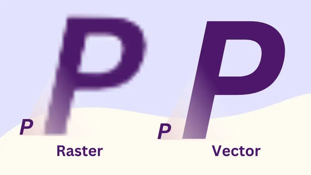
Vector art differs from traditional raster images, which rely on pixel grids. Raster graphics often become blurry when enlarged, but vector files can be resized freely without losing clarity or adaptability ( Penji ). This advantage makes them essential for branding, large-scale prints, and digital interfaces.
Choose the right software
Selecting suitable vector graphics software is the cornerstone of effective design work. Programs like Adobe Illustrator, CorelDRAW, and Inkscape each offer a range of tools to fit different needs ( CorelDRAW ).
Free vs. paid options
- Beginners can explore free or open-source platforms like Inkscape or Canva, which typically present a gentler learning curve.
- Advanced users often invest in software such as Adobe Illustrator or CorelDRAW for robust features like advanced layering, bezier curve tools, and color management.
Master the pen tool
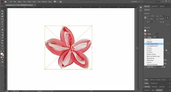
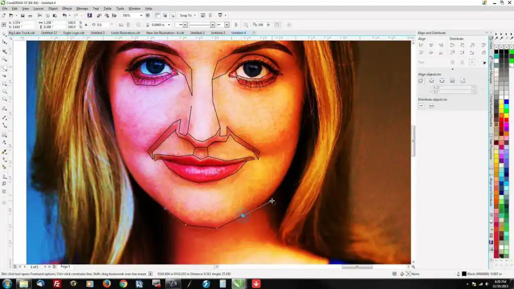
The pen tool is central to achieving precise lines and shapes in vector art. It allows designers to place anchor points and direct curves for a smooth finish ( Big Red Illustration ).
- Start with basic shapes.
- Add anchor points sparingly, keeping lines smooth and easy to edit.
- Practice adjusting curves and angles to refine shapes until they appear natural.
Organize your layers
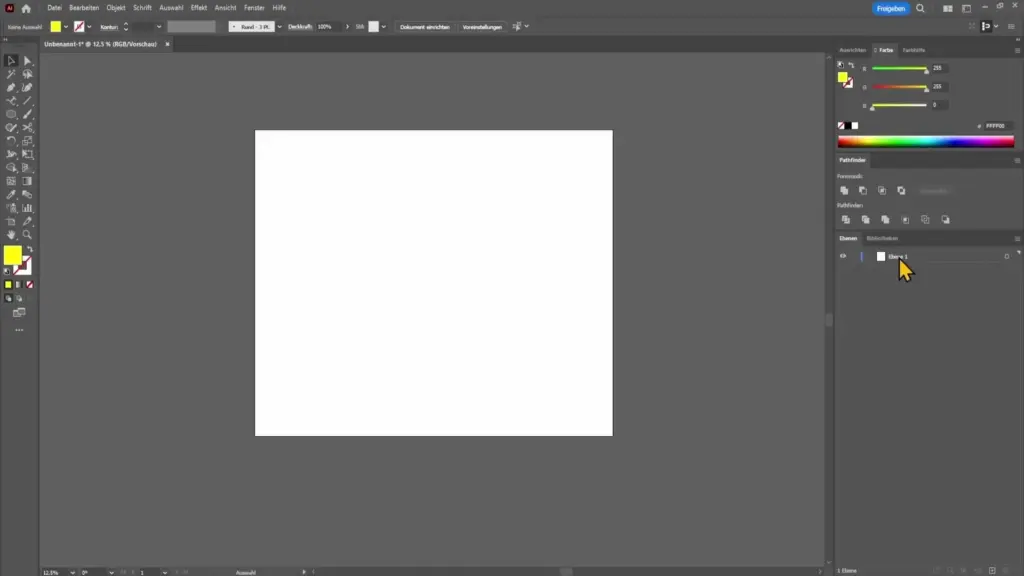
Complex illustrations benefit from a structured approach. Layers and grouping can keep complicated designs manageable ( Big Red Illustration ). Giving each layer a clear title helps track individual components and simplifies future edits.
- Group related elements, such as text or icons.
- Use descriptive layer names for quick navigation.
- Collapse unneeded layers to cut down on clutter.
Apply color and gradients
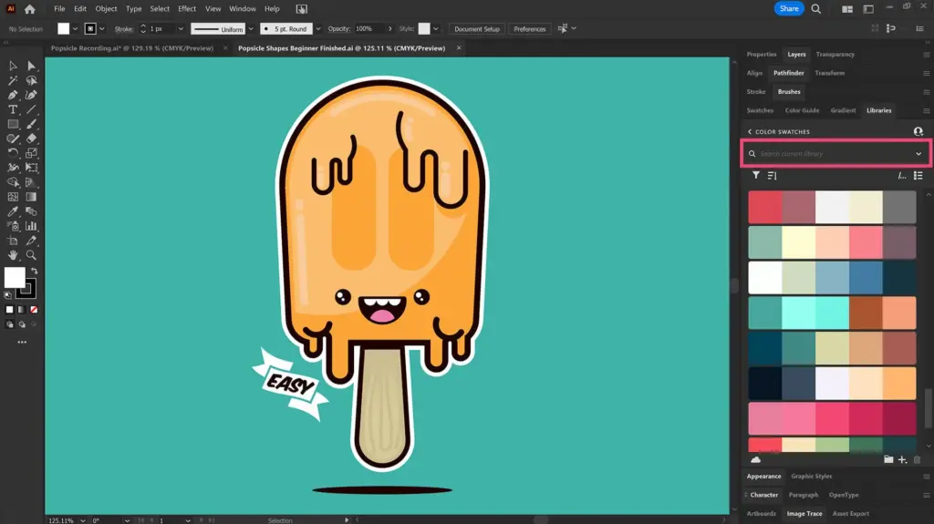
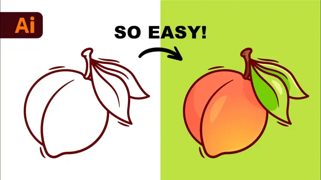
Once the outline is set, color choices can add depth and vibrancy to vector pieces. Designers often use color harmony tools and gradient meshes to elevate visual appeal ( Big Red Illustration ).
- Keep color modes in mind. RGB suits digital displays, while CMYK is preferred for professional printing ( DigitEMB ).
- Build up layers of shading. Even simple gradient transitions can give dimension to flat artworks.
Export in proper formats
Selecting the right file format ensures crisp results. Common extensions include AI, SVG, and EPS, each preserving scalability and editability ( Penji ). It is also vital to convert custom fonts into vector outlines to prevent text substitution issues ( DigitEMB ).
- Finalize all edits.
- Expand any fonts or strokes.
- Save a copy in an editable format for future tweaks and another copy for client delivery or printing.
| Platform | Pricing Model | Best For | Skill Level |
|---|---|---|---|
| Adobe Illustrator | Subscription required (Adobe Creative Cloud) | Professional vector illustration, branding, typography, print & digital design | Advanced |
| CorelDRAW | Paid (Subscription or one-time license option) | Professional graphic design, signage, print, and illustration | Intermediate–Advanced |
| Inkscape | Free & open-source | Vector illustration, SVG creation, logo design on a budget | Beginner–Intermediate |
| Krita | Free & open-source | Digital painting and illustration (limited vector tools) | Beginner–Intermediate |
| Canva | Free version available / Pro subscription optional | Quick designs, social media graphics, simple vector-style layouts | Beginner |
Frequently asked questions
What is the ideal resolution for vector art?
Vector files themselves are resolution independent, but setting the artboard to 300 dpi is useful when preparing for print to ensure clarity ( DigitEMB ).How can overly complex shapes be simplified?
Reducing or removing unnecessary anchor points streamlines shapes, making them easier to edit and reducing file size ( A1Digitizing ).Why convert text to outlines?
Converting text to vector shapes preserves custom fonts. If the file is opened without the original fonts installed, the text remains visually consistent ( DigitEMB ).Which color modes should be used?
RGB is recommended for digital displays, and CMYK is recommended for print projects to avoid color mismatches ( DigitEMB ).Are free vector graphic programs adequate for professionals?
Free tools like Inkscape or Krita serve well as introductions and can handle many professional tasks. However, paid platforms may offer superior control over advanced features ( CorelDRAW ).
- 1share
- Facebook0
- Pinterest1
- Twitter0
- Reddit0

