Are you looking to step up your creative game and inject more clarity into your compositions? Then you’ve come to the right place. When it comes to design principles in graphic design, the power is in how you combine them. Mastering these fundamentals helps your projects stand out while guiding your audience through your message. Below is a curated roundup of the 12 core principles you’ll love to explore, drawn from some of the top authorities in visual design (like Toptal and the Figma Resource Library). Let’s see how they work, why they matter, and how you can apply them starting today.


Use Contrast To Stand Out
Contrast is the simple act of placing visually different elements side by side so specific details pop. You might rely on color opposites, size disparity, or distinct shapes. According to research, contrast is crucial for readability and accessibility, especially for text on colored backgrounds (Toptal).
- Why It Works
Bigger vs. smaller, bold vs. light, dark vs. bright. When your design features a clear contrast, eyes land directly on the important parts. This also protects your layout from looking flat or monotonous. - How To Apply
Experiment with bold fonts for headlines and lighter ones for paragraphs. Try black text against a white background to make each word shine. For color, pair complementary hues like blue and orange, or red and green, but stay mindful of potential accessibility challenges.


Keep Balance In Check
Balance refers to the distribution of visual weight in your design. Whether you lean on symmetrical or asymmetrical placement, the goal is to avoid overwhelming one side of the page. Studies from AND Academy show that a balanced design quickly communicates stability and order (AND Academy).
- Why It Works
Think of it like walking a tightrope. If one side of your composition is too heavy, your viewer’s eye will get stuck there. Meanwhile, deliberate off-center layouts (asymmetrical balance) can look fresh and modern. - How To Apply
Split your design into halves (using a grid) and see if each side feels equally weighted. If you prefer asymmetry, balance a large focal point on one side with smaller, lighter elements on the other.
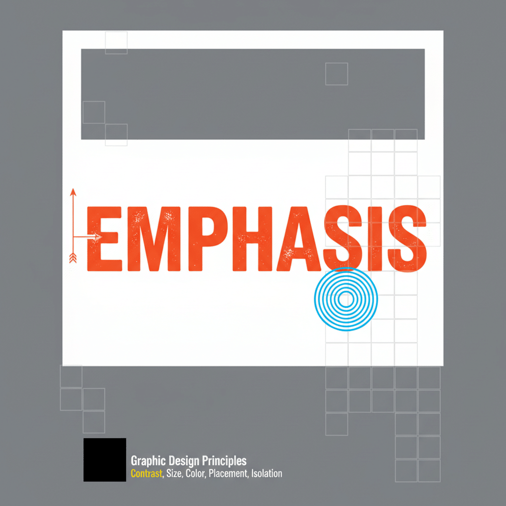
Add Emphasis For Impact
Emphasis is about making a specific element the star of your design. Typically, this is a headline, logo, or key image. You can emphasize something through color, framing, scale, or contrast.
- Why It Works
People want to know where to look first. By emphasizing a main feature, you direct attention right where you want it. This clarifies your message and reduces confusion. - How To Apply
Use bold or italic fonts on your main statement and keep the rest of the text simpler. Frame it with a shape or add a pop of color to highlight it. Just be sure not to overuse emphasis on too many items, or you’ll dilute its effect.

Size Elements With Proportion
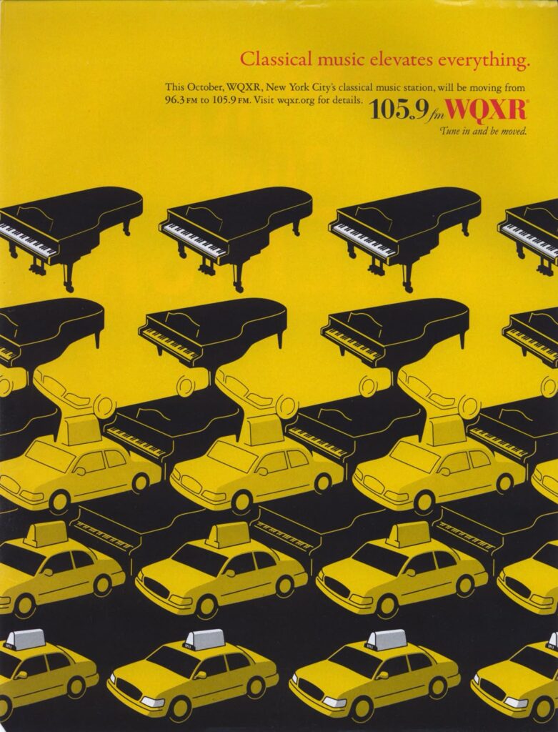
Proportion focuses on how elements relate in size compared to each other. It’s especially relevant when you create bigger visuals next to smaller ones, or in how you space text around images.
- Why It Works
Proper proportion feels intuitive because it reflects real-world scales. When something looks out of whack proportionally, the viewer’s brain notices immediately. - How To Apply
Keep your focus on ratios. For instance, if you have a large product image, pair it with smaller icons or text blocks for a sense of hierarchy. Adjust spacing around elements so nothing feels cramped.
Show Hierarchy For Clarity
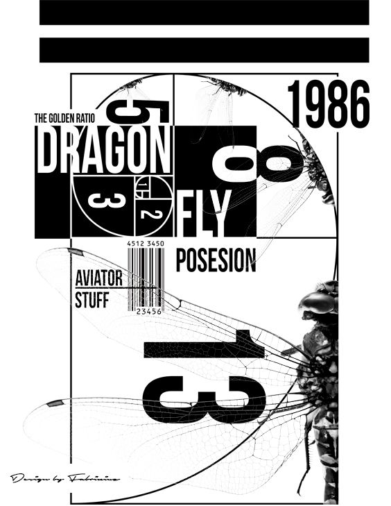
Visual hierarchy is about organizing your design so viewers easily see what’s most important first. Fonts, colors, sizes, and placements all come together to create a roadmap for the eye. Research from the Interaction Design Foundation emphasizes that visual hierarchy improves comprehension and trust (Interaction Design Foundation).
- Why It Works
Our eyes naturally follow cues like headings, bullet points, or bright colors. When your layout guides viewers methodically from a main heading to secondary text, your message sticks. - How To Apply
Try a bold, large headline at the top. Follow it with a medium-sized subheading, then use smaller text for body copy. You can also use color belts or boxes to highlight key info, like a button or main CTA.
Repeat Elements For Consistency
Repetition is a unifying tool, offering patterns in color, typography, and shapes to reinforce your brand personality. Big names like Coca-Cola or Apple keep a uniform style for instant recognition (BairesDev).
- Why It Works
Repetition ties your design elements together. When your audience sees consistent colors or typefaces, they immediately pick up the brand cues and sense reliability. - How To Apply
Use the same font family for all headlines, repeat a specific accent color across multiple sections, or rely on a pattern as a background. This not only looks polished but also builds brand identity.
Establish Rhythm And Flow
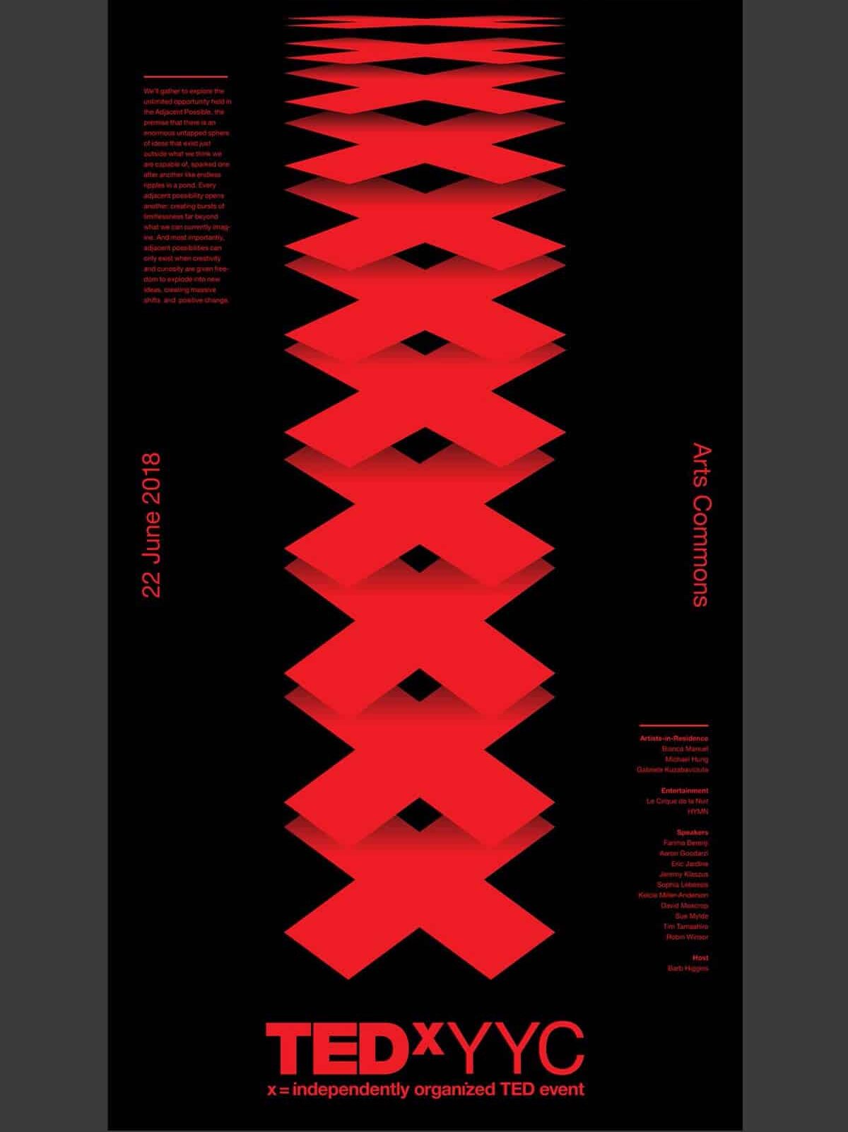
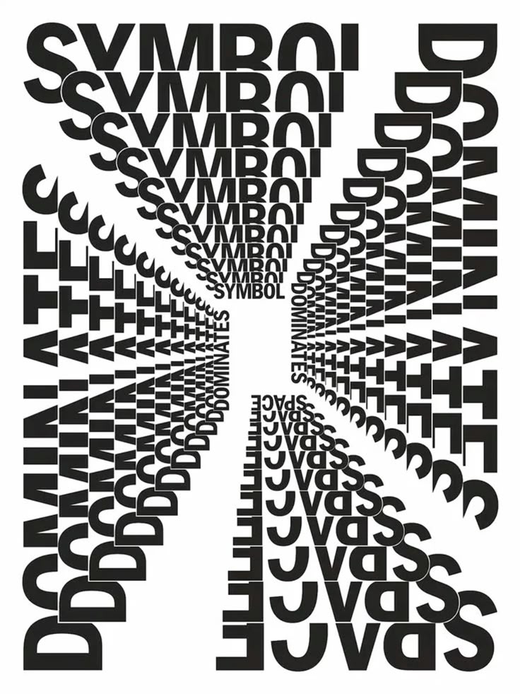
Rhythm in design isn’t just about music. It’s about the pattern of how elements repeat or alternate across your layout, creating movement for the eye to follow.
- Why It Works
Rhythm prevents stagnation. Straight lines of text broken up by recurring shapes or color elements can lead the viewer from top to bottom without feeling lost. - How To Apply
Divide your design into a grid and place elements at regular intervals. Alternate colors, shapes, or imaging sections so the eye moves in a predictable and pleasing pattern.
Include Patterns For Structure
Patterns take repetition to the next level by creating a sense of structure. They can be small icons repeated in a background or a consistent style of image frames throughout the design.
- Why It Works
By giving your design a visual structure, patterns can make layouts feel purposeful and aligned. They also allow viewers to predict where they might find specific information or features. - How To Apply
Test out a dotted or striped pattern behind text blocks. Keep the pattern subtle so it doesn’t fight with your main content, but let it tie the design together.

Use White Space Wisely
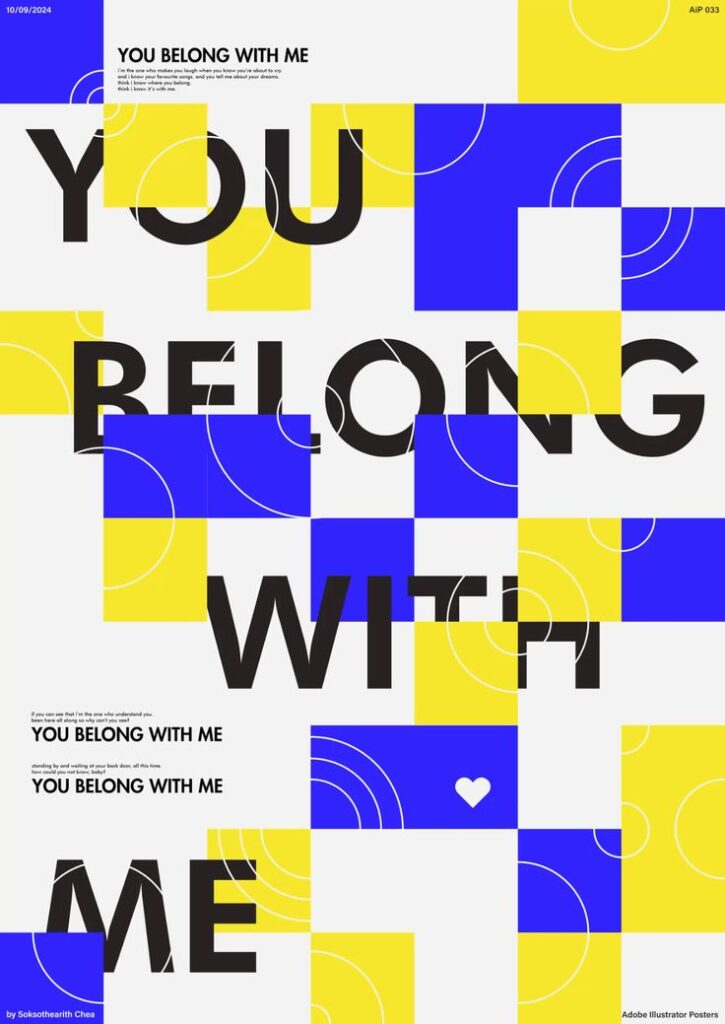
White space (or negative space) is the blank area around and between your objects. People sometimes think empty space looks like a missed opportunity, but it’s actually among the most powerful design techniques out there. According to the Figma Resource Library, white space makes content more readable and approachable (Figma Resource Library).
- Why It Works
White space highlights important content by giving it room to breathe. Our eyes can better capture information when not stressed by clutter. - How To Apply
Resist the urge to fill every square inch. Instead, set generous margins, increase line spacing, and add spacing around images. Let your design breathe so viewers can focus on the essentials.
Create Movement For Engagement
Movement is about guiding the path your viewers follow, sometimes leading them in a zigzag or swirl of shapes, lines, or transitions. In digital design, movement can also be animations and parallax effects for added flair (BairesDev).
- Why It Works
Movement injects life into an otherwise static layout. If you place an arrow or diagonal line, you prompt the viewer to travel in that direction, discovering the next part of your story. - How To Apply
Align images or shapes diagonally or across columns so the eye moves from left to right and top to bottom. If you’re designing online, add subtle hover animations or transitions that direct user attention.

Add Variety To Avoid Monotony
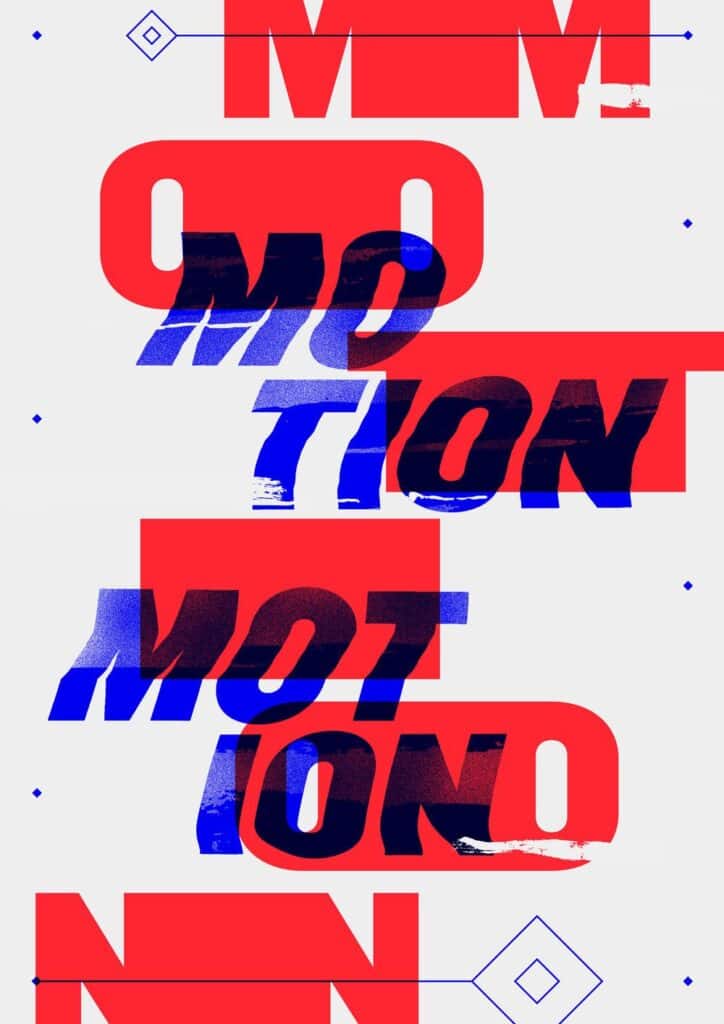
Variety is the spice that stops your designs from blending into the background. Visual interest comes from mixing different but harmonious elements like contrasting color palettes, font styles, or shapes.
- Why It Works
Users get bored when every element looks identical. Variety introduces a touch of surprise that can spark curiosity. - How To Apply
If you’re used to a single layout, swap one or two elements in your next design. Mix a sans-serif headline with a serif body text. Add geometric shapes alongside organic lines. Keep it moderate so you don’t lose cohesion.
Unite Designs For Cohesion
Finally, unity sums up how all these principles work as one. It’s the sense that your composition is complete, that every element has a purpose and belongs in the bigger picture. When everything pulls together, your design looks professional, and your message is crystal clear.
- Why It Works
A big part of unity is consistency. From the color scheme to the typography style, each piece of the puzzle fits together for an overall sense of harmony. This fosters trust and keeps your design from feeling random. - How To Apply
Check that your color palette is consistent. If you use an accent color in the top banner, repeat it in the footer. Make sure you’re using spacing the same way across headings and paragraphs. If you want more tips on applying these ideas, take a peek at our principles of design guide.

Why These Principles Matter
When you know your design fundamentals, it’s easier to plan every poster, product mockup, or website layout so you’re not just guessing. If you’re branching out beyond graphic design into environmental or digital spaces, check out how principles of design in interior design also revolve around balance, proportion, and unity. You can even go deeper with our basic principles of design if you’re craving more insight.
Together, these principles keep your audience engaged, simplify your workflows, and eliminate second-guessing. They’re like the unwritten rules of good taste. Apply them well, and you’ll guide your viewers exactly where you want them to look.
Frequently Asked Questions
Which Design Principle Should I Master First?
It’s best to start with contrast if you’re a newbie, because it’s the fastest way to make your design pop. When in doubt, try a bolder color or size differences for clarity.Does White Space Mean I Must Use White Backgrounds?
Not necessarily. White space means any empty space, regardless of color. It could be a solid color, gradient, or simple pattern. The key is that it’s free of additional elements.How Many Principles Can I Mix In One Project?
You’ll almost always have all principles at play to some extent. Still, focus on two or three that best serve your design’s goal. Balance, contrast, and hierarchy often work hand in hand.Is Symmetrical Balance Always Better Than Asymmetrical?
Not at all. Symmetrical designs feel steady and classic. Asymmetrical ones can look dynamic or modern. It depends on the vibe you’re aiming for and your brand identity.How Do I Integrate These Principles Across Different Channels?
Because the principles are universal, you can apply them to websites, social media graphics, and print materials. Keep a consistent approach to palette, typography, and alignment for a cohesive brand presence across all platforms.
Give these principles a go in your next creative project, and watch how they transform your designs. If you want to sink your teeth into broader visual elements, our principles of visual design resource is also a great place to explore. The more you practice, the sharper your sense of design becomes. Happy creating!
- 141shares
- Facebook0
- Pinterest141
- Twitter0
- Reddit0

