At the dawn of any creative masterpiece, the principles of visual design often tiptoe in, quietly unifying colors, shapes, and negative space into a harmonious whole. These guiding concepts—like faithful companions—stand behind every compelling layout, transforming scattered pieces of imagery and text into purposeful expressions. For designers and students alike, mastering these principles can be the difference between a hesitant first sketch and a polished, resonant final design.
1. Repetition
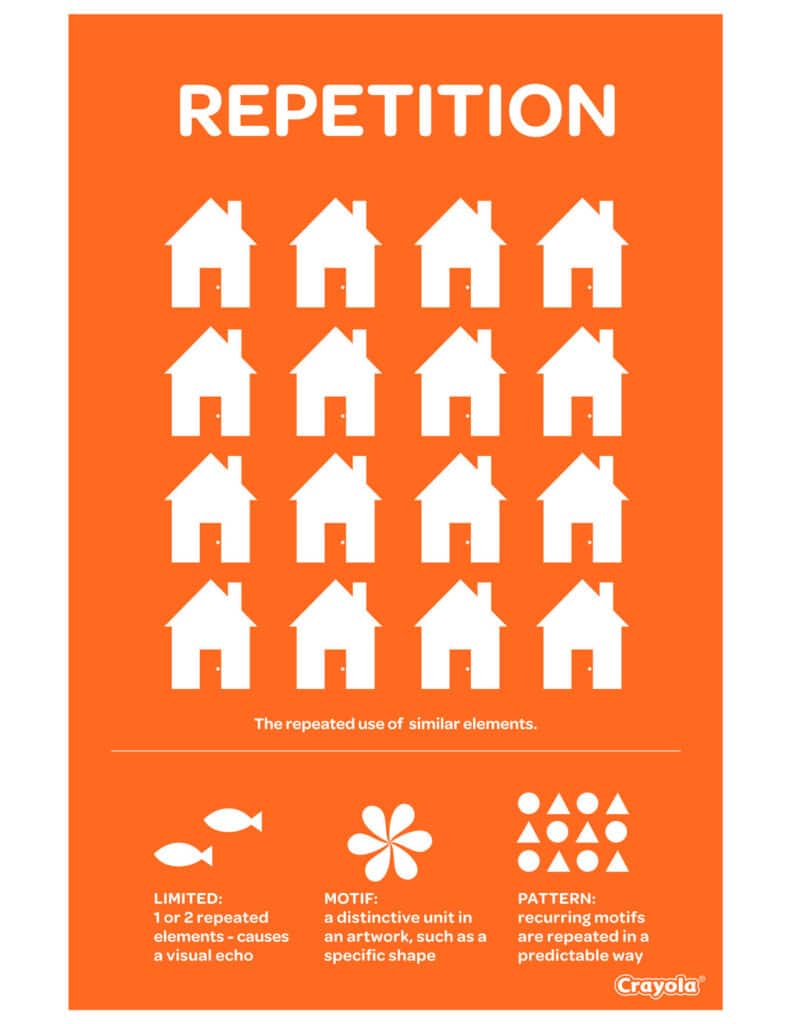
Repetition is the steady drumbeat that sustains visual consistency. By reusing colors, fonts, shapes, or layouts, designers create a sense of unity that draws viewers in. Ramotion explains how consistent repetition—whether it is a brand’s signature color palette or a recurring icon—fortifies audience recognition. This is evident in clear visual identities like Dropbox’s distinct blue-and-white blocks. Those repeated patterns not only stay memorable but also evoke trust.
For more insights on how repetition ties back to basic design strategies, visit basic principles of design.

2. Contrast
Contrast is the vibrant splash that commands attention. It creates visual hierarchy by using differences in color, size, or shape. Consider bold text against a softly tinted background—viewers know instantly where to look. Keboto illustrates how contrast boosts readability and accentuates important information, whether it is a CTA button or an urgent alert box. For designers, harnessing an artful mix of contrasts can quickly direct the eye to the crux of a message.


3. Balance
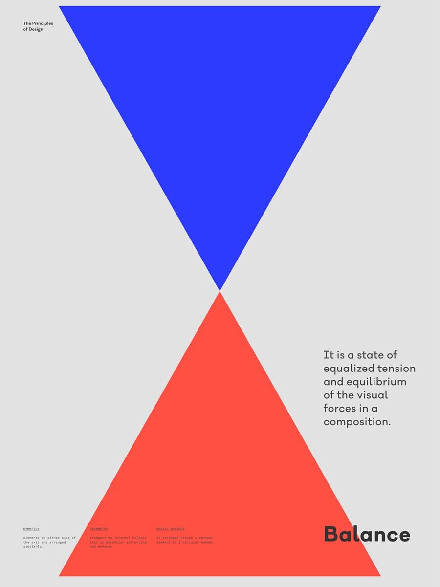
Balance provides the steady framework that settles a design into a place of calm. Whether employing symmetrical arrangements or opting for asymmetry to create a more dynamic feel, balanced designs reassure viewers that nothing is off-kilter or overwhelming. According to both Keboto and Nielsen Norman Group, balance distributes visual weight so no single element tips the composition too far. When users feel at ease in a design, they linger longer, exploring and engaging more naturally.
To see how balance applies to other realms, check out principles of design in interior design.

4. White Space
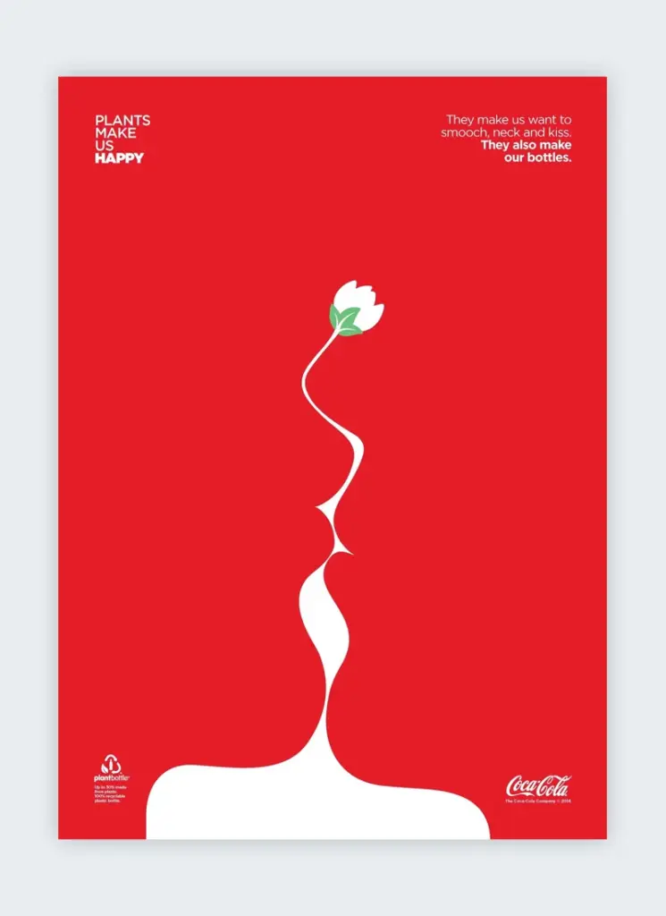
White space (also called negative space) is the hush that lets vital elements sing. Flux Academy notes that ample spacing around text, images, or calls to action gives each component its moment in the spotlight. This breathing room boosts legibility and guides the viewer’s journey without feeling cluttered. Whether it is a minimalist landing page with vast margins or micro spacing between lines of text, well-executed white space lends sophistication and clarity.

5. Hierarchy
Hierarchy orchestrates a visual chain of command, ensuring viewers know where to begin and what to focus on next. Designers often achieve this by varying element size, allocating prime screen real estate to crucial calls to action, and using bolder or contrasting colors for headings. Nielsen Norman Group emphasizes that a clear hierarchy leads the eye methodically through content. Headlines, subheaders, and body text each have distinct roles, keeping important details front and center.
For a deeper look at how hierarchy and other fundamentals shape layouts, explore principles of design.

6. Alignment
Alignment is the thread that stitches floating elements into a cohesive tapestry. 254-Online points out that lining up text, images, and icons along common edges creates a clear visual structure. Subtle details, from centered headlines to neatly aligned margins, exude a sense of confidence and professionalism. In other words, alignment tidies up a page, anchoring each piece to a shared rhythm.
If you are curious about how these alignments can shape entire design traditions, see design principles in graphic design.

7. Gestalt
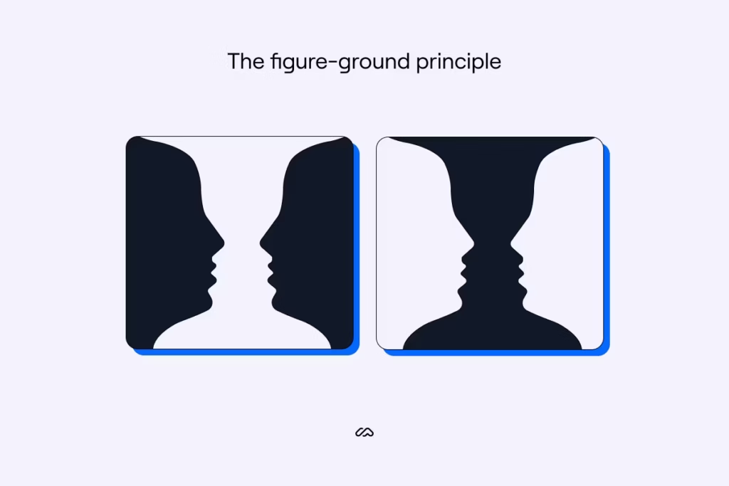
Gestalt principles demonstrate how viewers perceive unified shapes rather than disconnected parts. This concept, brought to life by early 20th-century psychologists and spotlighted by Nielsen Norman Group, shows that humans quickly make sense of patterns. Proximity, similarity, and figure-ground relationships all guide how people interpret clusters of elements. By grouping similar items or using whitespace to separate distinct sections, designers communicate purpose and organization without needing extra text or explanation.
FAQs
Why Are The Principles Of Visual Design Important?
They provide a roadmap for structuring and refining creative work. By applying these guidelines, designers ensure each element contributes to an overall sense of clarity, unity, and appeal.How Do Repetition And Contrast Complement Each Other In Design?
Repetition creates unity and reinforces brand identity, while contrast spotlights differences to capture attention. Together, they form dynamic designs that feel cohesive yet compelling.What Role Does Balance Play In User Experience?
Balance steadies the viewer’s eye, preventing any single area from dominating the page. A well-balanced layout feels approachable and encourages individuals to explore more thoroughly.Why Is White Space Sometimes Called Negative Space?
The term captures the emptiness around or between design elements. It might appear empty, but that space helps key components breathe, stand out, and remain inviting for the audience.How Can Designers Practice Applying These Principles Effectively?
They can start with smaller projects, experimenting with consistent spacing, color usage, or repetition. Frequent testing, peer reviews, and real-world feedback are excellent ways to refine and improve over time.
Whether a designer is sketching a new app layout or orchestrating a brand identity overhaul, the principles of visual design guide the process, ensuring each project resonates with purpose and clarity. By blending repetition, contrast, balance, white space, hierarchy, alignment, and Gestalt ideas, creative professionals craft experiences that engage the eye and linger in the mind.
- 30shares
- Facebook0
- Pinterest30
- Twitter0
- Reddit0


