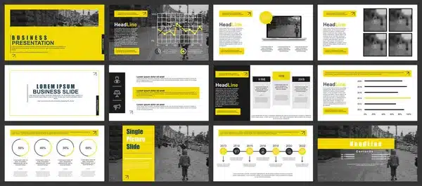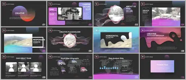
If your deck feels safe, it’s already forgettable.
The truth? Most pitch decks look like they were built by AI on autopilot. Generic fonts, templated insights, weak openings pretending to be bold. And founders wonder why investors pass. It’s not because your numbers suck. It’s because your story does.
So here’s your new metric: if your pitch deck doesn’t make you nervous to send, you’re not swinging hard enough.
Your Slides Are a Weapon. Treat Them Like One.
Forget “nice.” Nice decks don’t raise money. They get polite rejections.
Your deck should hit like a controlled explosion. Slide one should spark curiosity. Slide two should create tension. By slide three, if they’re not leaning in, you’ve already lost them.
Investors don’t flip through your deck hoping to like it. They’re looking for a reason to walk away. That’s why it pays to understand what really happens behind closed doors. According to this First Round Review breakdown, the partner meeting isn’t just a formality. It’s the entire pitch. You don’t get a second shot.
Death to the Data Dump

No one has ever been moved by bullet points.
Founders love cramming decks with every win, stat, and feature they’ve got. It feels productive. It’s not. It’s noise. If you can’t explain the value in 12 slides or less, it’s not the investor’s attention span that’s the problem.
Be brutal. Edit like your funding depends on it. Because it does.
Need a mental reset on what actually belongs in a pitch? This YC guide on how to pitch your company strips it down to the bones.
Design Like You Mean It (Or Don’t Bother)
Your deck isn’t a Canva hobby. It’s your first impression. A messy slide tells a silent story—and not the one you want.
If your layout lacks hierarchy, your narrative feels chaotic. If your colors clash, your vision does too.
Want to know how serious someone is? Look at their design.

The Founder’s Secret Weapon: Outside Eyes

You built the product. You solved the problem. But when it comes to telling the story, founders often don’t see what they’re too close to. That’s where expert consulting earns its keep.
Sometimes, what you need isn’t another slide. You need clarity.
If you’re at that point, consider bringing in professionals who specialize in pitch deck services. No, not to make it pretty. To make it land.
This Isn’t School. No One’s Grading You for Effort.
Investors aren’t evaluating your potential. They’re looking for proof. They want to know you can see the market, read the room, and move fast. A deck that hesitates, rambles, or over-explains tells them all they need to know.
Stop asking, “Is this clear?” Start asking, “Is this unforgettable?”

Final Thought
You’re not pitching a product. You’re pitching a future only you can see.
So burn the template. Break the format. Write the kind of deck that feels like a risk. Then take it.
Because safe decks die quietly. And if your company is going to win, your pitch needs to start louder than the rest.
- 0shares
- Facebook0
- Pinterest0
- Twitter0
- Reddit0


