Ever scrolled through an app or website and felt a subtle pull towards its buttons, almost like they were real, physical objects just waiting to be pressed? If so, you’ve likely encountered Neumorphism. This design trend isn’t just another fleeting fad; it’s a captivating visual style that brings a delightful blend of soft, extruded shapes and subtle lighting to digital interfaces. It emerged as a fresh alternative to the flat, minimalist aesthetic that dominated design for years, offering a refreshing sense of depth and tactility without reverting to the overly ornate skeuomorphism of the past. Think less glossy, realistic buttons of yesteryear, and more a gentle bulge or indentation that feels like it’s carved right out of the background. It’s chic, it’s elegant, and it’s certainly got people talking in the UI/UX world.
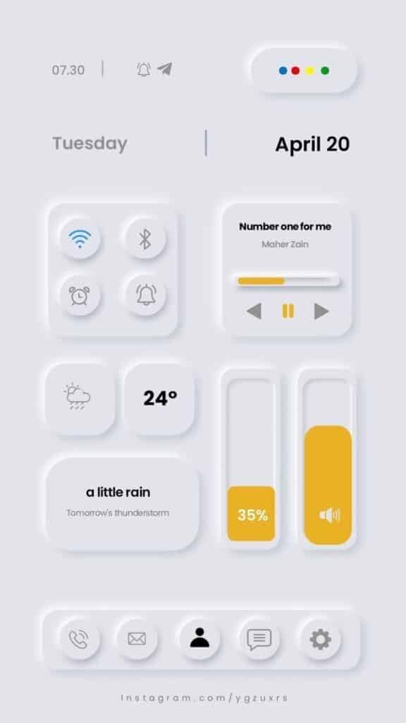
What Exactly is Neumorphism? A Deep Dive into its Core Principles
At its heart, Neumorphism is a portmanteau of “new” and “skeuomorphism.” Skeuomorphism, remember, was all about making digital elements look exactly like their real-world counterparts – think calendar apps that looked like desk calendars or note apps with torn paper edges. While charming for a while, it eventually felt clunky and outdated. Flat design, which followed, stripped everything back, prioritizing clarity and simplicity, often sacrificing any sense of depth or materiality. Neumorphism attempts to bridge this gap, taking the best bits of both worlds.
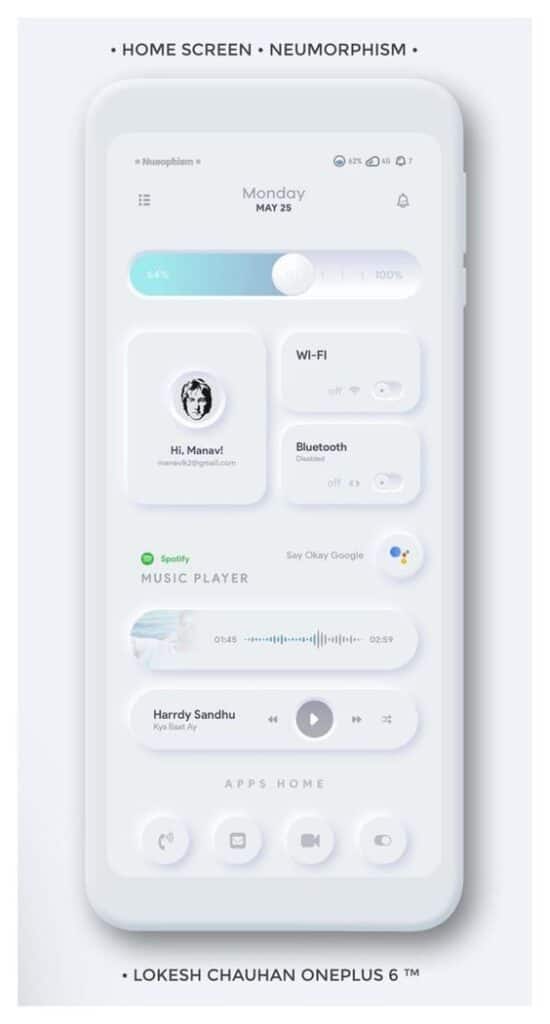
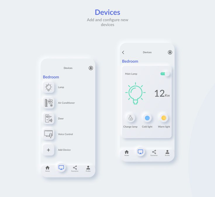
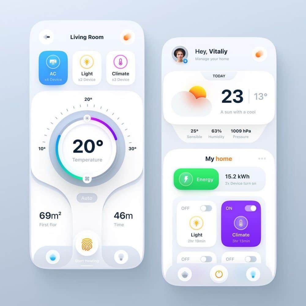
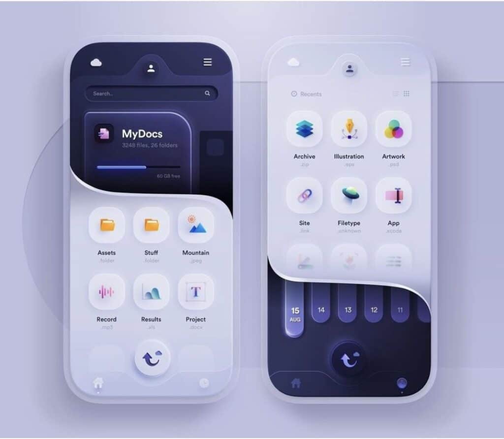
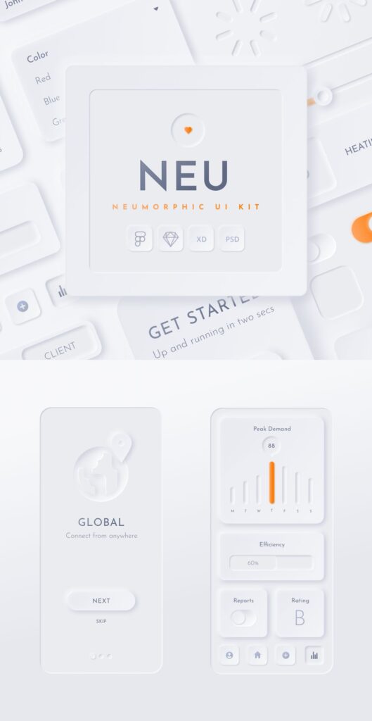
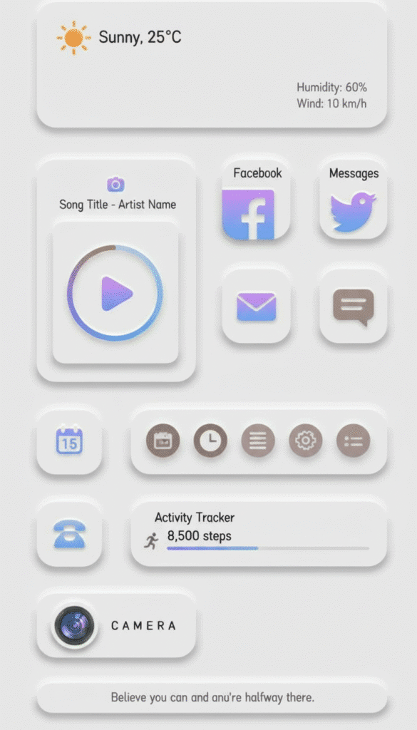
It essentially creates a soft, extruded plastic-like effect. Imagine you’re looking at a single, seamless surface. Neumorphic elements appear to either subtly push out from that surface or gently recede into it. This illusion isn’t achieved with gradients and shadows in the traditional sense, but rather with a clever combination of two shadows: a light one and a dark one. These shadows, strategically placed, trick the eye into perceiving depth and form, making buttons feel “pressable” and cards feel “lifted.”
The key differentiator from old skeuomorphism is its monochromatic nature and understated elegance. It doesn’t try to mimic wood grain or leather textures. Instead, it works within the existing color palette of the background, using variations of that color for its highlights and shadows. This creates a cohesive, sophisticated look that feels less like a digital imitation of a physical object and more like a sculpted digital form. It’s about visual softness and a subtle suggestion of interaction, making the interface feel more tangible and, dare we say, a bit more human.
The Anatomy of a Neumorphic Element: Shadows, Colors, and More
Understanding how Neumorphism works boils down to mastering a few core visual ingredients. It’s less about a single magical effect and more about the delicate interplay of these components.
The Power of Two Shadows
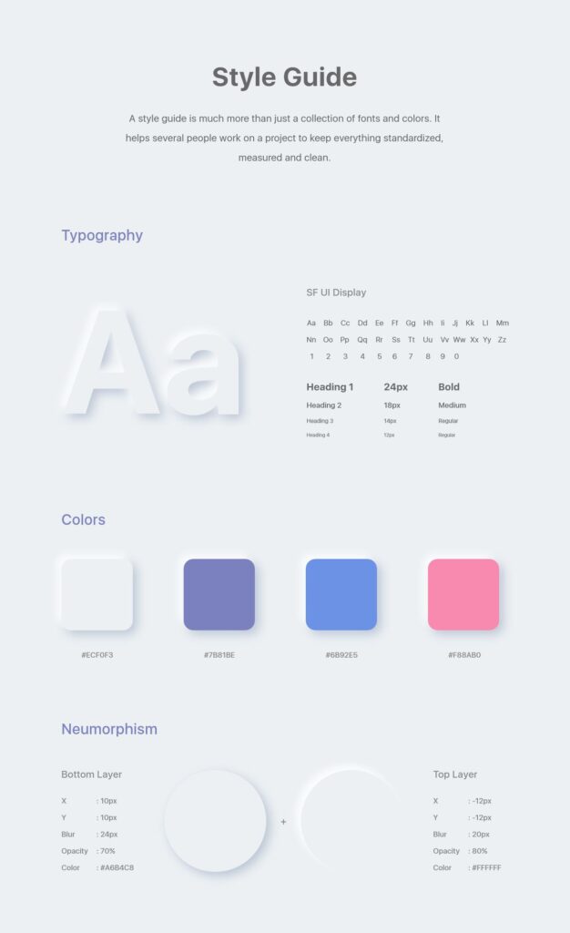
This is arguably the secret sauce of Neumorphism. Instead of a single drop shadow, each neumorphic element utilizes two shadows.
- Light Shadow: Typically a lighter shade of the background color (or white), positioned as if light is hitting the element from the top-left.
- Dark Shadow: Usually a darker shade of the background color (or black with low opacity), positioned as if light is hitting the element from the bottom-right.
The combination of these two shadows, often with subtle blurs and spreads, creates the illusion of depth. For an element that appears to extrude (like a raised button), the light shadow will be on top and left, and the dark shadow on bottom and right. For an element that appears to inset (like a pressed button or an input field), these shadow positions are reversed, giving the impression of a concave shape.
Color Palette Choices
Neumorphism thrives on a specific kind of color scheme:
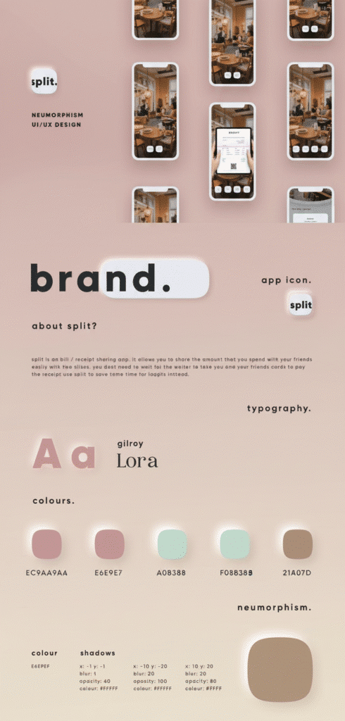
- Monochromatic or Analogous: The most successful neumorphic designs stick to a relatively monochromatic color palette. The background, and the elements on it, are often different shades of the same base color. This allows the shadows to truly shine and create the depth without competing with vibrant color shifts.
- Low Contrast: High contrast colors work against Neumorphism’s subtle nature. The beauty lies in the gentle shifts in tone, so bright, contrasting hues are generally avoided. This is also where some of the accessibility challenges arise, which we’ll discuss later.
- Subtle Gradients: While not always mandatory, a very subtle gradient on the background or within the element itself can enhance the “soft” feel, making it appear less flat before the shadows are even applied.
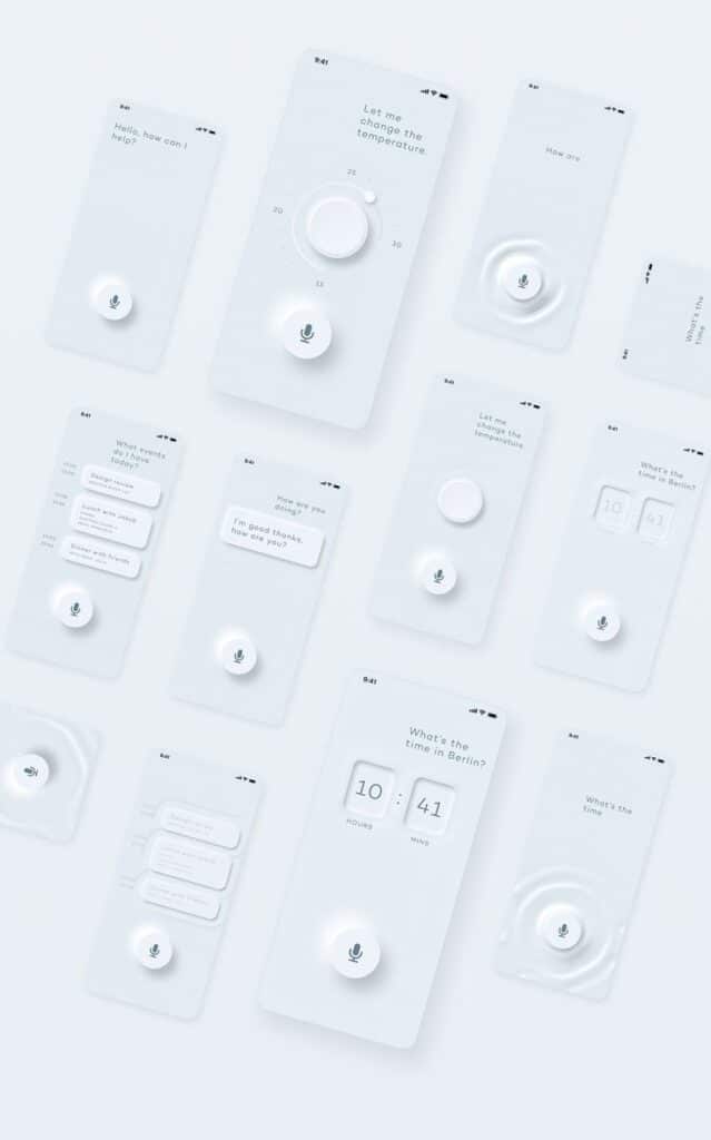
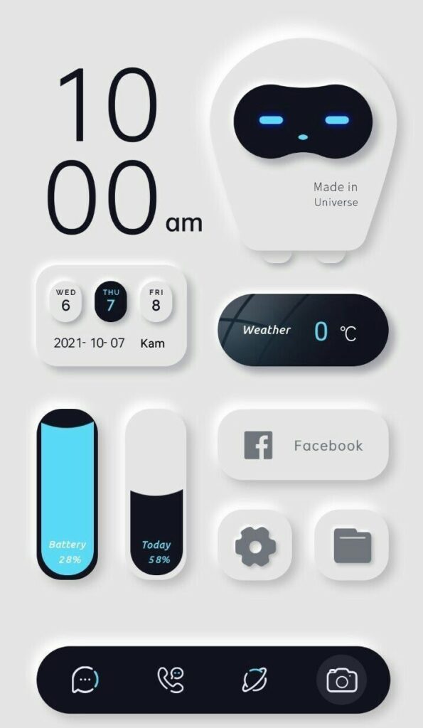
Inner and Outer Extrusion
This refers to whether an element appears to push out from the surface or pull in to it.
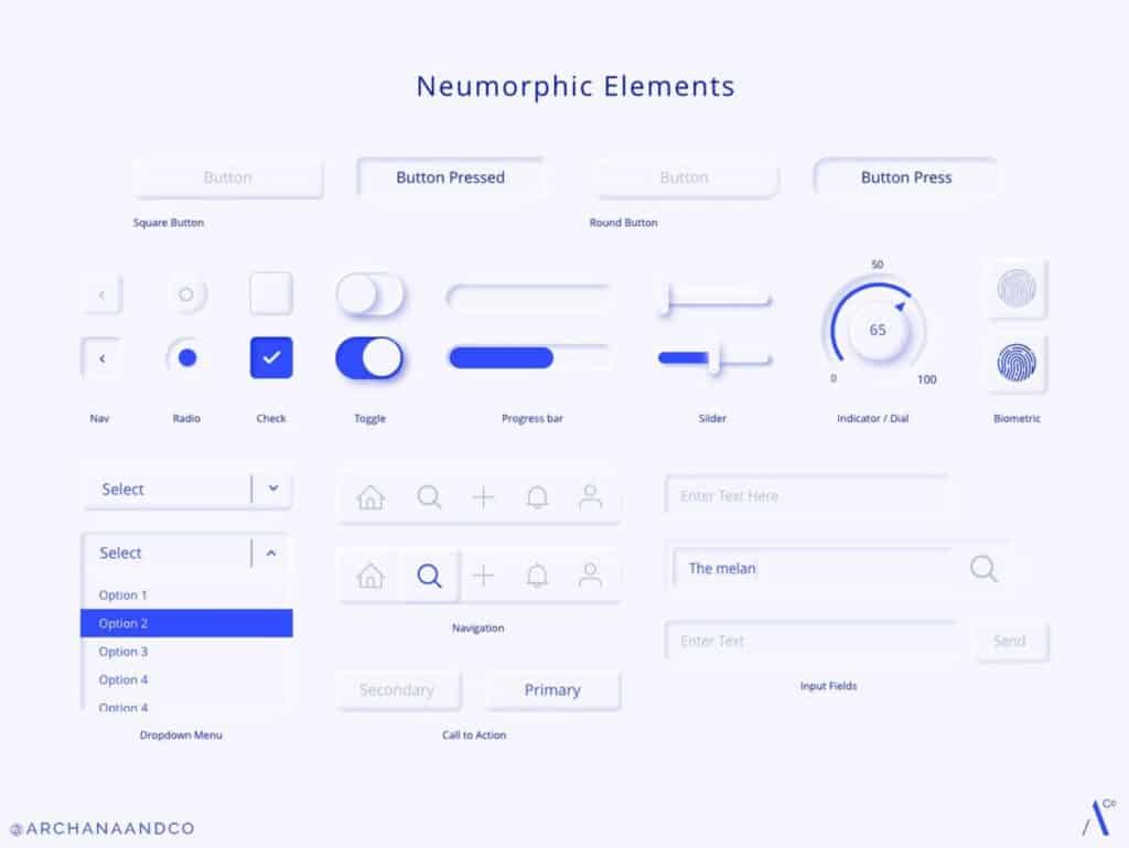
- Convex (Pressed Out): This is common for active buttons, cards, or indicators. The element looks like it’s swelling slightly out of the background. This is achieved with the light shadow on the ‘light source’ side (e.g., top-left) and the dark shadow on the opposite side.
- Concave (Pressed In): Ideal for input fields, toggle switches in an ‘off’ state, or containers that need to look like they’re receding into the surface. Here, the shadows are essentially ‘inside’ the element, with the light shadow on the ‘shadowed’ side (e.g., bottom-right) and the dark shadow on the ‘lit’ side.
Borders and Highlights
While the primary depth comes from shadows, very subtle borders or highlights can further refine the look. Often, these are thin lines, perhaps 1px, in a lighter or darker shade that corresponds to the shadow direction, adding a crispness to the soft edges. For instance, a convex element might have a subtle light border on its top and left edges, and a slightly darker border on its bottom and right, reinforcing the light source.
This meticulous attention to light and shadow, combined with a restrained color palette, is what gives Neumorphism its distinctive, almost sculptural feel. It’s a sophisticated approach that makes digital elements feel grounded and three-dimensional, without becoming overly complex or distracting. It’s also an approach that requires careful consideration in its execution to truly sing.
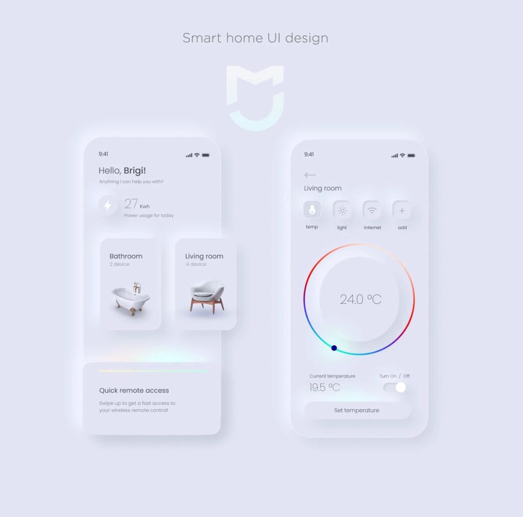
Why Did Neumorphism Emerge? Tracing its Roots
The rise of Neumorphism wasn’t accidental; it was a natural evolution, or perhaps a gentle rebellion, against the prevailing design norms. Every design trend has its precursors and its reasons for existing.
The Flat Design Fatigue
For nearly a decade, flat design reigned supreme. Propelled by Apple’s iOS 7 and Google’s Material Design, it emphasized minimalism, bright colors, and bold typography. It was clean, efficient, and mobile-friendly. However, after years of ubiquitous flat interfaces, some designers and users began to feel a sense of ‘flat design fatigue.’ While clear, interfaces sometimes lacked personality, warmth, or a tangible connection to the physical world. Buttons often looked like static labels, and interactive elements could be indistinguishable from decorative ones. The aesthetic, while functional, became somewhat sterile and uniform.
Skeuomorphism’s Redemption Arc (kind of)
Before flat design, skeuomorphism was the standard. Remember those old Apple apps that mimicked real-world objects to an almost obsessive degree? The iBooks app looking like a wooden bookshelf, the Notes app resembling a legal pad, or the Contacts app with leather binding. While these designs were intuitive for new digital users, helping them bridge the gap between physical and digital, they eventually became visually heavy and inefficient, especially as screen resolutions improved and digital literacy grew.
Neumorphism doesn’t bring back the “leather texture” or “wooden shelf” of old skeuomorphism. Instead, it resurrects the principle of making digital elements feel physical, but with a refined, modern twist. It takes the idea of tactile interaction and applies it with subtlety and grace, ditching the literal mimicry for an abstract, sculpted representation. It’s a “less is more” approach to depth.
Technological Advancements
The devices we use today are far more powerful than those a decade ago. High-resolution screens, advanced graphics processing units (GPUs), and sophisticated rendering capabilities allow for more complex and nuanced visual effects without compromising performance. Creating the subtle, multi-layered shadows and gradients of Neumorphism would have been far more resource-intensive and potentially sluggish on older hardware. Modern tech makes such intricate visual effects feasible and smooth, enhancing the user experience rather than hindering it.
Designer’s Quest for Novelty
Designers, by nature, are always pushing boundaries and seeking new ways to express creativity and enhance user interaction. After years of flat and material design, Neumorphism presented an exciting new playground. It offered a distinctive aesthetic that could help applications stand out in a crowded digital landscape. Many designers saw it as an opportunity to inject personality and a unique feel into interfaces, making them more engaging and memorable. Just like how trends in art, fashion, or even poster design evolve, UI/UX design is constantly searching for the next big thing, or a fresh take on an old idea.
So, Neumorphism isn’t just a random visual choice; it’s a thoughtful response to the evolution of design, technology, and user expectations, seeking to blend the best of past and present to create something fresh and engaging.
The Allure and Advantages of Neumorphism in UI/UX
When done right, Neumorphism offers a suite of benefits that contribute to a polished and intuitive user experience. Its unique aesthetic goes beyond mere looks, influencing how users perceive and interact with an interface.
Aesthetic Appeal
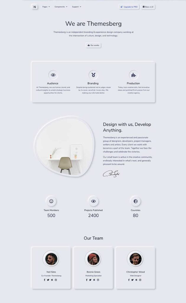
Let’s be honest, Neumorphism looks cool. It’s modern, clean, and sophisticated. The soft, sculpted forms give interfaces a premium feel, reminiscent of high-end consumer electronics or luxury dashboards. It avoids the harshness that can sometimes accompany purely flat designs and the clutter of old skeuomorphism. This polished appearance can significantly enhance a brand’s image, making an app or website feel more exclusive and thoughtfully designed. For certain applications, especially those aiming for a minimalist yet rich aesthetic, like a creative website design, Neumorphism can be a perfect fit.
Tactile and Intuitive
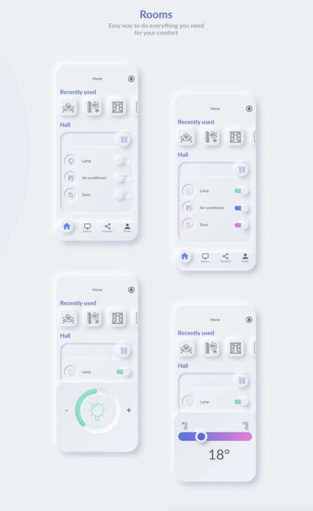
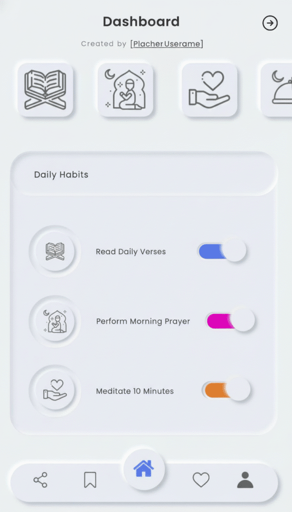
One of Neumorphism’s strongest points is its ability to make digital elements feel physical. When a button appears to push out from the surface, or an input field looks like it’s recessed, users intuitively understand its function. This tactile illusion makes the interface feel more responsive and engaging. Pressing a neumorphic button, even just visually, gives a satisfying sense of interaction, as if you’re engaging with a real-world object. This reduces the cognitive load, as users don’t have to guess what’s interactive and what’s merely decorative.
Reduced Cognitive Load for Interactions
Because of its inherent depth cues, Neumorphism often makes it easier for users to identify interactive elements versus static information. A raised button clearly signals “I can be pressed,” while a recessed field implies “I can be typed into.” This visual clarity helps guide the user through the interface, making navigation smoother and more intuitive, particularly for dashboards or data-heavy applications where distinguishing interactive elements is crucial.
Brand Differentiation
In a sea of apps and websites that largely conform to flat or Material Design guidelines, Neumorphism offers a distinctive visual language. Adopting this style can help a brand stand out and create a unique identity. For companies looking to convey modernity, elegance, and a forward-thinking approach, Neumorphism provides an excellent opportunity to differentiate their digital products and leave a memorable impression on users. It tells a story of attention to detail and a commitment to aesthetic quality.
Accessibility Considerations (with caveats)
While often criticized for its accessibility challenges (which we’ll cover next), Neumorphism can have some accessibility benefits if implemented with extreme care. The perceived depth, for example, can aid users with certain cognitive disabilities in distinguishing interactive elements. However, this is heavily dependent on maintaining sufficient contrast and careful design choices, which is where many implementations fall short. When paired with other accessibility features, its distinct visual cues can sometimes be an asset.
In essence, Neumorphism’s charm lies in its ability to bring a sense of tangible reality to the digital world, making interfaces more beautiful, intuitive, and engaging, provided its nuances are respected.
Navigating the Neumorphic Minefield: Challenges and Pitfalls
Despite its aesthetic appeal, Neumorphism is not without its significant hurdles. Many designers found out the hard way that this trend comes with a set of challenges that can hinder usability and accessibility if not addressed carefully.
Accessibility Concerns (The Big One)
This is hands down the most significant criticism of Neumorphism. The very essence of its “soft” look relies on low contrast between the elements and their background. Shadows are subtle, colors are often monochromatic, and the difference in luminance between a raised button and the background can be minimal. This poses a huge problem for users with visual impairments, color blindness, or even just those using screens in bright environments.
- Low Contrast: The Web Content Accessibility Guidelines (WCAG) recommend specific contrast ratios for text and graphical elements. Neumorphic designs often struggle to meet these, making text and even interactive components difficult or impossible to discern for many users.
- Lack of Clear Affordance: While the goal is tactile intuition, if the shadows are too subtle or the contrast too low, a button might not clearly “afford” interaction. It might just look like a slightly textured part of the background, especially for users who rely on stronger visual cues. This can lead to frustration and confusion.
Color Limitations
Neumorphism thrives in a world of muted, monochromatic, or analogous color schemes. It doesn’t play well with vibrant, contrasting colors. If your brand identity demands a diverse and bold color palette, trying to force a neumorphic style onto it will likely result in a cluttered, unharmonious, or even garish interface. The strength of Neumorphism lies in its subtlety, and bold colors tend to overpower this. It severely restricts creative freedom when it comes to expressing brand personality through color.
Overuse and Clutter
Like any powerful design tool, Neumorphism can be easily overdone. If every single element on a screen – every icon, every card, every input field – is neumorphic, the interface quickly becomes overwhelming and visually heavy. The “soft” effect loses its impact when there’s no flat space for the eye to rest. It can lead to a sense of visual noise, making it harder for users to focus on the most important information or actions. Imagine a website trying to implement this everywhere, from the menu bar to every small detail; it would be a usability nightmare. When considering projects like building web applications, strategic application of design elements is key, not blanket coverage.
Development Complexity
Implementing Neumorphism effectively with CSS can be more complex than standard flat design. Achieving the nuanced dual shadows, handling active states (where a raised button appears pressed in), and ensuring responsiveness across various screen sizes requires more intricate CSS properties and careful attention to detail. This can lead to increased development time and potentially heavier stylesheets, impacting performance if not optimized. Debugging subtle shadow issues can also be a headache.
Scalability Issues
Maintaining a consistent neumorphic aesthetic across different screen sizes and resolutions can be tricky. What looks perfectly subtle and elegant on a large desktop monitor might appear chunky and unrefined on a small mobile screen, or vice versa. The delicate balance of shadows and blur radii needs to be meticulously adjusted for various viewports, adding another layer of complexity to responsive design.
In conclusion, while Neumorphism offers a unique visual flair, its implementation demands a high level of design skill, a deep understanding of its limitations, and a commitment to user-centered design principles, particularly concerning accessibility. Ignoring these challenges can quickly turn an elegant concept into a frustrating user experience.
Best Practices for Implementing Neumorphism Responsibly
Given its challenges, especially around accessibility, it’s clear that Neumorphism isn’t a design style you can just slap onto any interface. It requires a thoughtful, strategic approach to harness its benefits without falling into its pitfalls. Here are some best practices to consider:
Prioritize Accessibility First and Foremost
This cannot be stressed enough. Before anything else, ensure your neumorphic elements meet accessibility standards, particularly WCAG contrast ratio guidelines.
- Increase Contrast: While the ‘soft’ look relies on low contrast, you must find a balance. Experiment with slightly bolder shadows or subtle outlines that improve visibility without sacrificing the overall aesthetic. Use tools to check contrast ratios.
- Provide Alternatives: For critical interactive elements, consider adding alternative visual cues like iconography, text labels, or even slight color changes on hover/focus that offer stronger contrast.
- Focus States: Ensure that interactive elements have very clear focus states for keyboard navigation. A strong border or a more pronounced shadow change can help.
Strategic Application: Less is More
Neumorphism is best used sparingly. Don’t make your entire interface neumorphic.
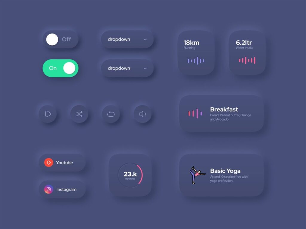
- Highlight Key Interactions: Reserve neumorphic effects for primary buttons, important input fields, or cards that house crucial information. This makes those elements stand out and reinforces their interactive nature.
- Combine with Flat Elements: Often, the most successful neumorphic designs blend beautifully with flat or minimalist elements. Use flat design for navigation, text, and less critical UI components, and let the neumorphic elements be the stars. This provides visual relief and guides the user’s eye to where it matters most.
Subtlety is Key
The power of Neumorphism lies in its understated elegance. Avoid exaggerated shadows or overly pronounced extrusions.
- Gentle Shadows: Keep shadow values (blur, spread, opacity) on the subtle side. The effect should be perceived rather than overtly noticeable.
- Monochromatic Harmonies: Stick to very close shades of your base color. Slight variations in lightness and darkness are enough to create the depth without looking gaudy.
User Testing is Non-Negotiable
No matter how confident you are in your design, real-world user testing is crucial.
- Diverse User Groups: Test your interface with users who have varying degrees of visual acuity, including those with color blindness or low vision, to identify potential accessibility issues early on.
- Contextual Testing: Test in different lighting conditions and on various devices to see how the subtle effects hold up. What looks good in a dark design studio might fail on a sunny outdoor screen.
Consider Brand Identity and Industry
Does Neumorphism truly align with your brand’s message and the expectations of your target audience?
- Luxury/Tech/Wellness: Neumorphism often resonates well with brands in luxury, smart home technology, fitness, or wellness sectors due to its clean, sophisticated, and intuitive feel. Think apps for meditation or sleek control panels.
- Information-Heavy/E-commerce: For interfaces that are information-dense, require high contrast for readability, or focus on diverse product displays (like e-commerce or complex dashboards), Neumorphism might introduce more problems than it solves.
By following these best practices, designers can leverage the unique aesthetic appeal of Neumorphism while ensuring that their interfaces remain functional, accessible, and user-friendly. It’s about being deliberate and designing with purpose, rather than just chasing a trend.
Conclusion
Neumorphism, with its distinctive soft, extruded, and recessed shapes, certainly made waves in the UI/UX world. It offered a refreshing departure from the pervasive flat design, bringing back a sense of tactile depth and sculptural elegance to digital interfaces. When executed with precision and restraint, it can create an incredibly intuitive and visually appealing experience, making buttons feel pressable and interfaces feel more tangible. Its monochromatic palettes and subtle dual shadows craft a sophisticated look, perfect for applications where a premium, calm, or focused aesthetic is desired – think music players, smart home dashboards, or minimalist utility apps.
However, the journey with Neumorphism is not without its challenges. Its inherent reliance on low contrast often creates significant accessibility hurdles, making it difficult for users with visual impairments to navigate. Overuse can lead to visual clutter, and its specific aesthetic limits its versatility across diverse brand identities and complex information-heavy applications. It’s a style that demands careful consideration, meticulous execution, and, crucially, thorough user testing to ensure it enhances, rather than detracts from, the user experience.
Ultimately, Neumorphism is more than just a fleeting trend; it’s a powerful aesthetic tool that has reminded us of the value of depth and tactility in digital design. While it might not become the universal design language, it will undoubtedly remain a significant influence, evolving into softer, more accessible variations and continuing to inspire designers to think beyond two dimensions. It serves as a testament to the ongoing quest for engaging, intuitive, and beautiful digital interactions. So, next time you’re crafting an interface, consider if Neumorphism’s unique blend of softness and style could be the perfect ingredient to make your design truly pop – just remember to wield its power responsibly!
- 868shares
- Facebook0
- Pinterest865
- Twitter3
- Reddit0

