The company’s logo of Jaguar car symbolizes its brand evolution. This article examines its history, changes, and what the latest redesign represents.
Key Takeaways
- Jaguar’s new logo is a bold change, adopting a minimalist design that reflects its modern vision while honoring its heritage.
- The launch of the logo at Miami Art Week was a creative celebration, attracting influential artists and defining Jaguar’s commitment to innovation.
- The ‘Copy Nothing’ ethos is steering Jaguar into a new era focused on originality and a unique identity, targeting a younger audience.
- The integration of Jaguar and Land Rover under the Jaguar Land Rover brand showcases their shared engineering facilities and production plants, highlighting their evolution as a single entity in the automotive market.
The Evolution of Jaguar’s Logo

Jaguar’s logo has undergone numerous transformations since the company’s inception in 1922. Originally a motorcycle manufacturer, Jaguar transitioned to automobile production, bringing with it a logo that symbolized spirited driving. The early emblem featured a winged design, capturing the sense of speed and freedom that the brand aspired to deliver. As Jaguar evolved, so did its logo, reflecting the brand’s growing sophistication and performance capabilities.
The most iconic iteration of Jaguar’s logo is undoubtedly the leaping jaguar cat. Introduced to symbolize agility, power, and elegance, this emblem became synonymous with the brand’s identity. Over the years, Jaguar has used two main logos: one depicting a frontal view of the jaguar cat, exuding a sense of fierce presence, and the other featuring the dynamic leap. These logos encapsulated the spirit of the brand, merging visual appeal with the promise of exhilarating performance.

In more recent times, the Jaguar logo has taken on a more aggressive styling, characterized by a striking red background and a silver outline. This modern design not only evoked a sense of speed but also reinforced Jaguar’s commitment to maintaining a bold and contemporary image.
Each transformation of the logo has been a testament to Jaguar’s ability to adapt and innovate, ensuring that its visual identity remains as dynamic as the vehicles it produces. With every change, Jaguar has managed to capture the essence of its brand while keeping pace with the evolving tastes of its audience, often in just a few seconds.
The New Logo Unveiled
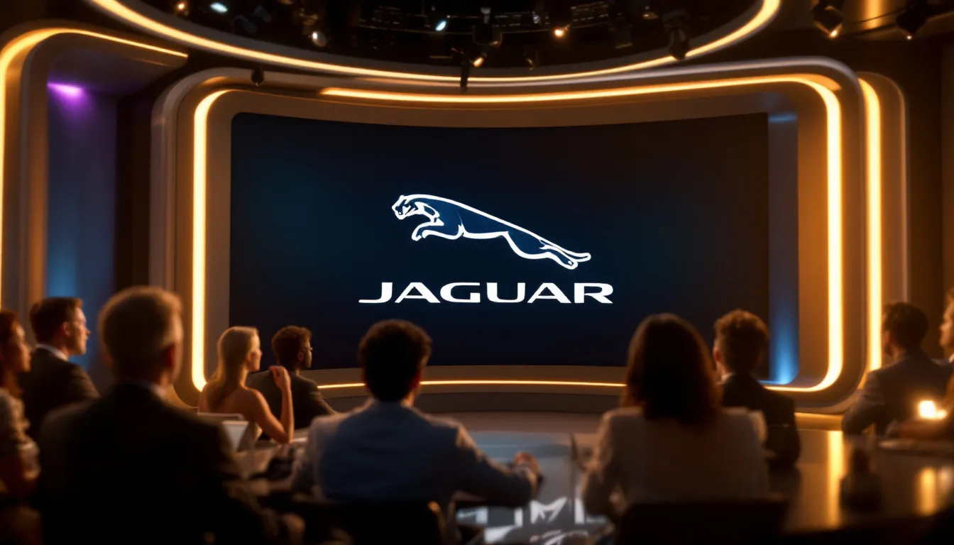
In a significant shift in branding strategy, Jaguar recently unveiled a new logo that marks the beginning of an exciting chapter for the company. The latest design moves away from traditional elements, embracing a modern minimalist approach that reflects the brand’s forward-thinking vision. This new logo was introduced during a prominent event at Miami Art Week, underscoring Jaguar’s commitment to innovation and artistry.
The unveiling event was not just about showcasing a new logo; it was a celebration of Jaguar’s rich heritage and its bold step into the future. Held at Miami Art Week, the event attracted over 300 influential figures from various creative sectors, including notable artists and musicians. The ambiance was electric, and the new logo was received with a mix of admiration and curiosity, setting the stage for a deeper exploration of its design elements and the ethos driving this transformation. Jaguar’s new logo aims to create a genuine connection with its audience, emphasizing the human aspect of the brand’s identity.
Design Elements
The redesigned logo features a refined leaping jaguar symbol, showcasing a sleek design that aligns with contemporary aesthetics. This elegant emblem is paired with modern typography, emphasizing Jaguar’s commitment to artistry and forward-thinking vision. The combination of these elements creates a cohesive and visually striking identity that resonates with the brand’s luxurious yet innovative character.
These design elements work together to convey a modern and artistic identity for Jaguar. The refined leaping jaguar embodies the brand’s agility and elegance, while the contemporary typography reflects its dedication to innovation and model design.
This new logo is not just a visual update; it’s a statement of Jaguar’s ongoing evolution and its commitment to leading with design and artistry.
Event Highlights
The unveiling of the new logo at Miami Art Week was a carefully planned event that highlighted Jaguar’s dedication to creativity and innovation. The event featured live performances and presentations that celebrated the brand’s evolution and future vision. Attendees were treated to a captivating blend of art, music, and design, making the launch a memorable milestone for Jaguar.
Among the highlights were the influential figures from various creative sectors who graced the event. Over 300 notable artists and musicians attended, adding to the event’s prestige and reinforcing Jaguar’s connection with the arts. This celebration was not just about a new logo; it was about showcasing Jaguar’s journey and its bold step into a new era.
‘Copy Nothing’ Ethos: A New Era for Jaguar
Jaguar’s new logo signals more than just a visual update; it marks the beginning of a transformative journey for the brand, guided by the ‘Copy Nothing’ ethos. This creative philosophy emphasizes a commitment to originality and innovation in design, aligning with Jaguar’s vision of exuberant modernism. The ‘Copy Nothing’ ethos is driving Jaguar’s transformation towards an ultra-luxury electric vehicle identity, targeting a younger, design-oriented audience.

This new era for Jaguar is not just about cars; it’s about redefining the brand’s identity and marketing strategy. The ‘Copy Nothing’ approach is reshaping Jaguar’s marketing, focusing on bold and artistic expressions that resonate with modern audiences.
Public reactions to Jaguar’s new branding have been mixed, with some expressing confusion about the brand’s direction, while others praise its modern aesthetics.
Inspiration from Sir William Lyons
Sir William Lyons, Jaguar’s founder, emphasized the importance of originality in automotive design, a principle that continues to drive Jaguar’s creative direction today. Despite lacking formal design training, Lyons is regarded as one of the most influential car designers, shaping Jaguar’s distinctive style and advocating for uniqueness. His philosophy of ‘Copy Nothing’ remains a cornerstone of Jaguar’s brand strategy, influencing its contemporary design and marketing approach.
Major media outlets, including USA Today, have highlighted Jaguar’s rebrand as a shift towards originality, emphasizing the company’s connection to its founder’s ethos. This commitment to originality is not just a nod to the past but a strategic move to position Jaguar as a leader in innovative and unique automotive design.
Impact on Brand Identity
The ‘Copy Nothing’ ethos represents Jaguar’s commitment to cutting-edge design and unique engineering, steering away from industry norms. This philosophy is reshaping Jaguar’s brand identity, emphasizing originality and innovation in both marketing and product design. By distancing itself from imitation, Jaguar aims to embody true originality, establishing itself as a brand that leads with creativity and artistic expression.


Major outlets like USA Today have highlighted Jaguar’s new branding as a significant shift, emphasizing originality and a unique character. This rebranding aims to redefine Jaguar’s identity in a contemporary market, appealing to a younger, design-oriented audience with a bold and innovative approach.
Branding Strategy
Jaguar’s new branding strategy is a bold declaration of its commitment to originality and innovation, encapsulated in its “Copy Nothing” ethos. This philosophy is not just a tagline but a guiding principle that permeates every aspect of the company’s operations. The new logo, with its sleek and modern design, is a visual representation of this ethos, setting Jaguar apart from other luxury car brands. By embracing a minimalist aesthetic, Jaguar is making a statement about its forward-thinking vision and dedication to standing out in a crowded market.
Integration with New Logo
The new logo is more than just a design update; it is a cornerstone of Jaguar’s branding strategy. This emblem will be prominently featured across all marketing materials, from the company’s website to its social media channels and advertising campaigns. The design of the logo, which evokes the dynamic energy of a leaping jaguar, is a nod to the brand’s iconic heritage while also appealing to a younger, more design-conscious audience. This strategic integration ensures that the newly designed logo is not just a symbol but a central element of Jaguar’s brand identity, resonating with both long-time fans and new customers.
Long-term Vision for Jaguar
Jaguar’s long-term vision is ambitious and clear: to become a leader in the luxury electric vehicle market. This goal is supported by significant investments in research and development, aimed at expanding the company’s lineup of electric vehicles. Jaguar is not just focusing on performance and luxury but also on sustainability and environmental responsibility, which are becoming increasingly important to consumers. The company aims to increase its sales by 50% over the next five years and to secure a position among the top three luxury electric vehicle brands globally. By expanding its presence in key markets such as the United States, China, and Europe, Jaguar is positioning itself for a future where innovation and sustainability go hand in hand. This long-term vision, combined with the new branding strategy, ensures that Jaguar is not just keeping pace with the industry but leading it into a new era of luxury and performance.
Reactions to the New Logo
The unveiling of Jaguar’s new logo has sparked mixed reactions across various platforms. Some fans and critics have expressed confusion and criticism, while others see it as a bold rebranding effort that aligns with Jaguar’s commitment to innovation.
This section sets the stage for a deeper exploration of the diverse reactions from media outlets and social media users.
Media Coverage
Media outlets, including USA Today, have featured extensive coverage of Jaguar’s new logo, sparking significant debate among automotive enthusiasts and branding experts. Critics on platforms like X (formerly Twitter) have labeled the new ad as ‘awful,’ questioning whether it can revitalize Jaguar’s image.
The removal of the traditional cat logo has been described as an ‘unbelievable marketing decision,’ reflecting the polarized views on this bold change.
Social Media Buzz
Social media platforms like Twitter and Instagram have been buzzing with discussions about Jaguar’s new logo. Many fans have praised its modern design, seeing it as a fresh look that the brand needed. However, critics have mixed responses, with some questioning the necessity of the redesign and others commending its boldness.
Automotive commentators have also weighed in, analyzing the implications of the new logo on Jaguar’s branding strategy. Overall, the social media buzz indicates strong engagement from the community, showing that while opinions vary, the conversation surrounding the logo is lively and vibrant.
Enhancing the Website Experience
In line with its new branding, Jaguar has revamped its website to provide a more cohesive and modern user experience safe. These updates ensure a secure verifying process and align with the brand’s contemporary visual identity.
The enhanced website reflects Jaguar’s commitment to innovation and user satisfaction, making it easier for users to engage with the brand.
Modern Design Features

The updated website design incorporates minimalistic aesthetics that resonate with younger users, showcasing a fresh and streamlined visual approach. Featuring cleaner lines and a more intuitive layout, the website emphasizes modern luxury and aligns with Jaguar’s new visual identity.
These design elements enhance the overall appeal of the website, making it a reflection of the brand’s innovative spirit.
User Experience Improvements
Enhancements to the Jaguar website have focused on simplifying navigation, making it easier for users to find information and engage with the content. The updates prioritize intuitive navigation, ensuring a seamless and user-friendly experience.
These improvements reflect Jaguar’s commitment to providing an exceptional online experience that aligns with its new branding.
The Role of the Leaper Badge
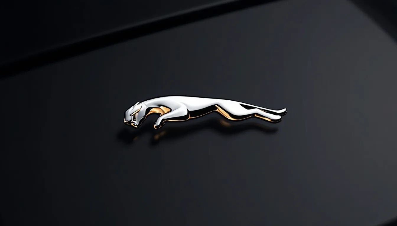
The leaper badge has long been a symbol of Jaguar’s luxury and performance attributes, representing the brand’s heritage and identity. Over the years, the leaper badge has undergone several design changes to align with the evolving identity of Jaguar.

This section explores the historical and modern significance of the leaper badge, highlighting its crucial role in Jaguar’s branding strategy.
Historical Significance
The leaper badge was first introduced to the public in 1938, following a design by an employee responding to Sir William Lyons’ vision. Since then, it has become an iconic representation of the Jaguar brand, undergoing significant redesigns to appear more dynamic and aggressive.


The evolution of the leaper badge reflects its enduring importance and the brand’s identity over the decades.
Modern Interpretation

In recent years, the leaper badge has been slightly redesigned to reflect a sleek, contemporary look that aligns with Jaguar’s commitment to innovation. The removal of the leaper logo signifies a shift towards modern branding in Jaguar’s identity, illustrating the brand’s dedication to evolving with the times.
This change highlights Jaguar’s ability to balance its rich heritage with a vision for the future.

Summary
Jaguar’s new logo marks a bold evolution in the brand’s identity, reflecting a commitment to innovation and originality. From its historical transformations to the modern minimalist design, Jaguar’s logo has always been a symbol of the brand’s spirit and performance. The ‘Copy Nothing’ ethos, inspired by Sir William Lyons, continues to drive Jaguar’s creative direction, ensuring that the brand remains a leader in automotive design.

The mixed reactions from media and social media highlight the impact of this change, sparking vibrant discussions about Jaguar’s future. With enhancements to its website and a modern interpretation of the leaper badge, Jaguar is poised to lead with a fresh and innovative identity. This new chapter is not just about a logo; it’s about embracing a vision for the future while honoring a rich heritage.
Frequently Asked Questions
Is the Jaguar made by BMW?
Nope, Jaguar isn’t made by BMW; it’s owned by Tata Motors. BMW used to have a stake in it but that changed years ago.
What is the meaning of the Jaguar car logo?
The Jaguar logo showcases a sleek leaping jaguar, symbolizing grace, elegance, performance, and power. It’s all about that ambitious leap forward!
Is a Jaguar a luxury car?
Absolutely, a Jaguar is considered a luxury car, known for its classic British elegance and sophisticated design. It’s the kind of ride that turns heads and makes a statement.
What is the inspiration behind Jaguar’s new logo?
Jaguar’s new logo draws inspiration from a modern minimalist approach, showcasing a sleek leaping jaguar and fresh typography to highlight their artistic and forward-thinking vision. It’s all about embracing a contemporary vibe!
How was the new logo unveiled?
The new logo was revealed at a big event during Miami Art Week, with over 300 creative influencers in attendance. It was a vibe, filled with live performances and talks about Jaguar’s evolution and future!
- 16shares
- Facebook0
- Pinterest16
- Twitter0
- Reddit0