I ruined dozens of otherwise decent landscape drawings with water that looked like blue construction paper. Flat. Solid. Obviously fake. I’d color the area blue, add some white lines for “waves,” and wonder why it didn’t look like water. It looked like a blue shape where water should be.
The breakthrough came when I stopped thinking about what color water is and started thinking about what water does. Water is transparent—you see through it to the bottom or to darkness beneath. Water reflects—it mirrors the sky, the shore, whatever’s nearby. Water moves—even “still” water has subtle ripples, distortions, and surface variations.
Here’s what separates convincing water from blue plastic: water isn’t really a thing you draw—it’s an effect you create. You draw what’s visible through the water, what reflects off its surface, and how those elements interact. The “water” emerges from these relationships, not from applying blue pigment to paper.
This guide breaks down the physics of water into drawable principles. Whether you’re working in pencil, watercolor, digital, or any other medium, these fundamentals apply. Understanding why water looks the way it does lets you draw any water scenario—calm lakes, rushing rivers, ocean waves, rain puddles—without memorizing separate techniques for each.
About this guide: These techniques come from years of landscape work, plein air painting, and studying how masters from Turner to contemporary concept artists handle water. The physics are universal; the applications adapt to your preferred medium and style.
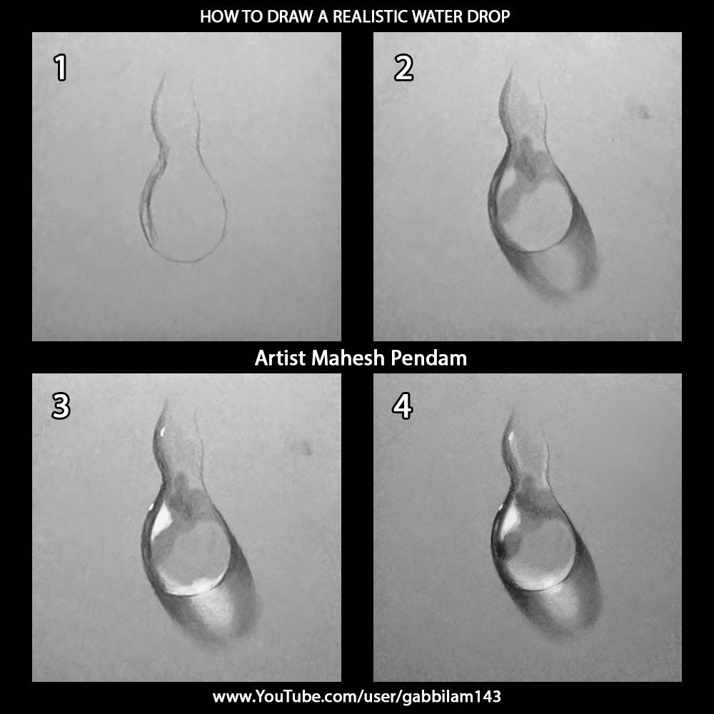
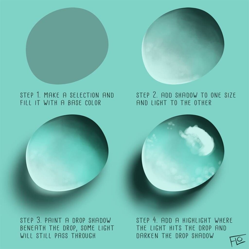
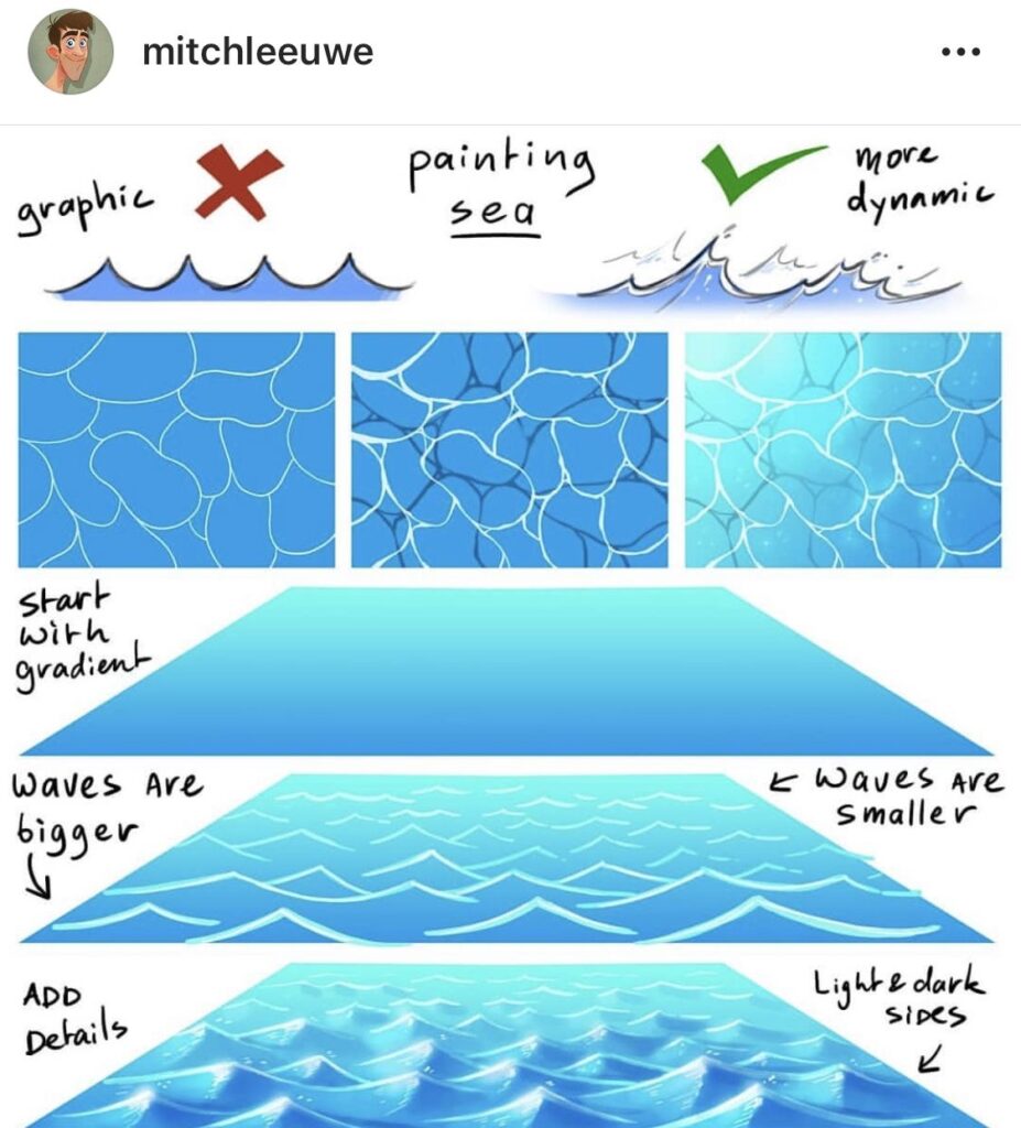
Understanding Water Dynamics
Before drawing water, understand what you’re actually trying to depict. Water behaves according to physical principles that determine its appearance. Learn these principles once, and you can draw water in any condition.
What Makes Water Look Like Water
Water has three visual properties that your drawing must address:
Transparency: Light passes through water, so you see what’s beneath the surface (the bottom, submerged objects, or just increasing darkness with depth). The clarity depends on the water itself—crystal clear mountain streams versus murky ponds—and on the viewing angle.
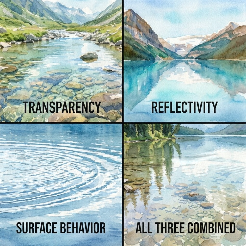
Reflectivity: Water reflects like a mirror, but the reflection quality depends on surface conditions and viewing angle. Calm water reflects sharply; disturbed water reflects in fragments. Low viewing angles show more reflection; steep angles show more transparency.
Surface behavior: Water surfaces respond to wind, currents, and disturbances. Even “still” water has micro-movements that create subtle value variations and soft edge transitions.
Your drawing must address all three. Leave out transparency and your water looks solid. Leave out reflection and it looks like colored glass. Leave out surface behavior and it looks frozen.
The Physics You Need to Know
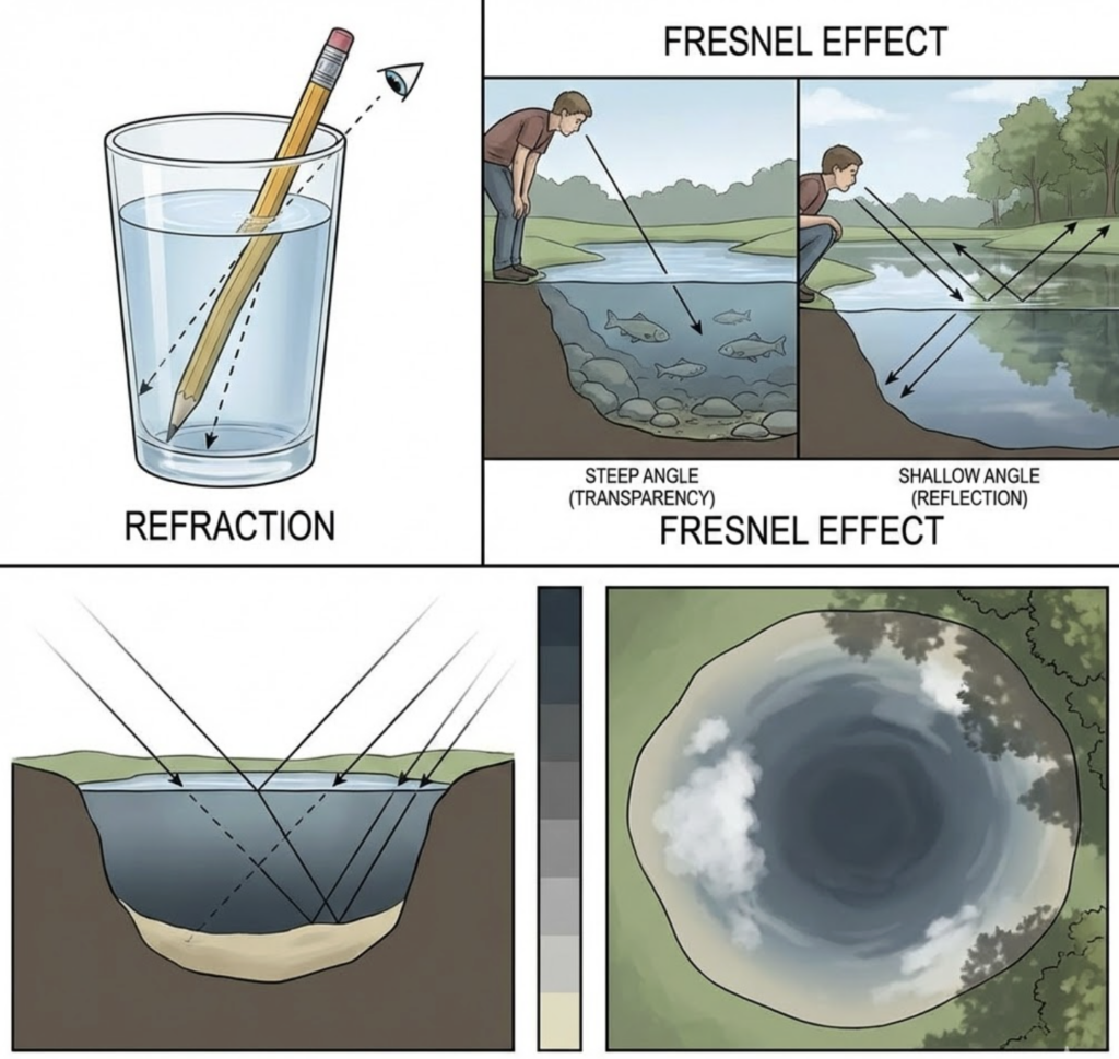
Refraction: Light bends when passing from air into water. This makes submerged objects appear displaced from their actual positions and creates the “bent straw” effect. For drawing purposes, this means underwater objects shift toward the viewer and appear slightly distorted.
Fresnel effect: At steep viewing angles (looking straight down), you see primarily through the water. At shallow angles (looking across the surface), you see primarily reflections. This gradient from transparency to reflection is critical for realistic water.
Value relationships: Water is almost never one flat value. Even in a small puddle, you’ll see variations from dark (deep or absorbing the sky) to light (reflecting bright areas). Map these value patterns and you’re halfway to convincing water.
Materials and Tools
The right tools support your technique. Different media handle water’s qualities differently, so match your materials to your goals.
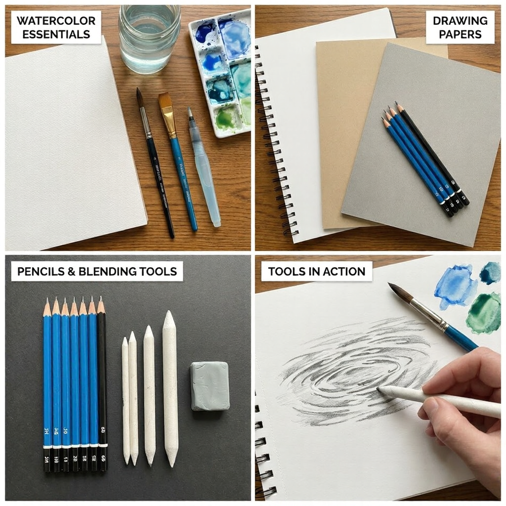
Choosing the Right Paper
Paper choice significantly affects water-drawing results:
Watercolor paper handles wet media without buckling. Hot-pressed (smooth) works for controlled, detailed water. Cold-pressed (textured) creates natural-looking texture effects. Rough paper produces even more texture—good for ocean surfaces, less so for calm lakes.
Drawing paper for pencil and ink work should be smooth enough for detailed gradients but have enough tooth to hold graphite. Bristol board (smooth or vellum) works well for detailed water drawings.
Toned paper simplifies value work because you’re not fighting against pure white. Mid-tone gray or tan lets you work both darker and lighter from the start—useful for water’s value complexity.
Selecting Pencils and Brushes
For pencil work: Soft pencils (2B-6B) create the rich darks you need for deep water and reflections. Hard pencils (H-2H) work for light surface details. A range from 2H to 6B covers most needs.
For brushes: Soft, water-holding brushes (sable or quality synthetic) create smooth washes. Round brushes offer control; flat brushes lay down even gradients. A water brush (built-in reservoir) helps with blending.
Blending tools: Tortillons and blending stumps smooth pencil gradients. Kneaded erasers lift highlights. For any medium, have tools ready for both adding and subtracting value.
Inks and Paints
Watercolor excels at water because its transparency naturally mimics water’s transparency. Build layers from light to dark. Let areas blend wet-into-wet for soft transitions.
Ink creates high-contrast water illustrations. Use diluted ink for gray washes, concentrated ink for dark depths. Fine pens add ripple patterns and detail.
Acrylics and oils require more planning because they’re opaque. Work from dark to light, saving highlights for last. Thin transparent glazes build depth effects.
Basic Techniques
Master these fundamentals before attempting complex water scenarios.
Pencil Sketching for Water
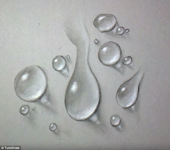
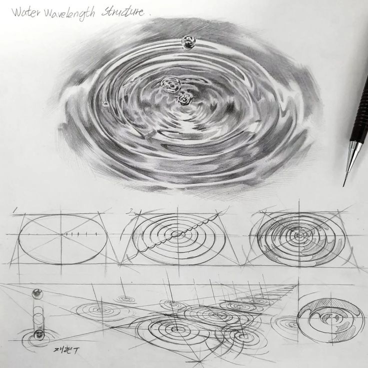
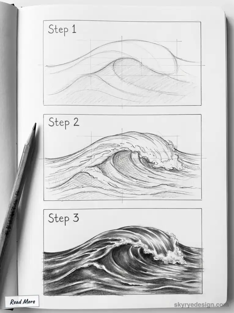
Start with a value map, not a color plan. Before drawing details, identify:
- Where is the water darkest? (Usually deep areas, reflections of dark objects, or areas absorbing dark sky)
- Where is it lightest? (Reflections of bright sky, foam, sunlit shallow areas)
- How do values transition between these areas?
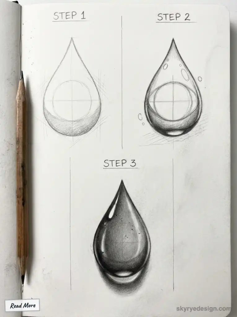
Basic pencil technique:
- Lightly outline the water’s boundaries
- Block in the darkest values with soft pencil (4B-6B)
- Develop mid-tones, working toward the light
- Add surface details—ripples, reflections, highlights
- Lift highlights with kneaded eraser
Stroke direction matters. Horizontal strokes suggest calm water. Curved strokes following wave shapes suggest movement. Chaotic strokes suggest turbulence.
Watercolor Washes for Water
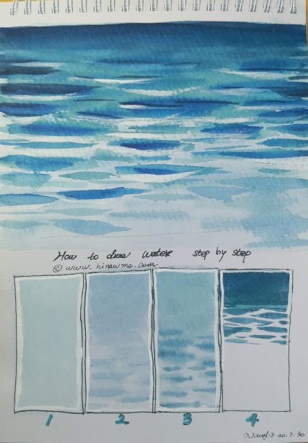
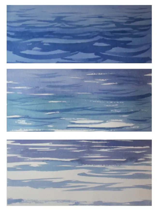
Watercolor’s transparency makes it ideal for water, but requires planning because you work light-to-dark.
Basic wash technique:
- Wet the paper in the water area (wet-into-wet allows soft blending)
- Apply a light wash of your base color (usually blue-gray)
- While wet, drop in darker values for depth and reflections
- Let dry completely
- Add crisper details and reflections with controlled brushwork
- Lift highlights by wetting areas and blotting with paper towel
Gradient control: Water often shows gradients from light (sky reflection at horizon) to dark (deeper water nearer the viewer) or vice versa. Tilt your paper while wet to encourage natural gradient flow.
Ink Drawing for Water
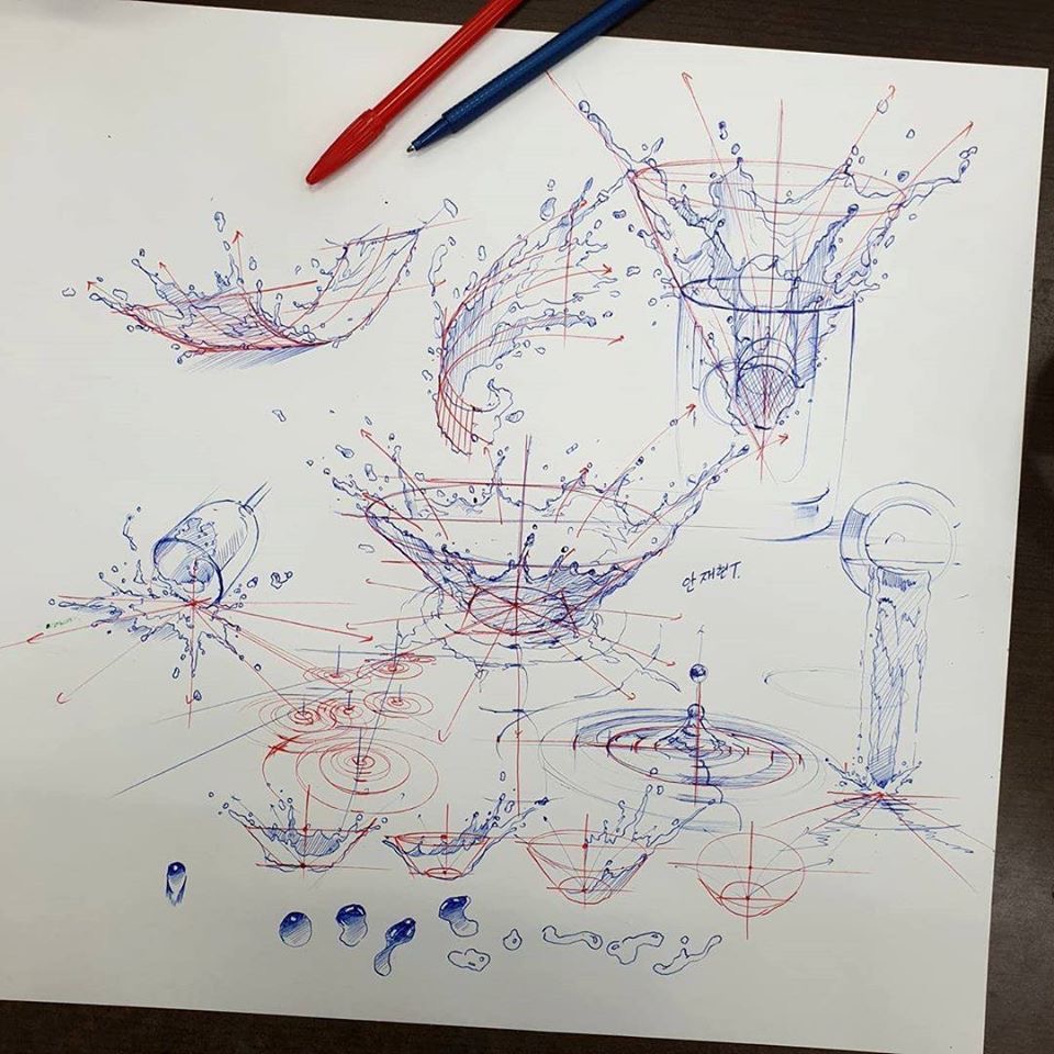
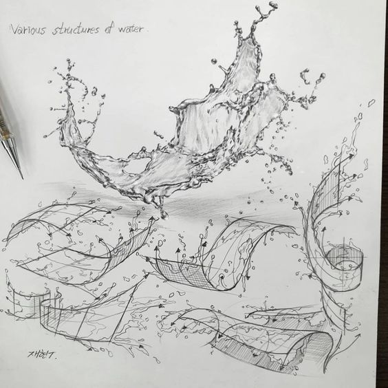
Ink produces high-contrast, graphic water effects. Use line patterns to suggest surface movement.
Technique options:
- Hatching/cross-hatching: Dense hatching creates dark water; sparse hatching suggests light surface reflection. Curve your hatching lines to follow the water’s surface.
- Stippling: Dot patterns create subtle value gradations. Vary dot density for value changes. Effective for calm water surfaces.
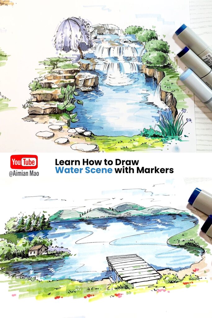
- Ink wash: Dilute ink with water for gray tones. Build layers for depth. Combines well with line work—wash for values, lines for detail.
Leave white space for highlights and reflections. In ink work, white paper is your brightest value—plan for it.
Drawing Still Water
Still water emphasizes reflection and transparency over surface movement. Master these quieter scenarios before tackling waves.
Capturing Reflections
Reflections are what make still water read as water. Get them wrong and the illusion fails.
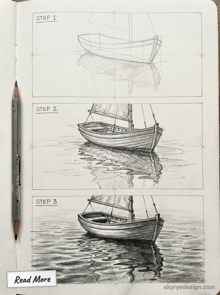
Reflection rules:
- Reflections are vertically below their source. A tree’s reflection appears directly beneath the tree, not offset.
- Reflections are equal in height to the object they reflect (from the water line). If a boat rises 2 inches above the water, its reflection extends 2 inches below.
- Reflections are reversed top-to-bottom. The bottom of an object reflects at the water line; the top reflects furthest into the water.
- Colors darken and desaturate slightly in reflections. Reflections are rarely as bright as the original.
- Edges soften in reflections due to surface disturbance. Even calm water has micro-ripples that blur reflected images slightly.
Drawing process:
- Draw the scene above the waterline first
- Establish the waterline clearly
- Draw reflections directly below each element, reversed vertically
- Slightly darken reflected values
- Soften edges and add horizontal distortions for surface movement
Depicting Transparency
Where reflections diminish, transparency increases. Balance these two effects based on viewing angle and water clarity.
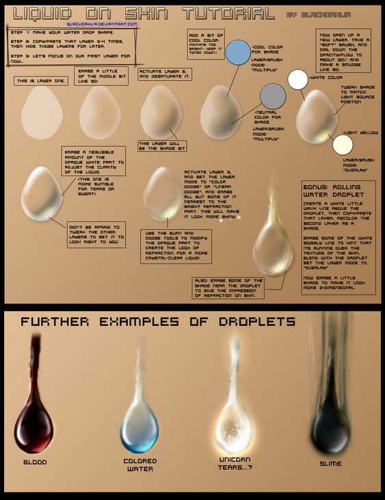
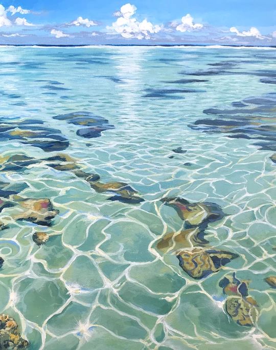
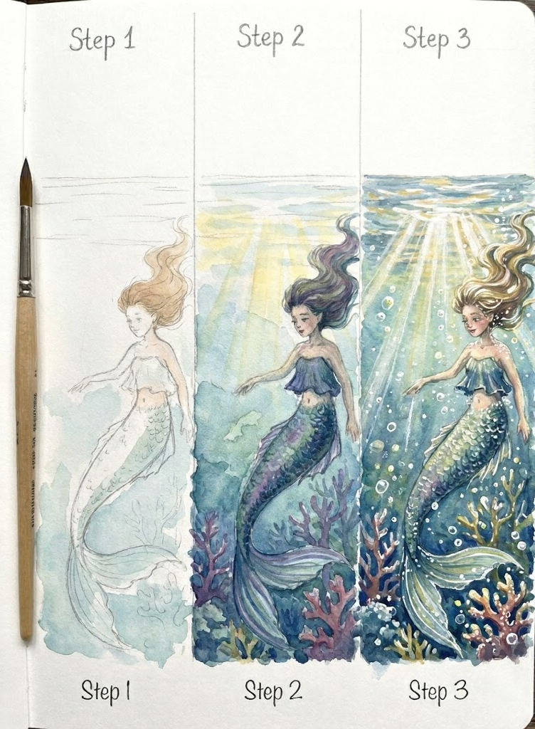
Transparency techniques:
- Value reduction: Underwater objects appear lighter (more washed out) due to the water between viewer and object. The deeper the object, the more faded it becomes.
- Color shift: Underwater elements shift toward the water’s color. In blue water, submerged objects appear more blue. In murky brown water, they shift brown.
- Edge softening: Underwater edges blur due to refraction and light scatter. Sharply drawn underwater details look wrong.
- Distortion: Ripples distort what’s beneath them. Draw underwater elements with slight waviness matching the surface movement.
Depth indication: Shallow water shows clear bottom detail. As depth increases, details fade and eventually disappear into solid dark. Use this gradient to show depth without drawing every stone on the bottom.
Illustrating Moving Water
Moving water adds surface complexity to the transparency and reflection challenges.
Conveying Motion
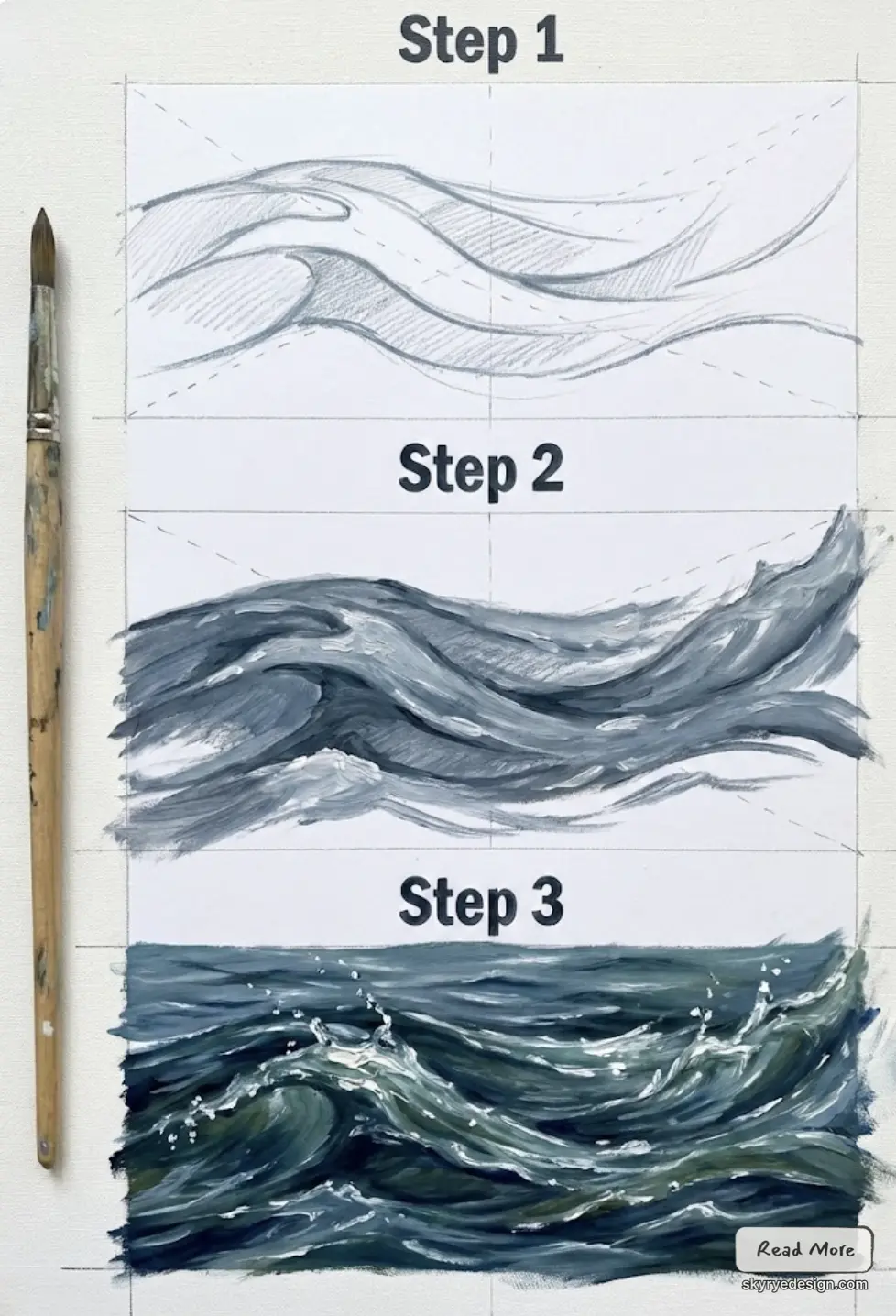
Moving water requires marks that suggest movement direction and speed.
Stroke techniques for motion:
- Direction follows flow. Strokes should move the direction the water moves. River currents flow downstream; waves approach shore.
- Speed affects length. Fast water uses longer, more stretched marks. Slow water uses shorter, rounder marks.
- Turbulence breaks patterns. Calm water has predictable reflection patterns. Turbulent water fragments everything—reflections become scattered marks, transparency becomes glimpses.
Foam and white water: Fast-moving water traps air, creating white foam. Draw foam as value contrast—bright white against darker water. Foam follows flow patterns, accumulating at obstacles and in eddies.
Creating Ripples and Splashes
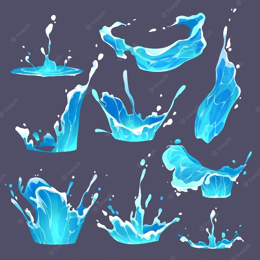
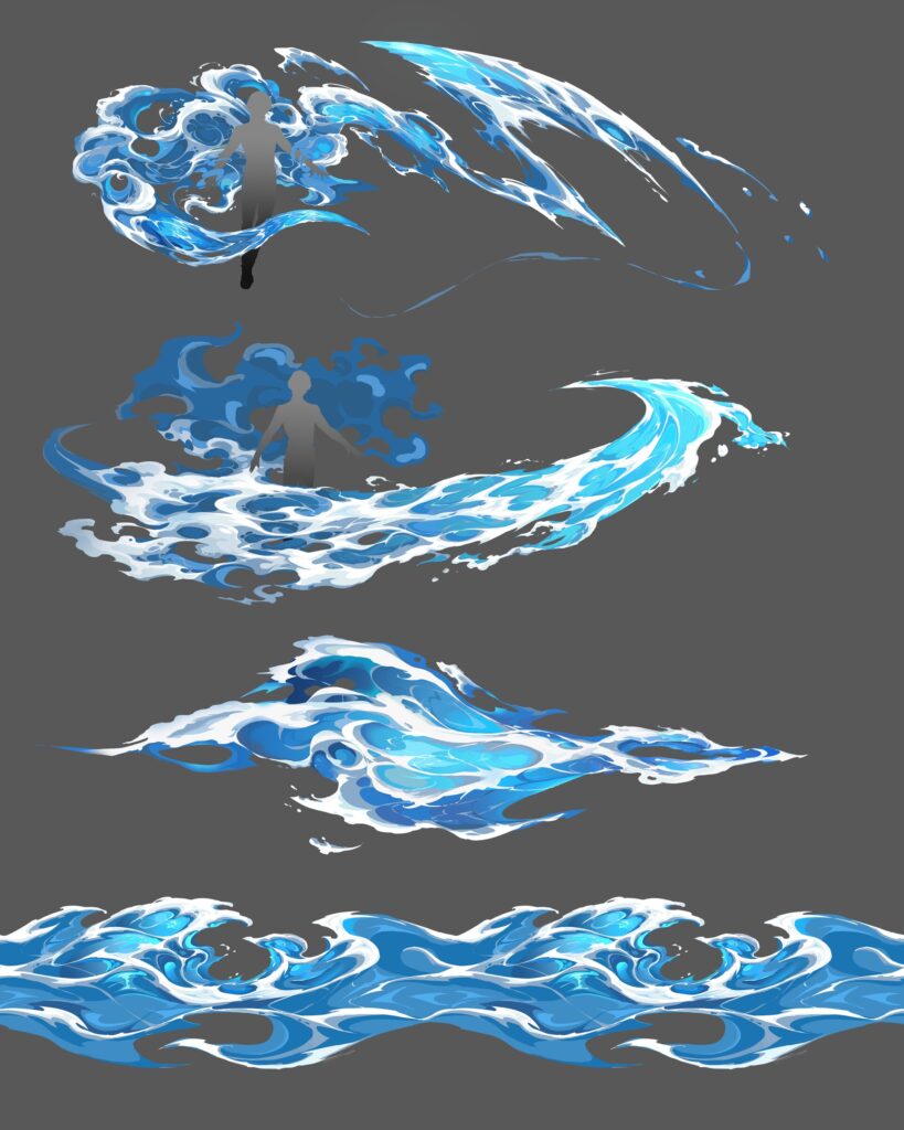
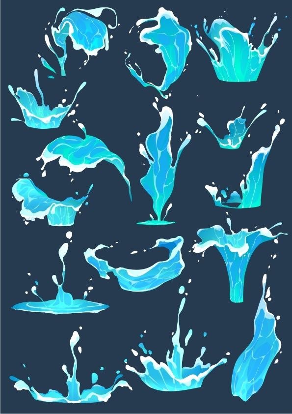
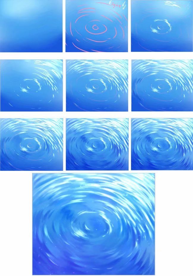
Ripples spread outward from disturbances in concentric patterns. Splashes explode upward against gravity.
Ripple technique:
- Identify the disturbance point
- Draw concentric ellipses spreading outward (not circles—water surfaces are seen at an angle)
- Ellipses flatten with distance due to perspective
- Value variation within ripples—each wave has a light side (facing light source) and dark side
- Ripples diminish and eventually disappear as they spread
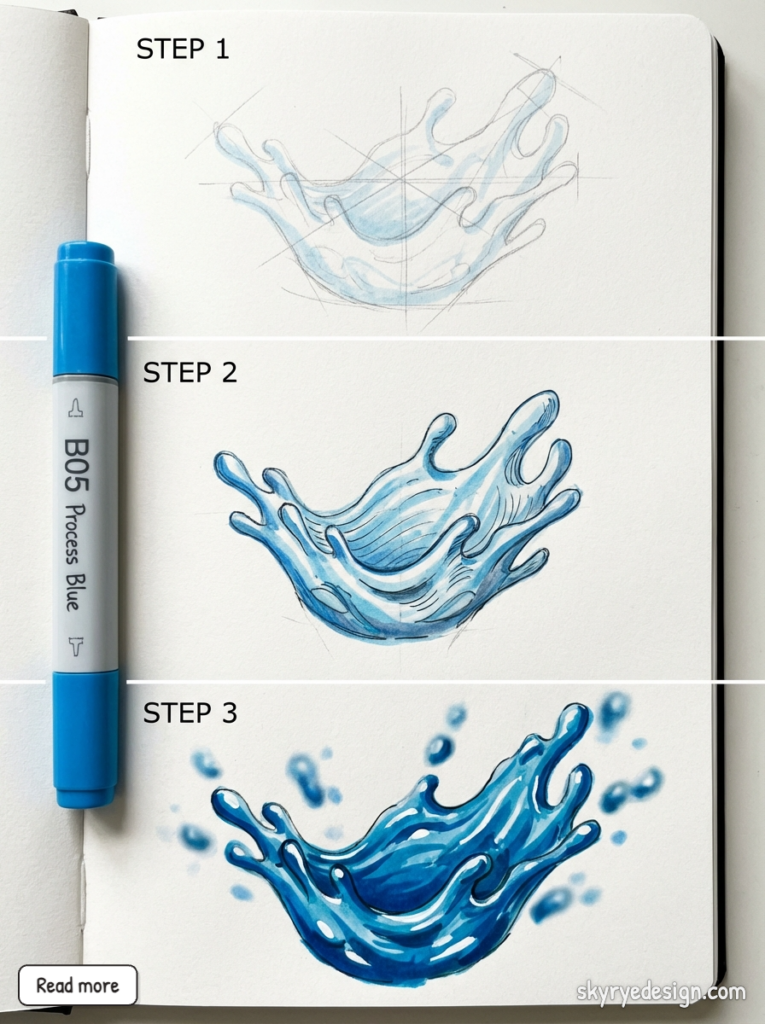
Splash technique:
- Draw the “crown” splash pattern at the impact point
- Establish the impact point
- Draw upward trajectories—larger mass rises less high, smaller drops fly higher
- Drops are spherical at apex, elongated while moving
- Add falling drops returning to surface
Advanced Concepts
Once basics are solid, these advanced approaches create more sophisticated water.
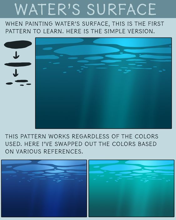
Underwater Perspectives
Drawing what’s beneath the surface requires different treatment than surface reflections.
Color and value shifts: Everything underwater shifts toward the water’s color and becomes progressively lighter (less saturated) with depth. A red object appears increasingly blue-brown at depth.
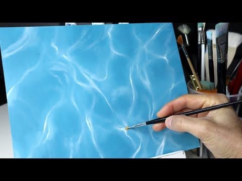
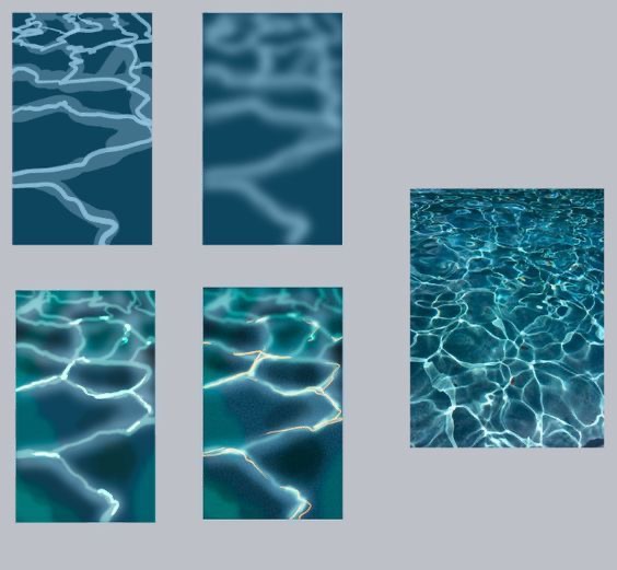
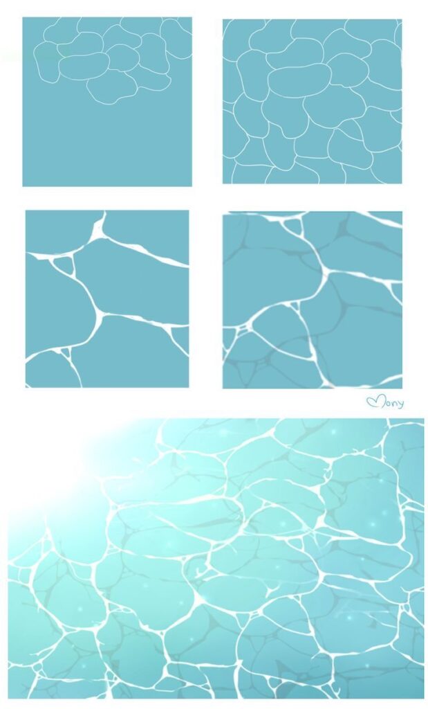
Light behavior: Light refracts at the surface, creating caustic patterns on the bottom—those dancing light networks you see in swimming pools. Drawing caustics: irregular organic shapes of lighter value over the bottom.
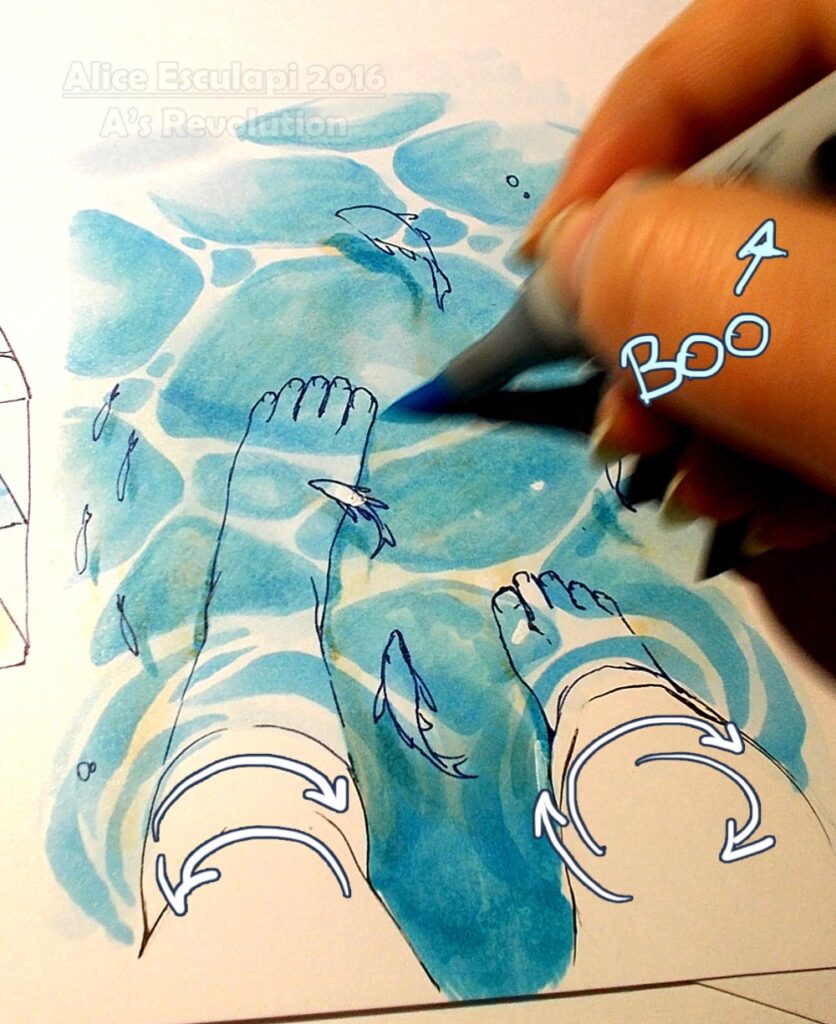
Distortion from above: When viewing underwater from above the surface, everything bends due to refraction. Objects appear closer to the surface than they actually are. Edges waver with surface movement.
Underwater lighting: Light diminishes rapidly with depth. Surface is brightest; deeper areas fall into shadow quickly. Use this value gradient to show depth.
Complex Water Bodies
Rivers, waterfalls, and rapids combine multiple water behaviors simultaneously.
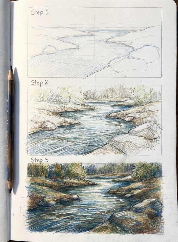
Rivers: Current creates directional flow patterns. Water moves faster in the center, slower at edges. Obstacles create wakes and eddies. Draw the flow direction first, then add surface details consistent with that flow.
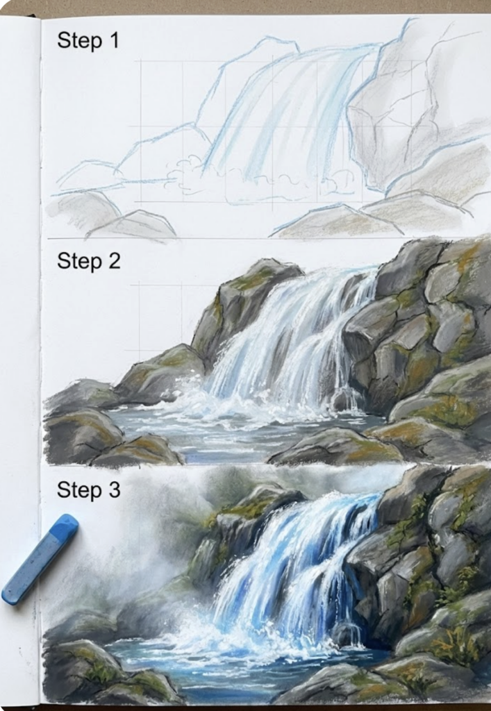
Waterfalls: Water falls in sheets and breaks into drops at the edges. The sheet is semi-transparent, showing rock behind it. Where water hits bottom, it explodes into foam and mist. The mist diffuses edges of surrounding elements.
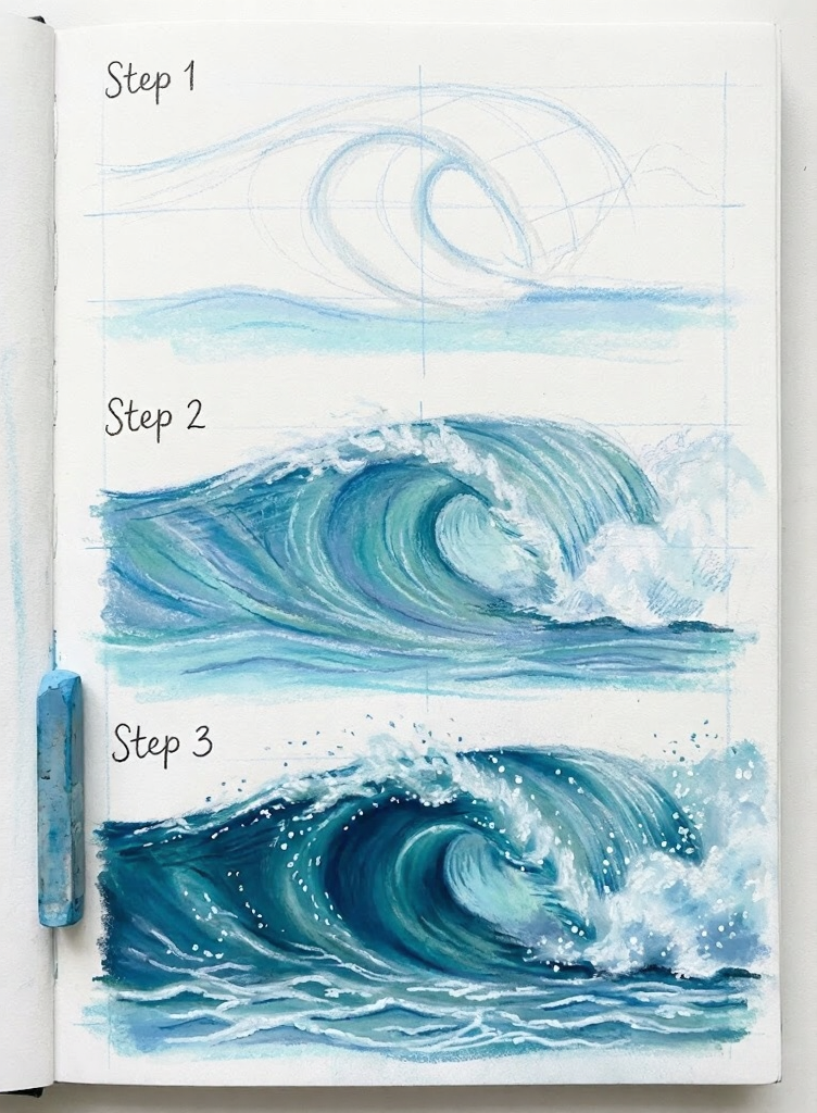
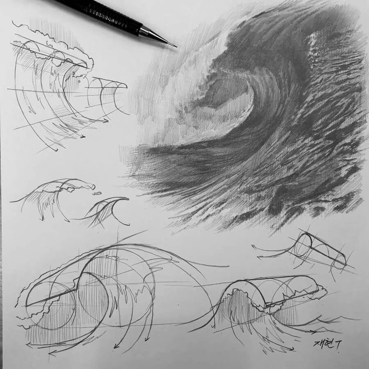
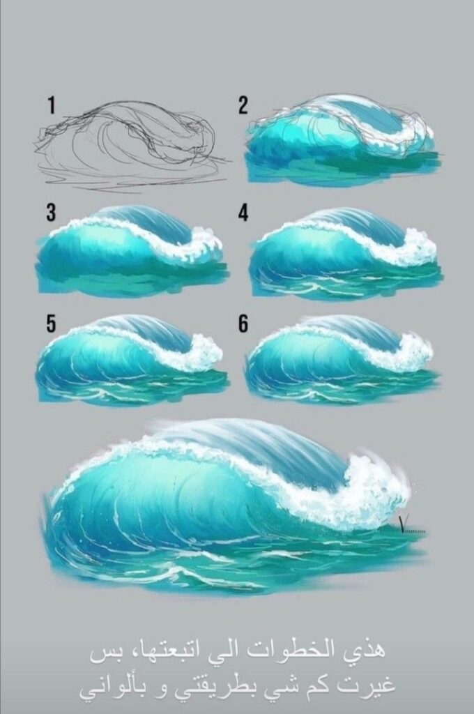
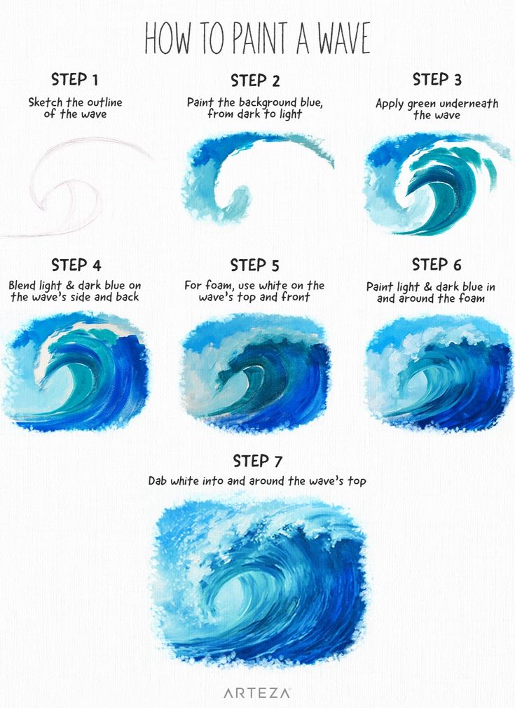
Ocean waves: Waves have predictable anatomy—face (front), back, crest, and trough. Transparent sections show through the wave face. Foam accumulates at the crest and in the turbulence zone after breaking.
Composition and Perspective
How you frame water affects how convincingly it reads.
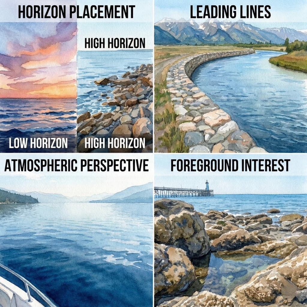
Framing Water Scenes
Horizon placement: Water surfaces extend to the horizon. Placing the horizon high emphasizes the water; placing it low emphasizes the sky. Neither is wrong—choose based on your subject.
Leading lines: Water edges (shorelines, riverbanks) create natural leading lines. Use them to guide the viewer’s eye through your composition.
Scale indicators: Water offers few size cues by itself. Include elements of known size—boats, people, rocks—to establish scale.
Depth and Foreground Interest
Atmospheric perspective in water: Distant water appears lighter, less detailed, and cooler in color temperature. Near water shows more detail, more value contrast, warmer colors.
Foreground interest: Rocks, vegetation, or beach in the foreground establish depth and give the eye a starting point before moving into the water area.
Value structure: Plan your values. Where is darkest? Where is lightest? Water scenes often work well with light backgrounds (sky, distant water) and darker foregrounds (nearby water, shore elements).
Finishing Touches
Final details separate competent water drawings from convincing ones.
Adding Details and Textures
Surface texture: Even calm water isn’t perfectly smooth. Add subtle value variations—small marks suggesting micro-ripples, slight wind disturbance, organic irregularity.
Reflection fragments: In slightly disturbed water, reflections break into horizontal streaks rather than clear images. These streaks follow the water’s surface movement.
Edge treatment: Where water meets land, draw the interaction carefully. Water often appears darker right at the edge where depth changes rapidly. Wet rocks differ in value from dry rocks.
Highlighting and Shadows
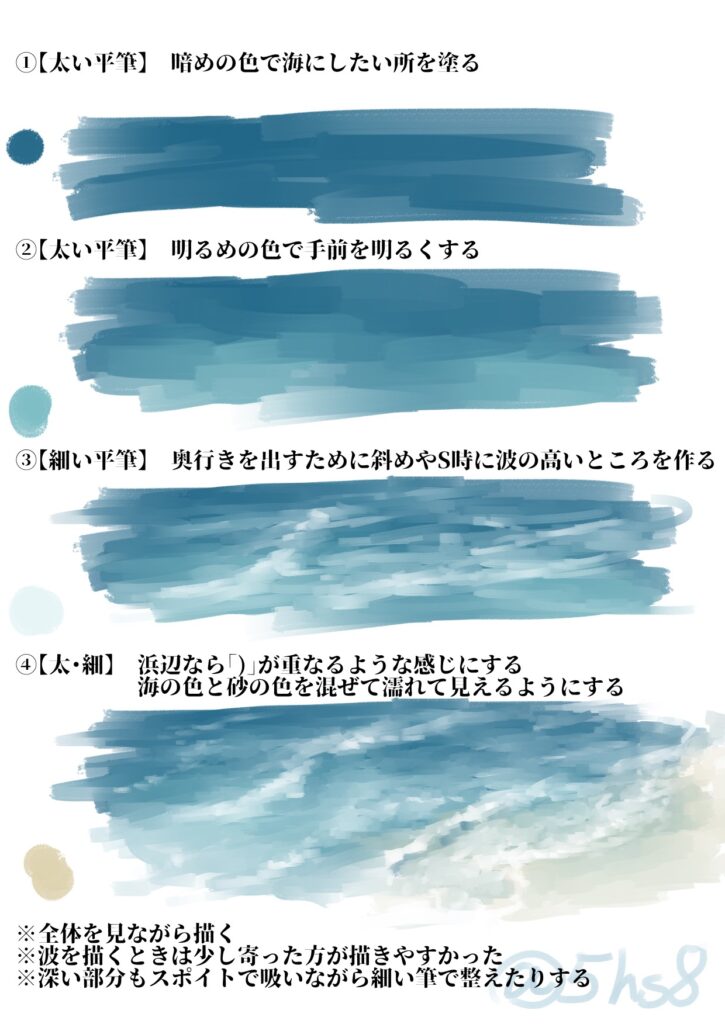
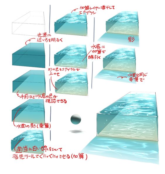
Highlights: The brightest spots on water are specular reflections of the light source (sun, sky). These highlights are small, bright, and concentrated where the surface angle catches the light directly. Don’t overuse—one or a few key sparkles read better than scattered highlights everywhere.
Shadows: Cast shadows from objects (boats, docks, overhanging branches) fall on water surfaces. These shadows follow the water’s contours and are affected by surface movement—a wavy surface breaks up cast shadows.
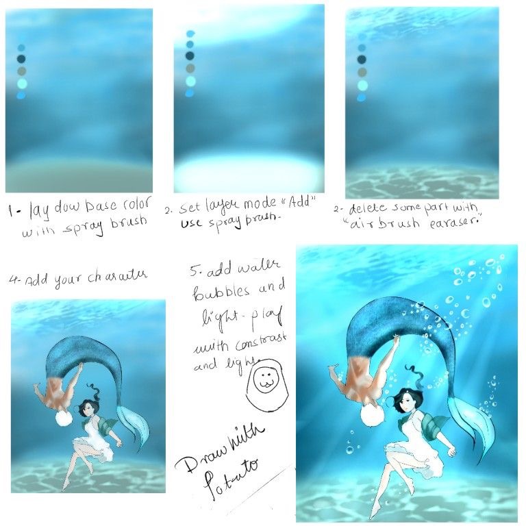
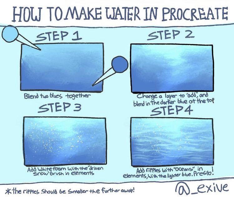
Gradients: Water surfaces typically show gradual value transitions, not sharp jumps. Use blending and soft edges for most transitions, reserving sharp edges for specific situations (foam edges, strong wave crests).
Practice & Improvement
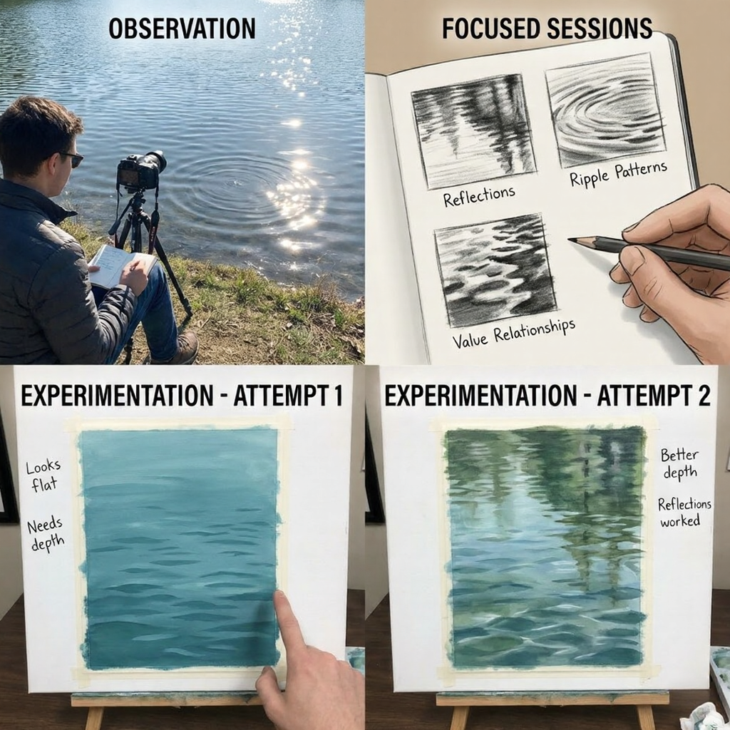
Studying Real Water
Nothing replaces observation. Spend time watching actual water:
- Notice light behavior: How do reflections change as you move? Where does transparency dominate versus reflection?
- Notice movement patterns: What shapes do ripples take? How does wind affect the surface? What happens at obstacles?
- Take references: Photograph and video water in different conditions. Build a reference library for studio work.
Focused observation sessions: Take a sketchbook to water. Don’t try to draw it perfectly—do quick studies capturing specific behaviors: just the reflections, just the ripple patterns, just the value relationships.
Experimentation and Iteration
Every water drawing teaches something. After each attempt:
- Identify what worked: What reads as water? What created convincing depth, reflection, movement?
- Identify what failed: What looks solid, flat, or wrong? Why?
- Try variations: Apply what you learned to the next attempt. Iterate deliberately.
Try different conditions: Calm water, moving water, shallow water, deep water, clear water, murky water. Each presents different challenges and teaches different lessons.
FAQ
Why does my water look solid instead of liquid?
Usually missing transparency or reflection cues. Water needs to show something through it (bottom, depth darkness) or something reflected on it (sky, surroundings)—or both. Pure flat color reads as solid.
How do I know when to show reflection versus transparency?
Viewing angle determines this. Looking straight down: mostly transparency. Looking across the surface at a low angle: mostly reflection. Most compositions fall somewhere between, showing both effects in different proportions across the water surface.
What colors should I use for water?
Water doesn’t have one color—it reflects its surroundings and shows what’s beneath. Start with the reflected sky color and the underwater color (bottom, or depth darkness). Water in a forest reflects green; water under a clear sky reflects blue; shallow water over sand shows tan-gold from below.
How do I draw convincing waves?
Understand wave anatomy: face, back, crest, trough. The face often shows transparency (light passing through). The crest catches light and may show foam. Shadows fall in the trough. Draw the overall wave shape first, then add these specific behaviors.
What’s the most common mistake beginners make with water?
Drawing water as a flat shape instead of an interaction of effects. Water is defined by what you see through it and what reflects off it—the “water” emerges from getting those relationships right, not from coloring an area blue.
Conclusion
When you’re trying to draw water, it’s not just about putting down some blue – that’s not water. Water is this really tricky thing that’s transparent, it reflects light, and it’s always moving – and your drawing has to capture all those qualities at the same time. It’s not about slapping on a flat blue area, it’s about getting the way all these different elements interact right.
The good painters of water don’t have any special tricks up their sleeves – they’re just doing a lot of careful observing and applying the same basic physics that we covered here. To get it right, you need to think about how transparency means you get to see what’s underneath, how reflections show you what’s above and to the sides, and how surface movement affects all those other things. Get it all working together and suddenly water just emerges from your pencil.
This week: Spend 15 minutes just sitting in front of some real water, no drawing involved. Just watch it. Take note of where you see reflections and where you see transparency. Think about how the water’s moving affecting all that. Take a few reference photos to help yourself remember.
Next week: Draw three tiny studies of water ( something around 3 inches by 3 inches) – each one concentrating on just one of those qualities: one that’s all about reflections, one that’s all about transparency or depth, and one that’s just about the movement of the water. Try and isolate the trickiest bits.
Ongoing: Build up a library of reference photos of water in all sorts of conditions – totally calm, really moving, crystal clear, murky, shallow, deep. Every time you try to draw water from scratch, check what you’ve got in that library to make sure you’re getting it right. The best water drawings come from artists who’ve spent a lot of time really watching real water.
Water is one of the most challenging subjects in art, but it’s also one of the most rewarding when it works. That moment when flat paper suddenly reads as liquid—when you’ve created the illusion of something transparent, reflective, and alive—is worth the effort.
Start with a simple still-water scene. Focus on getting the reflection and transparency relationship right. Don’t worry about complex waves or underwater perspectives yet. Master the basics and everything else builds from there.
- 34.3Kshares
- Facebook0
- Pinterest34.3K
- Twitter0
- Reddit0

