Ever felt like your digital product is throwing a tantrum? Buttons change colors on different pages, fonts have a mind of their own, and new features somehow break old ones? If you’re nodding your head, chances are your design system might be the culprit – or rather, the lack of a well-maintained one. These aren’t just minor annoyances; they’re genuine UI/UX headaches that can send users running and drive your development team to distraction.
A design system, in a nutshell, is a complete set of standards, documentation, and components that allow you to build and maintain a consistent user interface. Think of it as the ultimate blueprint and toolkit for your digital product. When it’s humming along, it’s a superpower for efficiency and consistency. When it’s acting up, though, it feels more like a tangled mess of conflicting instructions and rogue elements. But don’t fret! We’re diving deep into these common pain points and, more importantly, how to tackle them together.
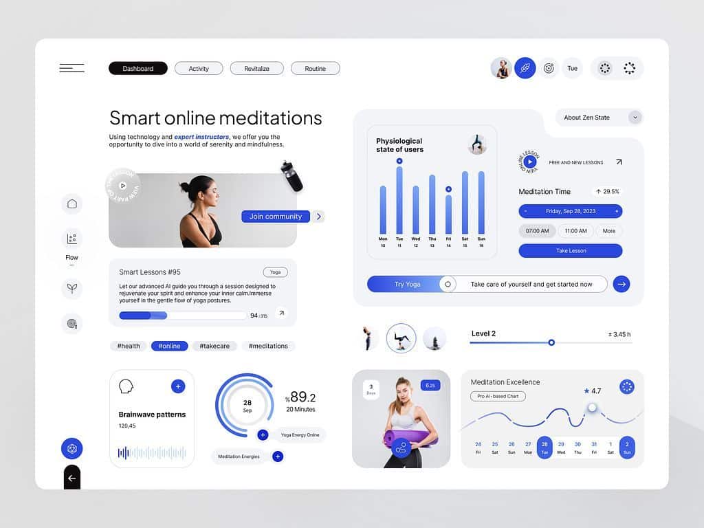
The Silent Saboteur: Inconsistent UI Elements
One of the quickest ways to erode user trust and cause confusion is through inconsistency. Imagine walking into a store where the signs change typeface on every aisle, or the checkout button moves around the screen. Frustrating, right? Digital products are no different. When your UI elements aren’t behaving, it’s a symptom of a larger problem within your design process.
What Inconsistency Looks Like
Inconsistency manifests in many forms, often subtly at first, then growing into a noticeable disjointed experience.
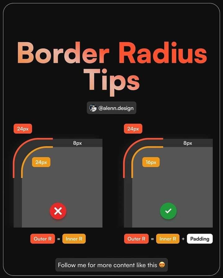
- Buttons: Different shades of “primary” blue, varying corner radii, inconsistent hover states, or even disparate wording for similar actions (e.g., “Submit,” “Send,” “Go”).
- Typography: Multiple font sizes for the same heading level, a mix of serif and sans-serif fonts without clear purpose, or inconsistent line height and letter spacing.
- Spacing and Layout: Padding and margins that vary wildly between components or sections, leading to an unbalanced and amateurish look. Elements might feel too cramped or unnecessarily spread out.
- Color Palettes: Ten shades of gray where three would suffice, or primary brand colors applied inconsistently across various features or platforms.
- Icons: A mix of different icon styles (filled vs. outlined, rounded vs. sharp) that clash and undermine visual harmony.
These seemingly small deviations accumulate, creating a fragmented user experience where users constantly have to re-learn patterns, even within the same application.
The User Experience Impact
The impact of inconsistency goes far beyond aesthetics.
- Cognitive Load: Users expend more mental energy trying to understand what they’re looking at and what actions they can take. This increased cognitive load leads to frustration and fatigue.
- Lack of Trust: An inconsistent interface feels unprofessional and unpolished, making users question the reliability and quality of the product itself. If the UI is sloppy, what about the underlying functionality?
- Slower Adoption: New features or even entire products with inconsistent UIs are harder for users to grasp, slowing down adoption rates and engagement.
- Brand Dilution: Your brand has a visual identity, and inconsistency chips away at it, making your product feel less cohesive and recognizable.
Design System to the Rescue
A robust design system is your secret weapon against inconsistency.
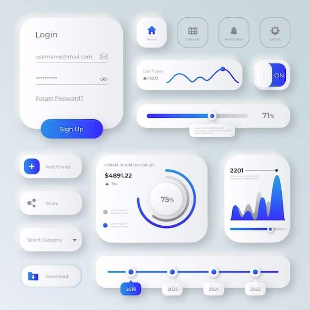
- Component Libraries: This is the core. A library of pre-built, documented UI components (buttons, input fields, navigation bars, cards, etc.) ensures that every instance of a component looks and behaves exactly the same way, everywhere it’s used.
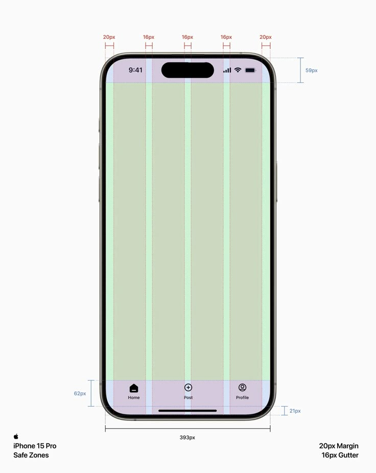
- Style Guides: Comprehensive guidelines for typography, color palettes, iconography, and spacing. These dictate how elements should look and when they should be used, leaving no room for guesswork.
- Documentation: Clear instructions on component usage, design principles, and best practices. This ensures that designers and developers have a single source of truth to refer to, removing ambiguity. Regularly updating this documentation, as explored in articles like a smarter approach to upgrading, is crucial for continuous improvement.
- Design Tokens: Abstract variables that store visual design attributes (like color values, font sizes, spacing units). When you change a token, it updates everywhere it’s applied, ensuring global consistency with minimal effort.
By standardizing these elements, a design system enforces visual and functional consistency, making your product predictable, intuitive, and a joy to use.
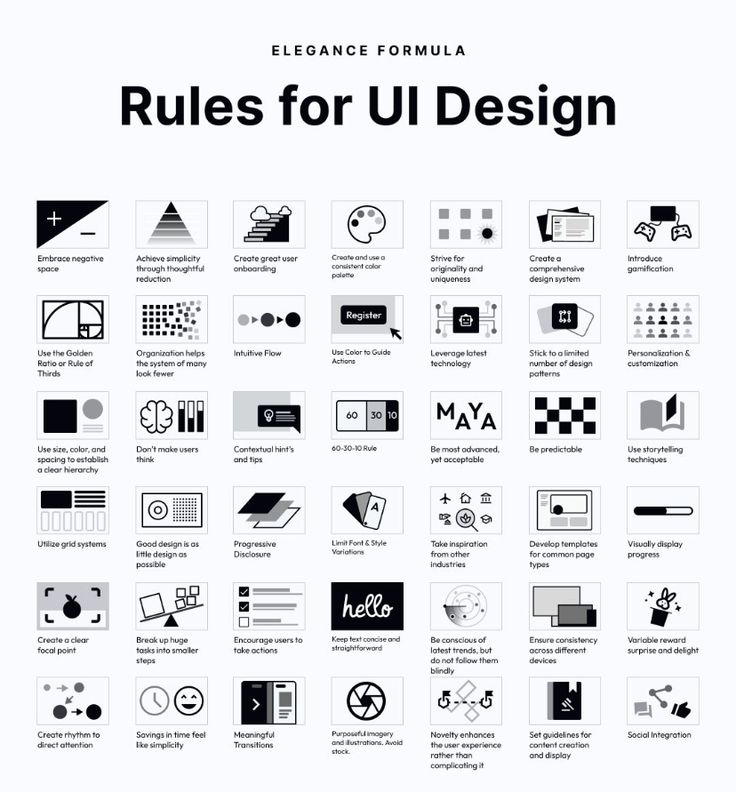
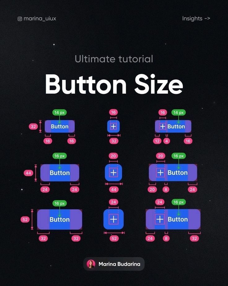
The Communication Breakdown: Designer-Developer Discord
Ever heard a designer say, “It looked perfect in Figma!” only for a developer to reply, “But that’s not how it works in code!”? This classic scenario is a hallmark of communication breakdown between design and development teams. Without a shared language and a clear reference point, misinterpretations are inevitable, leading to friction, delays, and a product that never quite matches the original vision.
Where Things Go Wrong
The gap between design and development often widens due to several factors:
- Interpretation: What one designer envisions as a “subtle shadow” might be interpreted by a developer as a standard box-shadow with a specific, less subtle value, or vice-versa.
- Outdated Specs: Design files might not always be the single source of truth. If a design changes but the documentation or developer story isn’t updated, the developer will build based on old information.
- “It Looked Different on My Screen”: Screen resolutions, operating systems, and browser differences can all lead to visual discrepancies that weren’t accounted for in the design handoff.
- Lack of Shared Language: Designers use terms like “atoms,” “molecules,” and “organisms” (from Atomic Design), while developers think in terms of components, props, and states. Without bridging this linguistic divide, misunderstandings are rife.
The Cost of Misalignment
The consequences of this communication breakdown are tangible and costly:
- Rework: Developers build something, designers review it, find discrepancies, and it goes back to development for adjustments. This iterative loop of corrections wastes valuable time and resources.
- Delays: Rework directly translates to missed deadlines and slower product delivery. Features take longer to ship, impacting time-to-market and competitive advantage.
- Frustration and Morale: Constant back-and-forth, blame games, and perceived inefficiencies can significantly lower team morale and foster a hostile work environment.
- Technical Debt: Quick fixes to bridge design-dev gaps often result in messy, unsustainable code that becomes harder to maintain in the long run.
How a Design System Bridges the Gap
A well-implemented design system acts as the ultimate translator and mediator between design and development.
- Single Source of Truth: Both designers and developers refer to the same set of components, guidelines, and documentation within the design system. The components in the design tool (e.g., Figma) are mirrored by components in the code base (e.g., React components).
- Shared Language: The design system provides a common vocabulary. When a designer says “button primary,” the developer knows exactly which pre-defined button component to use, including its visual styles and interactive behaviors.
- Clear Guidelines and Constraints: The system defines how components should be used, their allowed variations (props), and responsive behaviors. This removes ambiguity and reduces the need for constant clarification.
- Automated Handoff: Tools and plugins within modern design systems facilitate automatic handoff of specs, code snippets, and even live component previews, minimizing manual translation errors.
- Live Component Previews: Developers can access a live library of components, seeing them in action with various states and data, ensuring they match the design intent before writing any code. This unified approach can also inspire creative website design by providing a stable foundation.
By institutionalizing collaboration and providing common ground, a design system dramatically reduces friction, speeds up development, and ensures that the final product truly reflects the design vision.
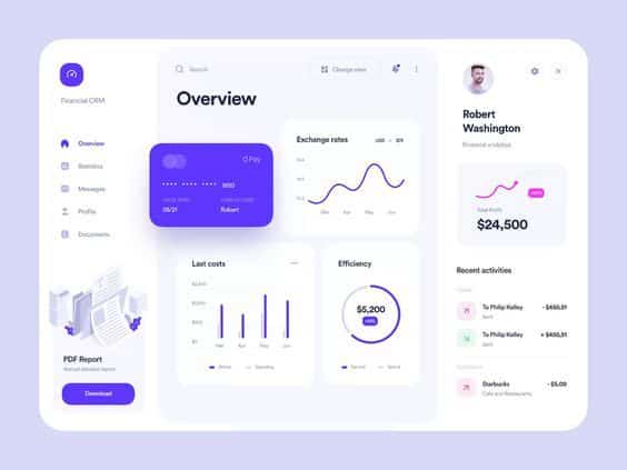
The Bottleneck Blues: Slow Design and Development Cycles
In today’s fast-paced digital landscape, speed is currency. If your design and development teams are constantly bogged down, reinventing the wheel, or struggling with handoffs, you’re losing precious time and potentially missing out on market opportunities. The “bottleneck blues” are a clear sign that your processes lack efficiency, and a design system can be the much-needed unblocker.
Why Your Team is Lagging
Several factors contribute to sluggish design and development cycles:
- Reinventing the Wheel: Without a shared library of components, designers repeatedly create similar buttons, input fields, or navigation elements from scratch. Developers, in turn, write code for these elements over and over again. This duplication of effort is a massive time sink.
- Redundant Tasks: Imagine a team of five designers each spending hours creating slightly different versions of the same modal window. Or five developers each debugging minor CSS inconsistencies across different parts of the application. These redundant tasks add up quickly.
- Lack of Standardization: Without clear guidelines, every new feature or page requires extensive discussions about visual styles, interactions, and accessibility. Decisions are made on the fly, leading to inconsistencies and more rework down the line.
- Inefficient Handoffs: If designers are simply handing over static image files, developers have to painstakingly translate every pixel, spacing, and interaction into code. This manual process is slow, error-prone, and frustrating.
Impact on Time-to-Market
The consequences of slow cycles are severe:
- Missed Opportunities: In competitive markets, being first (or at least fast) to market with new features or products can be a game-changer. Slow cycles mean you’re always playing catch-up.
- Competitive Disadvantage: Competitors who can ship features faster and iterate more rapidly gain an edge, potentially capturing market share and user attention before you can.
- Increased Costs: Time is money. Longer development cycles mean higher operational costs, more person-hours, and a slower return on investment for new features.
- Stagnant Innovation: If teams are constantly focused on maintaining existing code or fixing inconsistencies, there’s less time and energy available for true innovation and exploring new ideas.
Accelerating with a Design System
A design system is a powerful accelerator for both design and development, transforming slow processes into streamlined workflows.
- Pre-built Components: This is the biggest time-saver. Designers can assemble new interfaces by dragging and dropping existing, approved components. Developers can import ready-to-use, tested code components. This reduces design and development time by orders of magnitude. For example, rather than designing a new navigation bar, you pull an existing one from the system.
- Faster Prototyping: With a library of components, designers can rapidly create high-fidelity prototypes, testing ideas and gathering feedback much quicker than building from scratch.
- Efficient Handoff: The design system acts as the bridge. Designers work with components that directly map to coded components. Handoff involves pointing to the system’s documentation and linking to the specific components, rather than generating exhaustive static specifications.
- Reduced QA and Bug Fixing: Since components are pre-tested and standardized, the likelihood of UI-related bugs and inconsistencies decreases significantly, freeing up QA teams to focus on core functionality.
- Scalability: As your product grows, the design system scales with it. New features can be built rapidly using existing components, maintaining consistency across a sprawling product ecosystem. It’s like having a simple home design ideas that are functional and stylish for your digital product.
By leveraging a design system, teams can spend less time on repetitive tasks and more time on solving complex user problems and innovating.
The Accessibility Abyss: Excluding Users Unintentionally
In the quest for beautiful and functional interfaces, accessibility can sometimes become an afterthought. However, neglecting accessibility means you’re inadvertently excluding a significant portion of your potential user base. An inaccessible product isn’t just a poor user experience; it’s a barrier for people with disabilities, a potential legal liability, and a missed opportunity to build a truly inclusive brand.
Understanding the Accessibility Gap
The accessibility gap refers to the barriers encountered by users with various disabilities when interacting with digital products. These can include:
- Color Contrast Issues: Low contrast between text and background colors can make content unreadable for users with visual impairments, including color blindness.
- Keyboard Navigation Problems: Many users cannot use a mouse. If your interface isn’t fully navigable using only a keyboard (tabbing through elements, using arrow keys, etc.), it’s a major roadblock.
- Screen Reader Incompatibility: Screen readers vocalize on-screen content for users who are blind or have severe visual impairments. If elements aren’t properly labeled or structured semantically, screen readers can’t interpret them correctly.
- Lack of Alternative Text (Alt-Text): Images without descriptive alt-text are invisible to screen reader users, making the content inaccessible.
- Insufficient Focus States: If interactive elements don’t clearly indicate when they’re “focused” (e.g., via a visible outline), keyboard users won’t know where they are on the page.
- Poorly Structured Content: Long blocks of text without proper headings, lists, or paragraph breaks are difficult for everyone to read, but especially challenging for those using screen readers or assistive technologies.
The Moral and Legal Imperative
Beyond ethical considerations, there are compelling reasons to prioritize accessibility:
- Inclusive Design: At its heart, accessible design is about empathy and ensuring everyone, regardless of their abilities, can use your product effectively. It’s about designing for the full spectrum of human experience.
- Brand Reputation: Companies known for their commitment to accessibility are viewed more positively. It demonstrates a commitment to social responsibility and broad user consideration.
- Market Reach: Approximately 15% of the world’s population experiences some form of disability. Designing for accessibility opens your product up to a larger market.
- Legal Compliance: Many countries and regions have laws (like the ADA in the US, or the European Accessibility Act) that mandate digital accessibility. Non-compliance can lead to costly lawsuits and reputational damage.
- Improved UX for Everyone: Many accessibility features, like clear headings, good contrast, and keyboard navigation, benefit all users, not just those with disabilities.
Building Accessibility In
A design system offers a unique opportunity to embed accessibility directly into the product’s foundation, rather than treating it as an afterthought.
- Accessibility Guidelines within the Design System: The system’s documentation should include explicit accessibility standards for every component. This means specifying required color contrast ratios, providing clear semantic HTML structures for developers, and dictating keyboard interaction patterns.
- Accessible Components by Default: Each component in the design system (e.g., button, form input, modal) should be built with accessibility in mind from the outset. This includes proper ARIA attributes, focus management, and semantic markup. This pre-built accessibility ensures that any new feature built with these components is accessible from day one.
- Testing Protocols: Integrate accessibility testing into the design system’s quality assurance process. This includes automated checks for contrast and alt-text, as well as manual testing with screen readers and keyboard navigation.
- Education and Awareness: The design system can be a tool to educate designers and developers on accessibility best practices, fostering a culture of inclusive design across the organization. You could even integrate principles from A/B testing in UX to validate accessible design choices.
By making accessibility a core pillar of your design system, you ensure that every new feature and every iteration of your product is inclusive by design, benefiting all users and strengthening your brand’s commitment to equity.
The Maintenance Monster: Outdated and Unused Components
A design system isn’t a “set it and forget it” tool. Like any living product, it requires ongoing care, updates, and strategic pruning. Without this attention, your meticulously crafted system can slowly transform into a “maintenance monster” – a bloated, confusing repository of outdated or unused components that hinder more than they help.
The Problem of Stale Assets
Stale assets and components within a design system can lead to a host of problems:
- Bloat: The system accumulates components that are no longer used or have been superseded by newer versions. This makes the system heavy and slow, both for design tools and developer environments.
- Confusion: Designers and developers struggle to differentiate between active and deprecated components. Which button style is the right one to use? This ambiguity leads to inconsistent usage and frustration.
- Technical Debt: Every unused or outdated component in the codebase represents technical debt. It’s code that needs to be maintained, potentially updated for new browser versions, and tested, even if it’s not actively contributing to the product.
- Performance Issues: A bloated component library can slow down design tools, making the design process cumbersome. For developers, importing unnecessary components can increase bundle sizes, negatively impacting product performance.
Impact on Scalability
A neglected design system quickly becomes a barrier to scalability rather than an enabler.
- Harder to Adapt: When the system is cluttered with old components, it becomes difficult to introduce new design patterns or adapt to evolving brand guidelines. Changes become risky, as it’s hard to tell what might break.
- Inconsistent New Features: Teams might bypass the “official” design system if they perceive it as outdated or too complex, opting to create custom solutions. This leads to new features being built inconsistently, undoing the very purpose of the design system.
- Reduced Trust: If the design system isn’t reliably up-to-date, teams lose trust in it as the single source of truth, leading them back to ad-hoc solutions.
Taming the Monster
Taming the maintenance monster requires proactive strategies and a commitment to ongoing stewardship.
- Version Control: Just like code, design components should be versioned. This allows teams to track changes, revert to previous states if needed, and understand the evolution of each component.
- Regular Audits: Schedule periodic audits of your design system. Review every component: is it still actively used? Is it consistent with current brand guidelines? Is its documentation up-to-date?
- Deprecation Strategy: Establish a clear process for deprecating components. This involves marking them as deprecated, providing migration paths to newer alternatives, and eventually removing them after a defined grace period. Communicate these changes clearly to all users of the system.
- Component Ownership: Assign ownership to specific components or categories of components. This ensures that someone is responsible for their health, updates, and proper documentation.
- Usage Metrics: If possible, track how often components are being used in design files or across your codebase. This data can inform your deprecation strategy and highlight components that might need attention or a refresh.
- Dedicated Resources: Consider dedicating specific team members or even a small team to the ongoing maintenance and evolution of the design system. This isn’t a side project; it’s a critical product in itself.
By actively managing and evolving your design system, you ensure it remains a lean, efficient, and reliable tool that truly scales with your product and your team.
Conclusion
Those nagging UI/UX headaches—the inconsistent buttons, the frustrating handoffs, the slow development—aren’t just annoying; they’re symptoms of a system struggling to keep up. But as we’ve explored, your design system, when properly nurtured and maintained, is the ultimate antidote. It’s the unifying force that brings order to chaos, clarity to communication, and efficiency to your entire product development lifecycle.
By committing to a design system, you’re not just investing in cleaner UI; you’re investing in your team’s sanity, your product’s quality, and your users’ happiness. You’re fostering a collaborative environment where designers and developers speak the same language, where consistency is built-in, and where innovation can flourish without getting bogged down in repetitive tasks.
So, if your design system is acting up, don’t despair. Start tackling those headaches one by one. Invest in your system, empower your teams, document everything, and remember that it’s a living product designed to evolve. When you do, you’ll not only cure those UI/UX pains but also unlock a new level of efficiency, consistency, and delight for your digital products. It’s time to stop reacting to problems and start proactively building a healthier, happier design system for everyone involved. What step will you take today to begin transforming your design system from a source of headaches into your team’s greatest asset?
- 1.6Kshares
- Facebook0
- Pinterest1.6K
- Twitter3
- Reddit0

