Decentralized apps, or dApps, are redefining how people interact with blockchain. As opposed to traditional apps, dApps exist on peer networks and not at a central point of authority, which provides consumers with more security, transparency, and autonomy. But there are times when blockchain’s very complexity defeats mass adoption, and then visual design becomes an essential element. Excellent visual design is easier to use, engenders trust, encourages user engagement, and simplifies cumbersome blockchain processes.
Guiding Principles of Visual Design for dApps
Clarity and simplicity are paramount in app design. Blockchain technology is involved and sophisticated, and users are typically presented with a steep learning curve. Minimizing visual noise and highlighting simple interfaces ease the user’s navigating through the app effortlessly. For example, clear titles and uncomplicated calls to action cancel out errors and confusion.
Consistent UI components and interactions throughout the app do not confuse users. Buttons, icons, fonts, and colour schemes should be consistent with one style guide so users can learn and predict app behaviour. Consistency is also extended to feedback mechanisms, which must be unambiguous to build trust. Users should be informed when they submit, process, or verify transactions so they know the app status and account security.
Moreover, proper points of invitation to buy Solana can also be implemented in the flow without affecting the user experience. The deliberate placement serves the aim of balancing design and utility without overcrowding the user.


Layout and Navigation
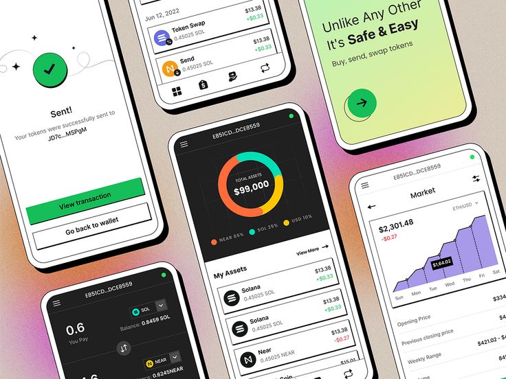
Blockchain workflows are often multi-step, such as wallet connection, transaction signing, and asset management. Developing a simple-to-use navigation pattern that mirrors these workflows is essential. Dashboards, for example, are handy home screens that display important information such as token balances, new transactions, and network status at a glance. Users can access vital information quickly without navigating through multiple screens.
Navigation menus should be clean and well-structured, minimizing the number of clicks to access key features. Responsive design is also equally important since most users access dApps using mobile devices. The design should adapt flawlessly on smaller screens without making navigating difficult, keeping touch-friendly controls and readable text.
Hybrid navigation patterns, such as combining sidebars on desktop and bottom navigation bars on mobile, might achieve peak usability in certain cases. For instance, when moving assets from TON to Solana, users should easily perceive this, as evident in the navigation process, achieving peak fluidity across blockchain protocols.
Visual Components
Visual and icon cues particular to blockchain actions are invaluable in assistively guiding users. The app’s icons for wallets, tokens, transactions, and smart contracts must be immediately intelligible and consistent. For example, a balance wallet icon, a lightning bolt icon for rapid transactions, or a shield icon for security choices can convey meaning instantly.
Data visualization is another robust feature. Token balances, transaction history, and network status charts and graphs make complex data more consumable. Graphs for wallet growth or gas fee trends allow for fact-based decisions. Zoomable and filterable graphs are more engaging and more understandable.
Colour schemes are also crucial for readability and emotional connection. Colours suggesting trust and safety—blues and greens—are typical for financial apps. Contrast is critical for accessibility, ensuring text and icons are visible against backgrounds. Colour coding of transaction status (e.g., pending, confirmed, failed) provides immediate feedback.


Interaction Design
Since blockchain is decentralized, users typically experience delayed transactions distinct from typical app load times. Designing unique feedback and loading states for these delays reduces frustration. Employing progress bars, spinners, or animated indicators to show transaction confirmation status can help manage user expectations.
Permission and security requests are the centrepiece of blockchain applications. Presentation of these notices must be unobtrusive but understandable. Modal dialogues with brief, plain-language labels and clear accept/decline buttons facilitate user training. Visual cues like lock symbols or warning triangles point to security significance.
Onboarding is also needed for novice users who are accustomed to blockchain concepts. Tooltips, walkthroughs, and integrated contextual help educate users without information overload. For example, a tooltip pointing out a gas fee or how to safely link a wallet allows users to interact confidently.
Branding and Theming
An app’s visual identity is highly related to its community and the protocol upon which it operates. Including branding elements such as logos, colour palettes, and typography encourages familiarity and loyalty. Community projects also include theme customization or avatars to enhance user interaction.
Offering dark mode and light mode themes is user-friendly and increases usability. Dark mode, in particular, reduces eye strain over extended use and is popular among technology consumers. Theming must be as smooth and consistent as possible throughout the app to maintain visual consistency.


Accessibility
Inclusivity is needed in dApp development. Accessibility is provided by designing for disabled users and applying best practices such as keyboard usability, screen reader compatibility, and sufficient colour contrast. Providing text alternatives for images and icons will improve usability for visually impaired users.
Multilingual support also expands the user base. Providing locally translated copies of the interface with plain, culturally sensitive translations allows dApps to reach global users. It especially fits in decentralized systems with diverse users.
Case Studies / Examples
Several dApps have successfully utilized strong visual design principles. For instance, Uniswap’s interface is excellent at simplicity and clarity in design. It uses a clean layout and minimal workflows to permit effortless token exchange. Its use of colour-coded states and live updates promotes user trust in blockchain transactions.
An example of this is MetaMask, which facilitates complex blockchain interactions with easy onboarding walkthroughs and responsive design. MetaMask’s security warnings and permission boxes are well-crafted to inform users about risk without overwhelming them.
An example of the latter is Zapper.fi, which uses powerful dashboards to present DeFi holdings over multiple protocols visually. Its visualization and simple navigation set a high transparency and user control standard.
Conclusion
Designing visual interfaces for decentralized apps demands a sensitive balance of simplicity, consistency, and transparency. Placing intuitive layouts, blockchain-conscious visual cues, and responsive design high on the agenda enables users to engage with frequently complex blockchain technology easily. Laying on additional thoughtful interaction feedback, transparent security language, and strong branding enhances trust and community bonds.
As dApps evolve, future trends like augmented reality interfaces, AI-based personalization, and tighter cross-chain interactions will shape the future of visual design. Adhering to today’s best practices, developers and designers can build decentralized applications that not only function but also mesmerize and empower users worldwide.
- 0shares
- Facebook0
- Pinterest0
- Twitter0
- Reddit0


