People think neon and minimalism don’t mix. They’re wrong. Custom neon signs can anchor minimalist spaces when used correctly. It’s about intention, not volume. The design world shifted in 2025 and 2026 toward what designers call “warm minimalism,” which fundamentally changed how neon signs fit into clean interiors.
Cold, gallery-style rooms are out. Today’s minimalist spaces include texture, character, and pieces that actually mean something. This guide covers the practical side of adding a neon sign to your interior design. You keep calm. You keep the space clear. But you add something that matters.
Why Neon Signs Are the Perfect Accent for Minimalist Interiors
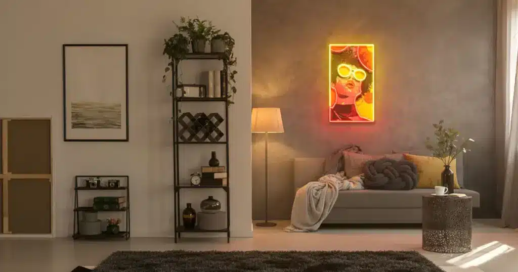
Minimalism doesn’t mean stripping out visual interest. It means removing what doesn’t belong. A well-placed neon sign doesn’t clutter your space. It creates a focal point that draws the eye naturally.
Strip everything else away, and each object gains weight. The glow of neon against neutral walls becomes something you can’t ignore, much like how one piece of art transforms a blank wall or how a plant changes a corner. Neon hits something psychological, too. It feels nostalgic and modern at once, connecting past and present in a way that resonates deeply.
Neon signs create focus without adding bulk. They carry personal meaning and intention. They bridge simplicity with personality. People notice them immediately. They draw the eye and give a room character. Right now, neon signs in interior design align with the shift toward warm minimalism that feels lived-in.
In a minimalist space, you can’t just fill it with things. Everything has to earn its place. A neon sign works because it’s personal. Whether it’s words you actually live by, your initials, or an image that genuinely matters to you, it doesn’t come across as clutter.
It comes across as a choice. And that matters. Design trends have moved away from cold, sparse minimalism. People want rooms that feel intentional but also comfortable.
Designers now blend simplicity with warmth, creating space for neon signs to work genuinely. You’re not slapping neon into an empty room. You’re adding it to a space already built on natural materials, soft textures, and real personality.
Neon Color Temperature: Choosing the Right Hue for Minimalist Spaces

Color choice separates good neon integration from bad; the colors you pick either support or undermine your minimalist aesthetic. Color psychology plays a bigger role than most people realize.
Warm white neon emits a soft glow that pairs well with neutral walls. It doesn’t compete for attention or feel jarring. Soft yellows, blush pinks, pale lavenders; these colors have a calming effect. They work naturally in spaces where you want to unwind. Blue and green do the same thing. Put them in a bedroom or an office, and they create the right mood for rest or concentration.
Warm white neon signs create a gentle glow that complements neutral walls without causing visual noise. Soft yellows, blush pinks, and pale lavenders encourage relaxation psychologically. Blue and green work similarly, making them suitable for bedrooms and offices where you need calm or focus.
Blue suggests trust and calmness. Cool tones like mint green and soft blue feel contemporary and refined, especially against neutral walls or warm wood, and support creativity and focus, which explains why people pair cool-toned neons with workspace setups.
Overly saturated colors like hot pink, electric blue, and bright orange overwhelm minimalist aesthetics. Multiple competing colors in one space contradict minimalist principles.
Many people choose overly saturated neon colors for minimalist spaces, which is a bad move. There’s a balance point: slightly muted or pastel versions of bright colors. Dusty rose instead of hot pink, muted teal instead of neon turquoise. You get personality and presence without the visual punch.
Consider your room’s existing lighting too. If your space uses warm incandescent or soft LED bulbs, pair them with warm-toned neon. If you have cooler LED lighting or natural daylight, cool-toned neon works better. Harmony between light sources creates cohesion and intention.
Strategic Placement: Where Neon Signs Shine in Minimalist Design


Placement decides everything. A neon sign in the wrong spot feels like clutter, regardless of how subtle the color is. The right spot changes a room.
Most effective placements for neon signs:
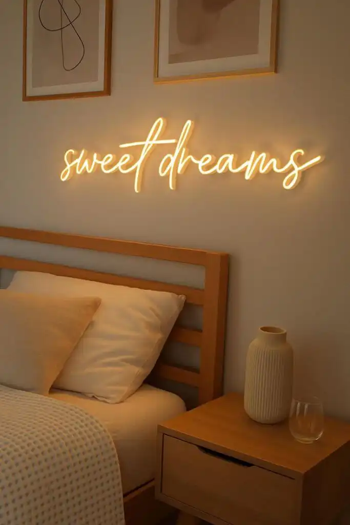
- Above the bed as a headboard alternative or accent
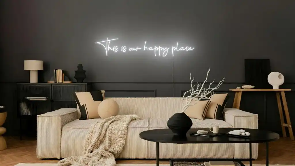
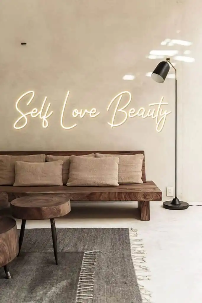
- On a feature wall above the sofa for a focal point
- On the neutral entryway wall to greet people
- On a floating shelf as a decorative accent
- Corners of minimalist spaces for asymmetrical interest
- Above windows or doors for unexpected placement
Above the bed, a soft neon sign creates a personal focal point without consuming physical space. This works especially well in bedrooms designed for calm. Above a sofa, a medium-sized neon sign, usually 24 to 36 inches wide, becomes a conversation piece and natural gathering point.
For smaller spaces, think about corners or shelving. A compact neon sign on a shelf or floating on a mostly bare wall adds interest without cramping the space. The key is to ensure there’s space around it; negative space matters in minimalism. Calm, uncluttered areas should surround your neon.
Standard eye level ranges from 1.6 to 1.8 meters when standing, which draws the eye naturally and creates visual balance. Smaller signs can go higher for an asymmetrical effect. Ceiling height matters too; adjust for rooms under 8 feet or over 10 feet.
Don’t place neon signs directly in high-traffic pathways or where they might compete with other elements. In minimalist design, everything should have its place. Your neon sign should feel like it was always meant to be there.
Neon Signs for Different Minimalist Styles: What Works and Why
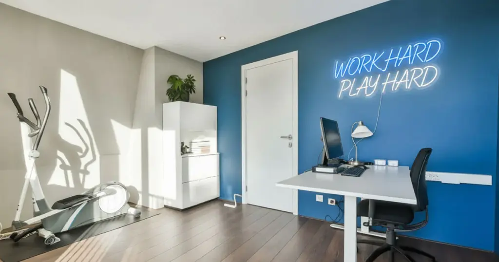
Minimalism isn’t one thing. Your neon signs should complement your specific aesthetic.
Scandinavian Minimalism
Light woods, pale greys, and layered neutrals pair beautifully with warm white or pale yellow neon. The organic warmth of wood complements soft neon tones naturally. A simple word or symbol in warm white feels at home alongside Scandinavian furniture’s clean lines and natural materials.
Neon signs work exceptionally well here because they can be personalized to match your space perfectly. Best choices include warm white neon with natural wood accents, pale yellow for subtle warmth, geometric shapes with clean lines, and simple sans-serif typography.
Japandi (Japanese-Minimalist Fusion)
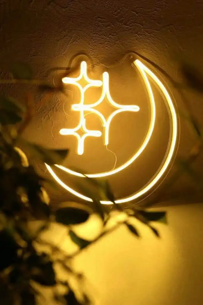
This emerging style blends Japanese minimalism with Scandinavian warmth. Neon signs here should be subtle. Soft pastels or muted tones work best. A simple neon symbol inspired by nature, like a crescent moon or wave, complements Japandi’s intentionality. Use soft pastels and muted color tones, nature-inspired symbols and motifs, asymmetrical placements for an authentic feel, and minimal text or single-word designs.
Contemporary Minimalism
Contemporary minimalism includes clean lines, geometric shapes, and sometimes bold accents. You can lean into softer pastel neons or even more saturated colors. A geometric custom neon design or motivational phrase in a muted jewel tone feels right at home.
Here, you can use geometric and abstract designs, slightly bolder muted colors, modern typography styles, custom shapes and unique forms, and mixed media with neon and wood or metal.
Warm Minimalism (Dominant Trend 2025-2026)
This style keeps minimalism’s clean lines and clutter-free aesthetic while introducing texture, earthiness, and personality. Neon signs should complement the warm, natural palette. Think soft pinks, pale greens, creams, warm whites.
This is the most forgiving context for neon signs, because the overall design is already inviting and personal. Use soft pinks and blush tones, pale greens and sage hues, warm creams and off-whites, natural materials like wood and linen alongside neon signs, and personal quotes and meaningful symbols.
In all these styles, the rule is consistency. If your minimalist space uses a particular color palette, your neon sign should fit within it or serve as a single, intentional pop of complementary color.
Neon Sign Size and Proportion: How to Choose the Right Dimensions

Size matters tremendously in minimalist design. A neon sign that’s too large overwhelms the space and contradicts the minimalist principle of restraint. Too small, and it disappears or feels insignificant.
Size guidelines by room type:
- Bedrooms and small to medium rooms: Aim for 12 to 24 inches in width
- Larger living rooms and open spaces: 24 to 36 inches works well
- Huge walls: Consider 36 to 48 inches rather than exceeding that
- Shelf placements: 9 to 12 inches gives you a decorative element without visual weight
- Entryways and hallways: Tall, narrow designs like 12 by 24 inches work better than wide, short formats
Context matters tremendously. A 36-inch sign on a 10-by-10-foot bedroom wall feels enormous, but the same sign in a 20-foot living room feels proportionate.
Your neon sign should occupy roughly 20-30% of the available wall space. Above a bed, it shouldn’t extend more than two-thirds of the bed’s width.
Above a sofa, align with the furniture scale, not beyond it. On a feature wall, allow ample space around it. A larger neon sign typically looks best when its center aligns with eye level, around 1.6 meters.
Smaller signs can float higher, especially if you’re creating an asymmetrical, intentional look. The point is: it should feel deliberately placed, not randomly hung.
Common Neon Lighting Mistakes to Avoid in Minimalist Design
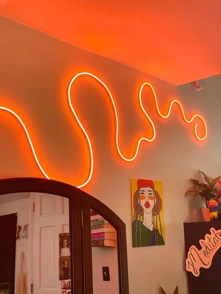
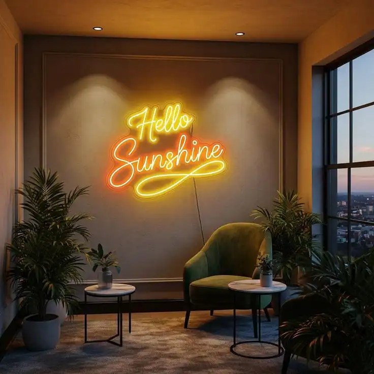
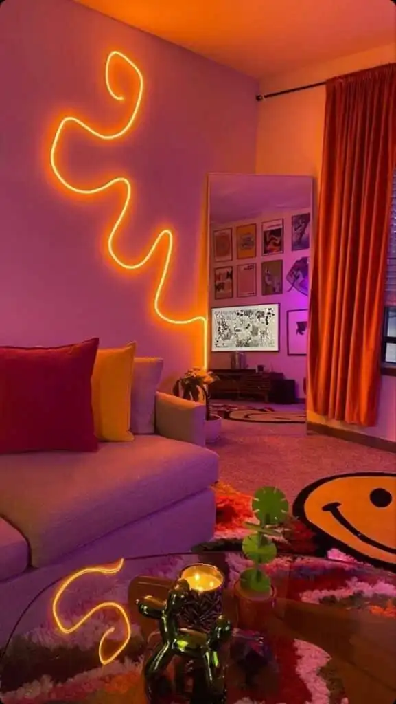
Several pitfalls can derail an otherwise perfect minimalist neon setup. Being aware of them helps you make these decisions confidently.
Mistake 1: Too Many Signs or Colors
The most common error is hanging multiple neon signs in one space. Minimalism thrives on restraint. One thoughtfully chosen neon sign per room is the standard. When you have multiple neon signs in one space, they fight for attention. That’s the opposite of minimalism. And honestly, it weakens what each sign actually means to you.
Mistake 2: Clashing Color Palettes
Think about putting a hot pink neon sign in a room full of cool greys and soft blues. It clashes. The space feels off-balance. Your neon should either work with your existing colors or be the one bold choice you’re making.
Don’t let it feel accidental. Compare your neon color to wall colors before purchasing. Test how colors look at night with lights on and off. Consider the time of day and how natural light affects colors. Match undertones: warm with warm, cool with cool.
Mistake 3: Poor Integration With Other Decor
Placing a neon sign amid clutter negates its impact. In minimalist design, your neon should be surrounded by calm space. If you’re putting it on a shelf, clear the shelf of other items. If it’s on a feature wall, ensure that the wall is relatively bare. The emptiness amplifies the neon’s presence.
Mistake 4: Oversizing for Your Space
A large neon sign in a small room makes the room feel even smaller, like an intrusion. Scale proportionately, and when in doubt, go smaller. Measure wall dimensions before ordering neon signs. Calculate 20-30% of the available wall space. Consider the ceiling height for proportion. Leave breathing room around the sign.
Mistake 5: Choosing Traditional Glass Neon for Interior Use
Glass neon looks beautiful, but it comes with real problems. It breaks easily. You need someone professional to install it. And then you’re stuck maintaining it. LED neon changed that. It’s stronger, doesn’t need special installation, and uses way less power
Why LED Neon Sign Always Wins:
It uses about 10x less energy than glass neon. Safer if you have kids or pets around. You can install it yourself or move it later without calling a technician. Colors are endless; whatever you imagine, you can get. Maintenance is practically nonexistent. And it costs less upfront and over time.
For a minimalist home where durability and quality matter, LED is the obvious choice. You won’t notice the difference visually, especially with soft, warm colors. Both look beautiful. But LEDs actually last. It performs consistently. When you’re investing in something custom, reliability matters.
Mistake 6: Ignoring Room Function
A sharp, bright white neon or electric blue belongs in a creative workspace or office where you need energy. A bedroom? That sign will work against you. You’re trying to sleep. Relaxation spaces need soft colors and warmth that actually support what you’re doing in there.
Different rooms, different colors:
Bedrooms work best with soft pastels, warm whites, or pale blues. Home offices benefit from cool tones when you’re focused, warm tones when you’re generating ideas.
Living rooms suit neutral warm tones that blend with your furniture. Entryways can handle welcoming pastels or warm whites. Creative spaces can push more, bolder muted tones work fine.
Key Takeaways: Neon Signs in Minimalist Homes
It comes down to one thing: intentionality. Every single choice you make should feel like a decision, not an accident. Your neon sign strengthens the minimalist look by adding one clear point of personality. Nothing more. That’s how you avoid clutter.
Quick reference checklist:
- Select one neon sign per room, maximum
- Choose colors that complement or intentionally contrast with the existing palette
- Select a size that equals 20 to 30% of the wall space
- Place at eye level or with intentional asymmetry
- Ensure it is surrounded by space to let it breathe
- Match the neon color to the room function and lighting temperature
- Use LED neon for durability and ease of installation
- Consider the warm minimalism trend for contemporary appeal
- Invest in quality neon signs that reflect your style
Start with your color palette and choose a custom neon sign tone that either complements or intentionally contrasts with it. Please select a size that’s proportionate to your space, roughly 20-30% of the wall it occupies. Place it where it creates natural visual balance, surrounded by space that lets it breathe.
Minimalism in 2025 and 2026 is increasingly warm, textured, and human. Your neon sign fits the trend perfectly. A soft neon glow with real personal meaning makes a minimal room feel warmer. More human. It says something about who you are.
The shift toward neon in minimalist homes reflects something bigger; people don’t want cold, empty rooms anymore. They want spaces that actually feel like home. Spaces where someone lives, not just exist.
Your neon sign is part of that. When you choose it carefully and place it right, it tells the story of the space. Simple, yes. But not hollow. Minimal, but not lifeless. Edited down, but still deeply yours. Neon does something important: it turns a minimal room from sparse into welcoming. From cold into somewhere you want to be.
- 12shares
- Facebook0
- Pinterest12
- Twitter0
- Reddit0
