Yard signs look small but carry a bold mission: deliver messages from passing glances. Great design turns corrugated plastic into a silent persuader through color, clarity, and strategic placement. In neighborhoods and busy corners, they work because they’re part of real life. People see them during real drives in real moments every day. When attention spans are short, yard signs keep marketing grounded in visibility and simplicity. Smart design transforms something ordinary into real influence. Even tiny signs become impossible to ignore when designed strategically.
Yard signs succeed because they meet people where attention already focuses naturally. Drivers pass countless signs daily, noticing very few of them. The ones that catch eyes do so through clear intention. Strategic placement positions signs exactly where eyes naturally look. Color combinations create strong contrast demanding attention. Clear messaging means understanding happens instantly. There’s no time for complexity at thirty miles per hour. Every single design choice serves one primary goal: make people stop and read.
The psychology behind effective signs explains why they outperform expectations. Repetition creates familiarity building trust over time. Seeing the same message multiple times feels legitimate. Neighbors seeing signs influences perception deeply. Local presence signals community support. Yard sign design succeeds by leveraging human psychology. Understanding how minds process visual information transforms decisions. What works in theory produces measurable results.
Simple Shapes, Instant Readability
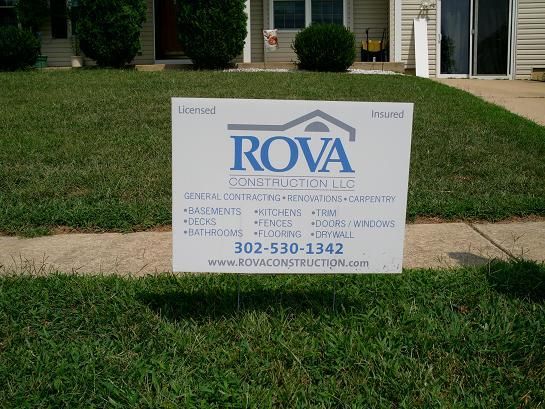
Large type commands attention before smaller elements register. Bold contrast between text and background creates instant hierarchy. Quick comprehension means successful communication in seconds. Busy people won’t stop to read small text. They scan quickly, absorbing main points. Design serves readability above everything else. Simple shapes guide eyes toward messages. Unnecessary elements distract from core ideas. Every choice either serves readability or harms it.
Color selection matters tremendously for visibility and emotion. Certain combinations create urgency; others convey trust. High contrast works best for distance visibility. Red and white create excitement. Blue and white suggest stability. Yellow backgrounds command attention in peripheral vision. Color psychology directly impacts how people respond. Understanding color theory improves design effectiveness. Colors influence behavior, not just appearance. Good color choices spread messages faster.
Typography choices affect how quickly messages register. Sans-serif fonts read faster than decorative styles. Font size relative to viewing distance determines readability. Bold weights stand out better than thin letters. Letter spacing affects legibility at distance. Professional typography demonstrates competence. Poor typography undermines even great messages. Font selection is functional, never merely decorative. Best fonts serve messages while remaining invisible.
Colors That Command a Drive-By


Brand consistency through color creates instant recognition. People associate specific colors with specific brands. Seeing familiar colors triggers brand memories. Consistent color usage builds recognition faster than alternatives. Different colors for different campaigns confuse audiences. Maintaining color palettes across campaigns strengthens identity. Color consistency builds equity compounding over time. Every sign reinforces recognition through repetition.
Visibility science reveals which colors work best outdoors. Fluorescent colors command daylight attention. Reflective elements glow at night. Matte finishes prevent glare reducing readability. Color combinations must work in various lighting. What looks perfect in software performs differently outside. Testing colors in real environments prevents failures. Science guides selection more than preference. Colors perform differently in different contexts.
Environmental factors influence color performance significantly. Shadows cast by buildings affect appearance. Time of day changes color registration. Weather impacts visibility. Surrounding colors influence perception. Professional designers account for environmental variables. Placing signs in optimal light amplifies impact. Understanding context prevents failures. Colors need environmental consideration.
Placement That Multiplies Impact
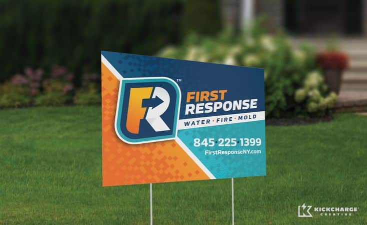
Sightlines determine whether people notice signs. Positioning at natural eye level increases visibility dramatically. Removing obstructions ensures visibility. Understanding traffic patterns identifies locations. High-traffic areas multiply impressions exponentially. Strategic placement matters as much as quality. Visible signs get noticed; hidden signs disappear.
Traffic flow analysis reveals optimal patterns. Drivers see signs best perpendicular to travel. Multiple signs along routes create frequency. Clustered signs suggest momentum. Spacing prevents fatigue. Understanding psychology informs decisions. Strategic distribution maximizes reach. Placement transforms design into results.
Corner locations command premium impact. Drivers turn attention toward corners naturally. Intersection stops provide viewing time. Corner visibility extends multiple directions. High-value locations multiply effectiveness. Investing in corners yields results. Geography guides strategy. Optimal locations produce measurable improvements.
Conclusion
Small footprints deliver huge communication power when designed strategically. Yard sign design combines psychology, art, and physics. Simple signs achieve complex goals through intention. Visibility, clarity, and placement transform plastic into persuasion. Every element serves one mission: deliver messages that stick. Understanding design principles improves results. What looks simple requires sophisticated thinking. Best signs appear effortless while needing careful planning. Investing in quality pays dividends through results. Small signs become loud voices through thoughtful execution and strategic deployment.
- 3shares
- Facebook0
- Pinterest0
- Twitter3
- Reddit0

