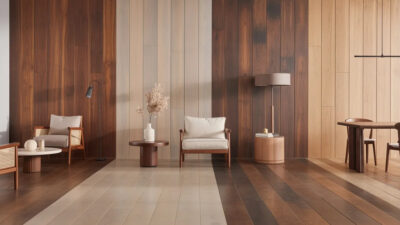
Principles of design in interior design play a crucial role in transforming simple rooms into inviting and functional living spaces. When you understand how concepts such as balance, harmony, and rhythm shape interior layouts, you gain the skills to craft environments that feel purposeful and aesthetically pleasing. Designers and students like you often begin by studying these core guidelines, then integrate them into various projects, from cozy residential designs to large commercial layouts.
Learning these principles offers several benefits. It helps you:
- Create a consistent look across different rooms or zones.
- Focus on how each decorative element interacts with others to maintain visual flow.
- Adapt traditional guidelines to modern trends such as open-concept floor plans, which require cohesive transitions among functional areas.
- Avoid overwhelming design choices that clash visually and distract from your main focal points.
When you apply the principles of design in interior design, you elevate your professional skill set. As a result, you can create designs that not only look stunning but also serve the practical needs of the people who interact with them daily.

Focus on balance
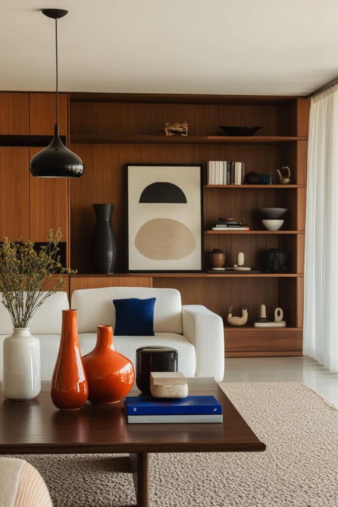
Balance is one of the first principles you address when planning an interior. It involves distributing visual weight in a way that brings stability to a room. Elements such as furniture placement, color distribution, and decorative pieces can affect the perception of balance. According to design experts at Vera Iconica, achieving visual equilibrium helps people feel more comfortable and calm in the space.
Types of balance
Symmetrical balance
This type occurs when you place items in a mirrored arrangement on either side of an imaginary center line, such as two matching sofas or chairs facing each other. It conveys a sense of tradition, order, and calm. Symmetry is often used in more formal design settings, and it can give your room an immediate feeling of harmony.Asymmetrical balance
Here, you achieve equilibrium by pairing objects of different shapes, sizes, or textures while still maintaining an equal perception of visual weight. For example, you could balance a large painting on one wall with a cluster of smaller pieces on the opposite wall. This approach feels more dynamic than strict symmetry, offering an engaging sense of flow and modernity in the space (Alma de Luce).Radial balance
Radial balance centers design elements around a focal point, such as a round table with chairs arranged around it. By radiating out from a central area, you draw attention to a specific place while emphasizing a sociable, intimate layout. This style of arrangement can be perfect for dining areas or parlors, providing an inviting look that naturally sparks conversation.


Tips for creating balance
- Place large or bold items thoughtfully. One oversized statement piece might need multiple smaller elements elsewhere for contrast.
- Spread color evenly around the room. If you have bright red cushions grouped on one side, add a red vase or accent piece on the opposite side to balance the color.
- Keep traffic flow in mind. Even a balanced design can feel awkward if movement within the space is restricted.
Embrace harmony and unity
Harmony and unity are closely connected, focusing on how each piece in your design complements the others. This principle ensures your space feels complete rather than disjointed. As Srote & Co notes, unity arises when all design elements work together, whereas harmony involves ensuring those elements share enough common traits—such as color, pattern, or texture—to create a sense of oneness.
Why it matters
- Continuous flow: When you use a consistent color palette or materials, you make it easier for the eye to move throughout a room and appreciate the overall design rather than fixating on mismatched elements.
- Cohesion in open layouts: In modern construction, large open spaces are more common. Employing harmony and unity helps you avoid an overwhelming or confusing visual experience by linking areas together through carefully repeated hues, patterns, or textures.
- Balanced personality: A unified space doesn’t mean it is dull. You can still showcase personality through accents, statement furniture, or artwork, as long as the rest of the design shares unifying characteristics.
Strategies for unity
- Choose a core color palette of three to five colors and repeat them in varying shades or intensities throughout the space (Havenly).
- Incorporate complementary textures, such as mixing smooth surfaces with soft fabrics, but keep one or two textures dominant to maintain cohesiveness.
- Unify decorative patterns through a shared color scheme or motif, which prevents clashing details and fosters continuity.
- Add personality with pops of color or statement pieces. Just ensure they contrast in a way that highlights—rather than disrupts—your overall theme.
Create a strong rhythm
Rhythm is about guiding your eye through the space, much like the regular beat in a piece of music. In interior design, rhythm emerges from the variation or repetition of design elements: color, patterns, shapes, lines, or textures. It ensures your room feels dynamic instead of static. According to Minotti London, rhythm in interior design involves organized movement around a space.
Techniques to establish rhythm
Repetition
By repeating the same color, shape, or texture across the room, you provide visual pathways that help the eye move smoothly. For example, a set of framed prints with the same color scheme or repeated architectural details, such as ceiling beams, can reinforce repetition.Gradation
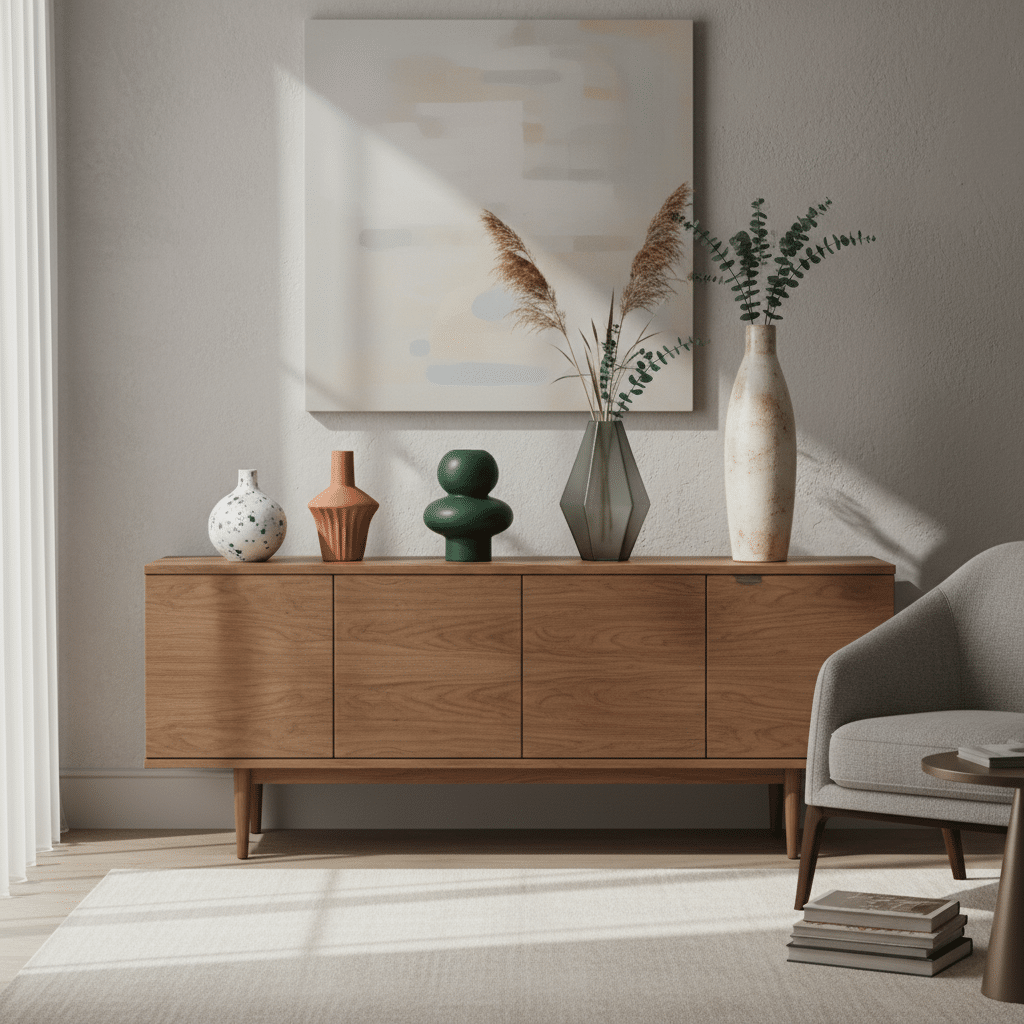
Gradation uses a sequence of elements that gradually change in size, color, or pattern. For instance, you might display a collection of vases in ascending or descending height. This arrangement encourages the viewer’s eye to follow the progression.

Transition
Transition allows the eye to glide from one point to another, typically through architectural features such as curved doorways or arched molding. Curves and fluid lines essentially escort your gaze along a gentle path, connecting the room’s focal points.Contrast (or alternation)
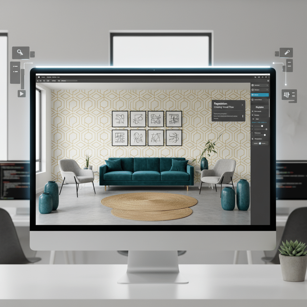
Using contrasting elements rhythmically can keep your design both interesting and organized. For example, you might alternate large and small patterns on cushions along a sofa, or alternate color blocks on a wall design.
When you layer these techniques, you create a visually appealing environment that retains attention. If you want a deeper dive into essential design fundamentals that overlap with rhythm, consider exploring our guide to the basic principles of design.
Use proportion and scale
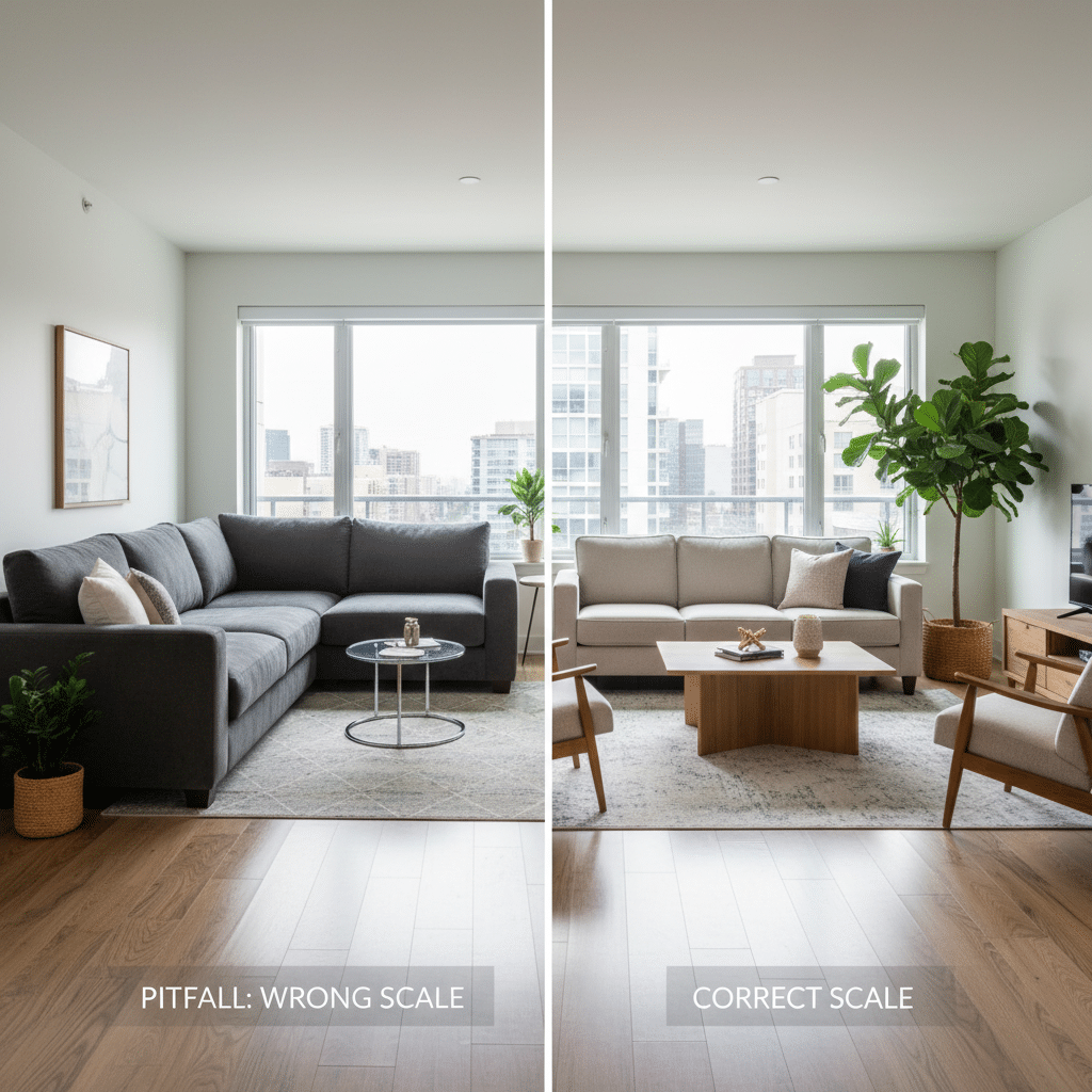
Proportion and scale determine how the size and shape of objects relate to each other and to the overall space. A petite coffee table can look lost in a large living room, while oversized chairs can feel cramped in a small den. Interior design professionals often refer to the Golden Ratio as an ideal standard for layouts, but in practical terms, you simply want to ensure that no piece looks too large or too small for its surrounding environment (Kathryn Interiors).
How to achieve the proper proportion
- Measure furniture against room dimensions. If you have high ceilings, you can opt for taller shelves or large artwork without overpowering the space.
- Combine a mix of different object sizes for variety, but ensure at least one visual link, such as color or style, to maintain unity.
- Use furniture groupings that reflect a clear relationship. For example, pair a larger sofa with two equally tall armchairs instead of one short accent chair, so you don’t disrupt the visual balance.
- Keep traffic flow in mind. Extra space around furniture ensures that even larger statement pieces don’t undermine function.
Proportion and scale aren’t just about big or small. They also involve the relationship between the dimensions of each item—its height, length, and depth. By checking these relationships, you avoid crowding or visual chaos.
Spotlight emphasis carefully
Methods to create emphasis
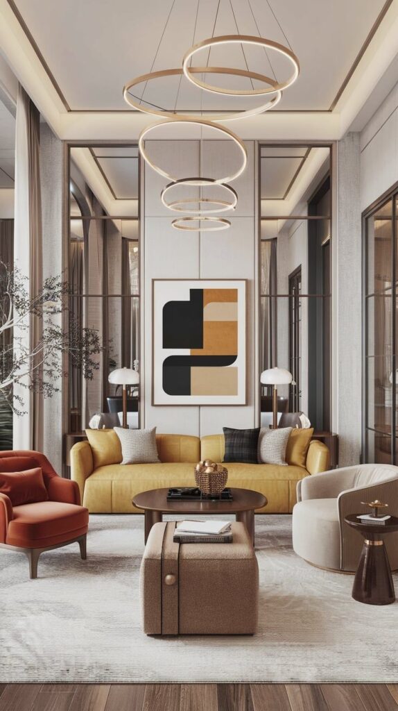
Emphasis ensures that there is a focal point drawing immediate attention when someone enters the room. This might be a fireplace, a striking piece of artwork, or even a large window with a scenic view. When you highlight one element as the centerpiece, you help direct movement through the room and tell a visual story.
- Color pop: Paint a single wall in a contrasting color or place a vibrant rug in a neutral-toned room.
- Unique furniture: Position a standout piece—like a sculptural coffee table or a vintage armoire—to capture immediate attention.
- Lighting: Install accent lights such as spotlights or wall sconces around the focal area for added drama.
- Architectural frames: Use decorative trim, columns, or built-in shelving to frame an important feature—like a fireplace mantel—and ensure it stands out.
Always balance your chosen focal point with complementary elements. Too many highlights can dilute the overall impact, leading to a cluttered or confusing look.
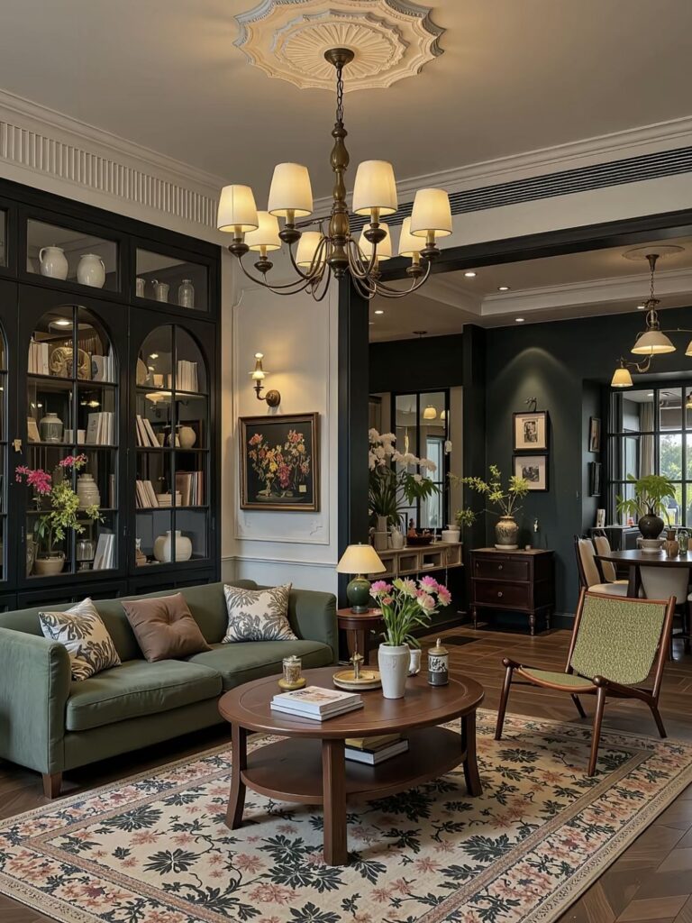
Play with contrast
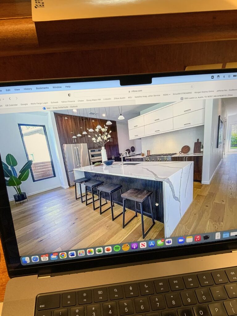
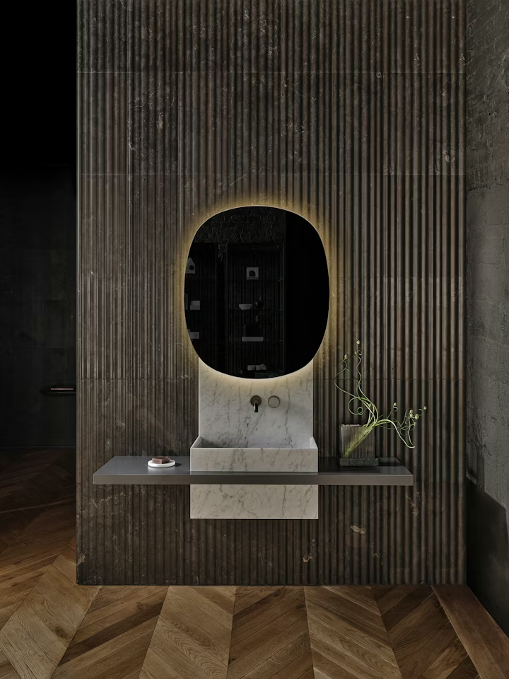
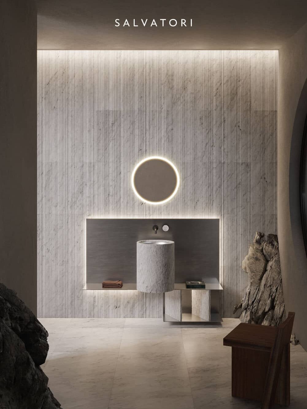
Contrast is the principle of placing different elements side by side to create an engaging visual effect. These elements might differ in color, texture, shape, or material. For instance, pairing a marble countertop with a wood backsplash can create a striking contrast that emphasizes each material’s unique qualities (Salvatori).
Effective ways to use contrast
- Color pairs: Choose complementary or opposite shades on the color wheel—for example, black and white or blue and orange—to make your design pop (Designers Mark).
- Material mixing: Combine smooth glass elements with rough-textured fabrics or polished metals with reclaimed wood for a modern-rustic vibe.
- Form variation: Bring in round objects alongside sharp, linear shapes to prevent a monotonous design. A circular mirror above a rectangular console table can serve as a focal arrangement.
- Positive vs. negative space: Ensure you balance filled and empty areas. Dense furnishings with no open space can feel overwhelming, while too much bare space may look sparse.
When layering contrast, try not to go overboard. Contrasts should enhance your design, not create visual chaos. You can learn more about broader visual composition techniques used in other creative fields by checking out our overview of design principles in graphic design.
Note important details
Details might be the smallest principle, yet they have a substantial impact on how your space feels overall. Think about patterns in upholstery, trim on cushions, or the hardware on cabinet doors. These nuanced elements can tie entire themes together.
Types of details
- Texture: Throw pillows, rugs, and draperies add softness and warmth or sleekness and modernity, depending on the materials you use.
- Pattern: Subtle patterns on curtains or wallpaper can enhance your color scheme. Try repeating the same motif in multiple areas for a unifying effect.
- Hardware: Even small things like drawer handles or light switch plates can act as decorative statements.
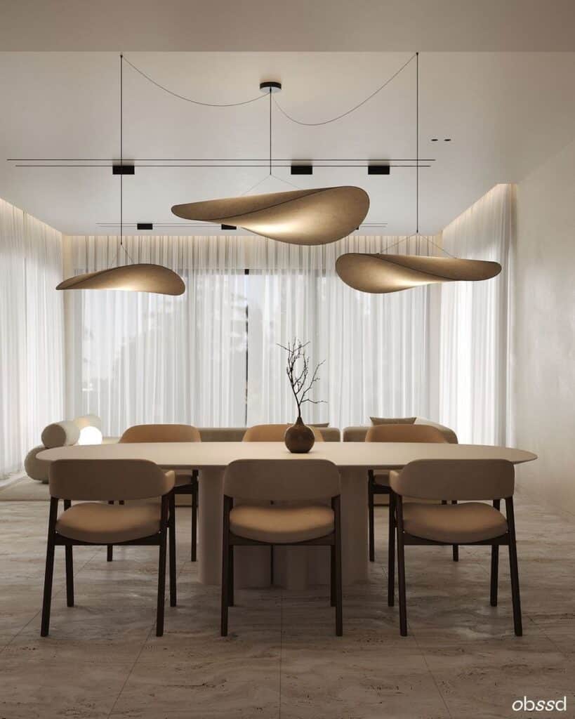
- Lighting fixtures: Chandeliers, pendants, or sconces can double as functional art. Matching metal finishes in different fixtures introduces consistency.
Details require thoughtful curation. They often represent your final design touches, so try to ensure these small items enhance the space rather than distract from major elements.

Avoid common pitfalls
Even when you understand each principle, it’s easy to slip into common missteps. The good news is that these mistakes are often simple to correct once you know how to spot them.
Excessive repetition or symmetry
Too much repetition can lead to monotonous interiors. Similarly, overly formal symmetrical arrangements might feel stiff instead of welcoming.Cluttered focal points
If you emphasize too many features—such as artwork on every wall, multiple bold prints, and strong accent colors—you risk creating a chaotic effect. Choose one or two standout elements and let them shine.Ignoring scale
Furniture that is too big for a room can limit movement, while miniature decor in a vast space looks lost. Always measure and visualize how items will fit relative to each other.Neglecting negative space
Leaving some areas empty is vital. A lack of breathing room causes your design to appear cramped, while thoughtful empty areas make your accent pieces more prominent.Forgetting to unify
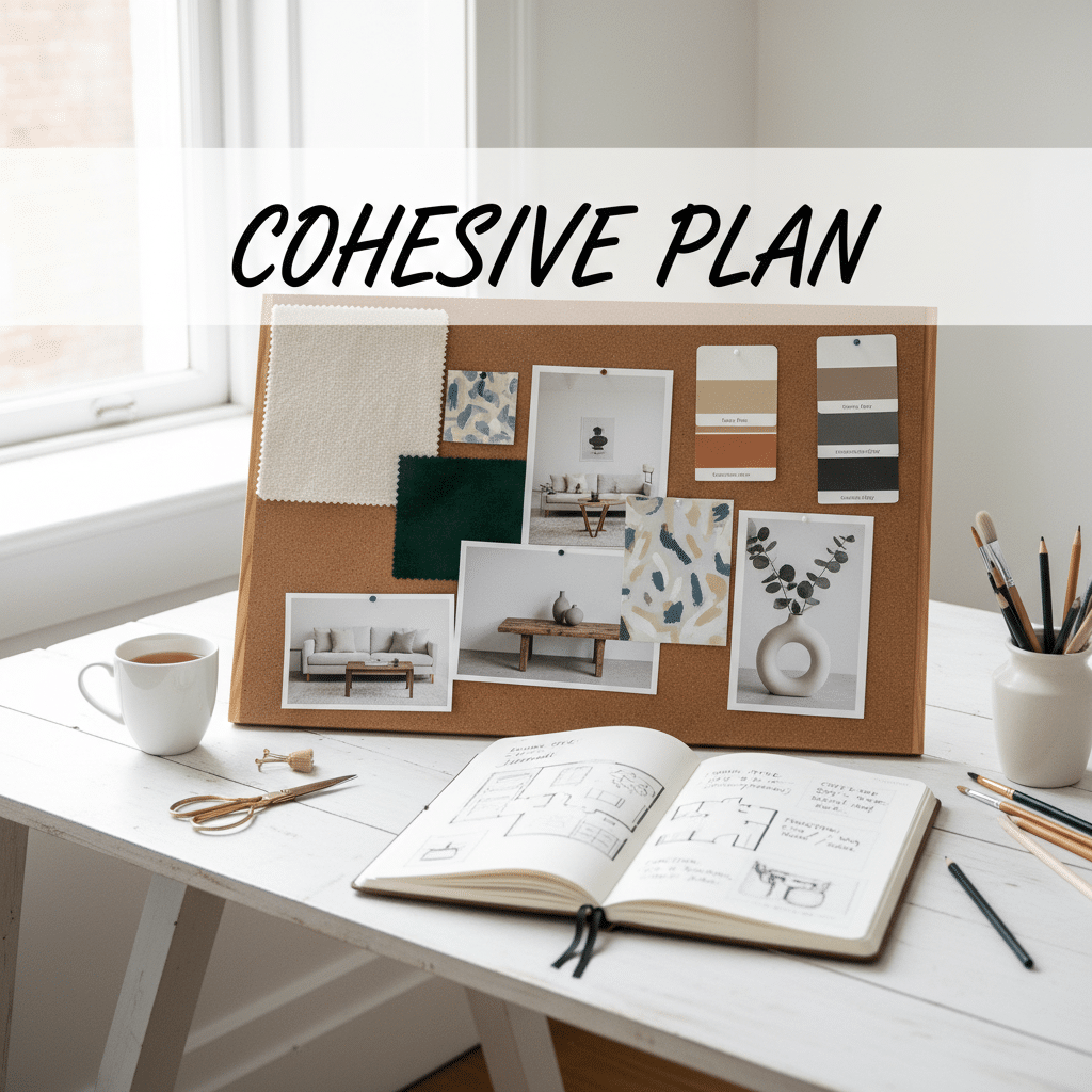
Mixing many styles to showcase variety can be fun, but if there’s no design thread tying them together—like a repeated texture or color palette—your space may feel disjointed.
You can build confidence in your overall design by checking each principle throughout the process. If you need more foundational insight into these overarching rules, consider our helpful overview of principles of design. You can also explore principles of visual design to understand how visual elements interconnect beyond the scope of interiors.
Frequently asked questions
How many principles of design should I prioritize first?
Start with the core principles—balance, harmony, and rhythm. As you become more comfortable, you can incorporate scale, emphasis, contrast, and details. Practicing in phases helps you master each principle without feeling overwhelmed.Can I mix multiple themes in one room?
Yes, but you need an overarching concept to keep the design cohesive. Look for ways to unify different themes with a shared color palette or repeated textures so the room doesn’t feel scattered.How do I choose the right focal point?
Look for natural conversation starters in the room—like a fireplace or a large window with a view. If none exist, introduce a strong piece of furniture or artwork. Then, reinforce it with lighting and smaller accent pieces that draw the eye toward that area.Is it necessary to paint all walls the same color for unity?
Not necessarily. You can still achieve unity with an accent wall or varied hues, as long as those colors relate to each other with coherence in tone. Repetition of key colors in artwork, pillows, or rugs can help tie different wall colors together.What is the best way to handle open-concept spaces?
Define zones through rugs, furniture groupings, or visual dividers like accent walls or partial partitions. Apply a consistent color scheme and repeating design elements—like similar light fixtures—to link each zone into one cohesive interior.
By integrating these principles of design in interior design—balance, harmony, rhythm, proportion, emphasis, contrast, and detail—you ensure a strong foundation for any space you plan. When you let these guidelines inform your decisions, you can curate environments that look beautiful, feel purposeful, and cater to the unique needs of anyone who steps inside.
- 793shares
- Facebook0
- Pinterest793
- Twitter0
- Reddit0


