Why principles of design matter
When you use the principles of design effectively, you transform your projects into visually compelling experiences. These guidelines—from balance and movement to contrast and unity—help you engage your audience, communicate your message clearly, and keep your designs organized. Whether you’re creating a poster or planning an interior layout, understanding these principles sets a solid foundation for creativity and problem-solving.
Explore the core principles
Below are some of the major principles of design you can apply to just about any project. Each one works in harmony with the others, so try mixing and matching them to find the perfect look and feel.
Balance
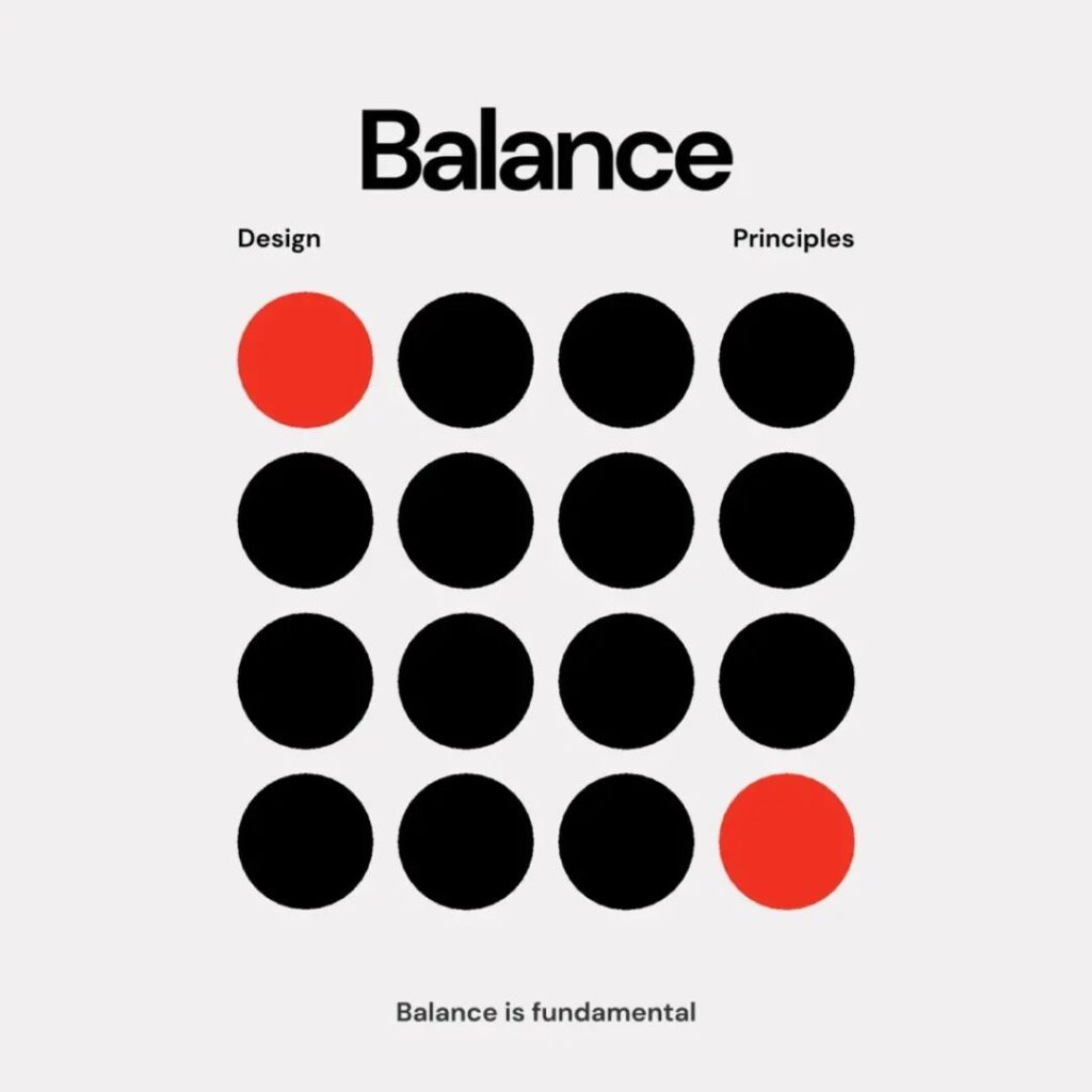
Balance is all about distributing your design elements in a way that feels steady. Picture symmetrical balance, where objects mirror each other around a central axis, or asymmetrical balance, where different-sized items still feel stable because of their placement. Sometimes, you’ll see radial balance, where elements radiate from a center point.
- Tip: Keep an eye on spacing, color, and size to ensure each part of your composition gets its fair share of visual weight.
- According to the UC Berkeley Library Guides, balanced designs can be spotted everywhere from architecture to photographs of animals.
Emphasis
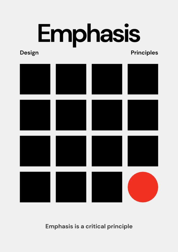
Emphasis tells viewers where to look first by making a focal point stand out. You might use a bold color, a large shape, or a unique texture to call attention to that spot.
- Tip: Start by choosing which element is most important—maybe it’s a headline or a central figure. Then, make it pop with contrast or size differences.
- For more on prioritizing key design aspects, check out the concept of hierarchy mentioned in Figma’s resource library.
Movement
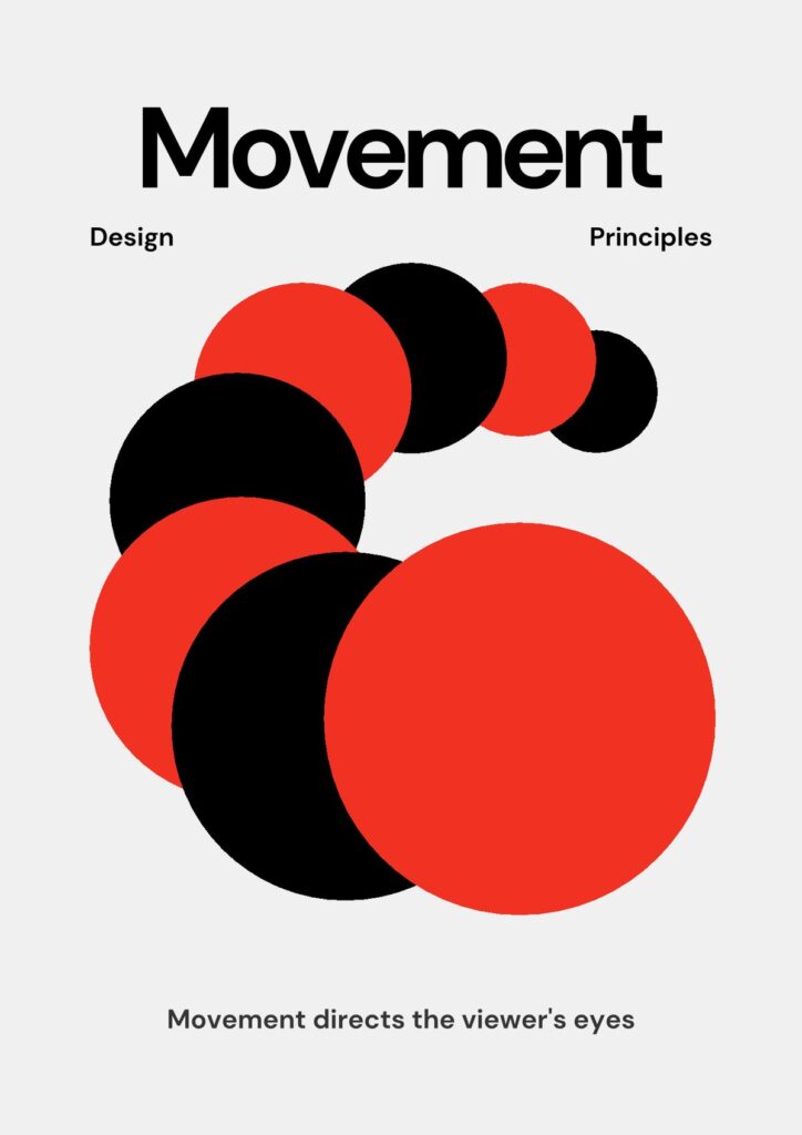
Movement is the path your eyes take across a design. Even static images can suggest motion or guide you in a specific direction.
- Tip: Arrows, lines, or curving shapes can gently lead the viewer’s gaze where you want it to go.
- As described by the UC Berkeley Library Guides, movement can be implied through gestures, meandering lines, or repeated arrows.
Proportion
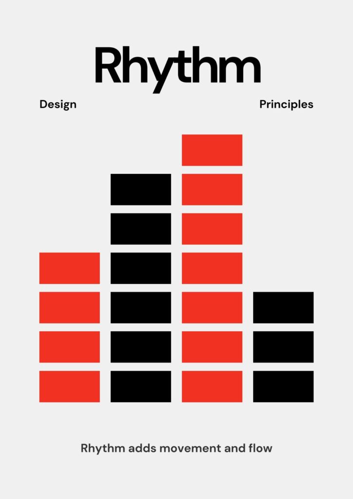
Proportion refers to how the size of each element compares with others. When proportions feel off, your design can seem confusing or overwhelming.
- Tip: Use scale (larger or smaller elements) to give emphasis to important areas. For instance, bigger text might highlight a headline, while smaller text recedes into the background.
Contrast
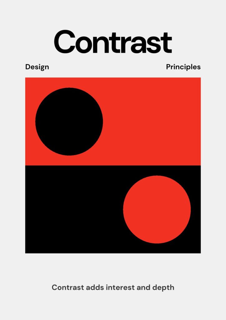
Contrast highlights differences—light vs. dark, large vs. small, or bold vs. thin. You can leverage contrast to make elements stand out and improve overall readability.
- Tip: Using contrasting colors, shapes, or even fonts can draw attention where it’s needed most.
- According to Toptal, contrast also enhances accessibility for viewers with visual impairments.
Repetition and pattern
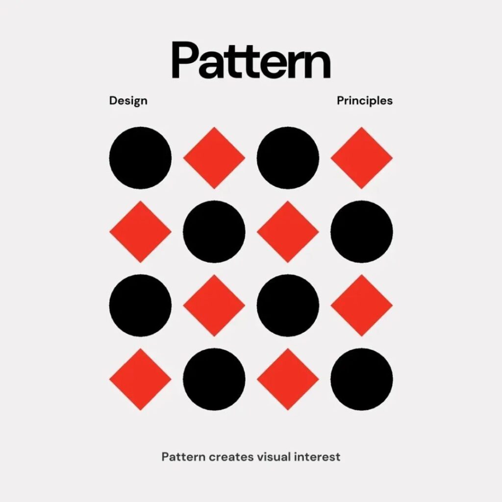
Repetition and pattern add rhythm and consistency, making your design feel cohesive. Icons, colors, or fonts repeated throughout a layout strengthen visual unity.
- Tip: Alternate patterns or color variations to avoid monotony, but keep enough repetition that your design still feels connected.
- If you’d like to explore repetitive elements in branding, consider looking at design principles in graphic design for more insights on maintaining clarity and consistency.
Alignment
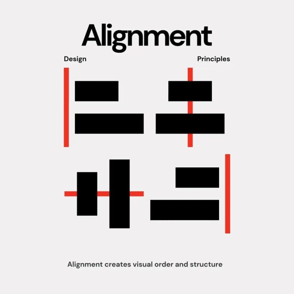
Alignment arranges your elements so everything feels connected. Items aligned along a common edge or center often look cleaner and more professional.
- Tip: Grids can help keep your elements in check. A neat grid system can easily tackle alignment, margin, and spacing issues.
- For additional examples, you can refer to basic principles of design to see how alignment fits into other foundational concepts.
Unity
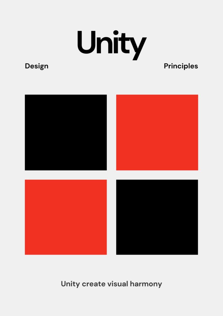
Unity ties all parts of your design together, giving a sense that each element belongs. Use consistent color schemes, spacing, and textures to achieve it.
- Tip: Check for consistency across your design—does the color palette drift in strange ways, or do fonts clash? Keeping them aligned ensures your layout looks polished.
- For even more ways to unify your overall composition, you might look at principles of visual design.
White space

White space (or negative space) is the empty area surrounding and between your elements. It might sound bare, but it can be your design’s best friend.
- Tip: Embrace breathing room so the viewer has a clear path to the most important parts of your design.
- As Toptal points out, white space keeps your project from becoming cluttered and makes it easier to read.
Putting principles to work in your projects
You’ve got the principles, now it’s time to apply them. Suppose you’re redesigning a website banner. You could balance headlines on one side with an eye-catching image on the other (balance), highlight main text in bold colors (emphasis), and leave enough white space around the edges to avoid clutter. If you’re interested in broader applications, check out our guide on principles of design in interior design for ideas on scaling these concepts beyond just graphics.
Experiment with different approaches. If something feels off, adjust the scale, switch up the alignment, or refine your color palette. Continually stepping back to see if each principle is in play can make a huge difference in the final outcome.
Frequently asked questions
What are the principles of design?
They are guidelines that help you arrange elements—like color, shape, and typography—in a way that looks great and communicates effectively. Common principles include balance, emphasis, movement, contrast, proportion, repetition, alignment, unity, and white space.
Why are principles of design important?
They bring order and clarity to your projects. By applying these rules, you help viewers quickly grasp your message without feeling overwhelmed. This is especially crucial in fields with heavy visual communication, such as graphic design and interior design.
How do I choose which principle is most important?
It depends on your design goal. For example, a large poster might rely on bold contrast and alignment, while a soft, conceptual website design might lean more on movement and white space. Focus on what best serves your main objective.
Can I mix multiple principles in one design?
Absolutely. In fact, most successful pieces combine several principles. For example, you could use asymmetrical balance alongside strong contrast and strategic repetition. Just make sure everything feels cohesive.
Where can I learn more about the principles of design?
You can check out resources from Art With Trista or Interaction Design Foundation for in-depth guides, lessons, and examples. These can help you apply each principle through real projects and case studies.
Try incorporating one new principle of design into your next project—perhaps bold contrast or a cleaner alignment—and watch how it transforms the final look. Over time, you’ll naturally integrate all these concepts, and your designs will become more engaging and professional with each iteration. Happy creating!
- 26shares
- Facebook0
- Pinterest26
- Twitter0
- Reddit0


