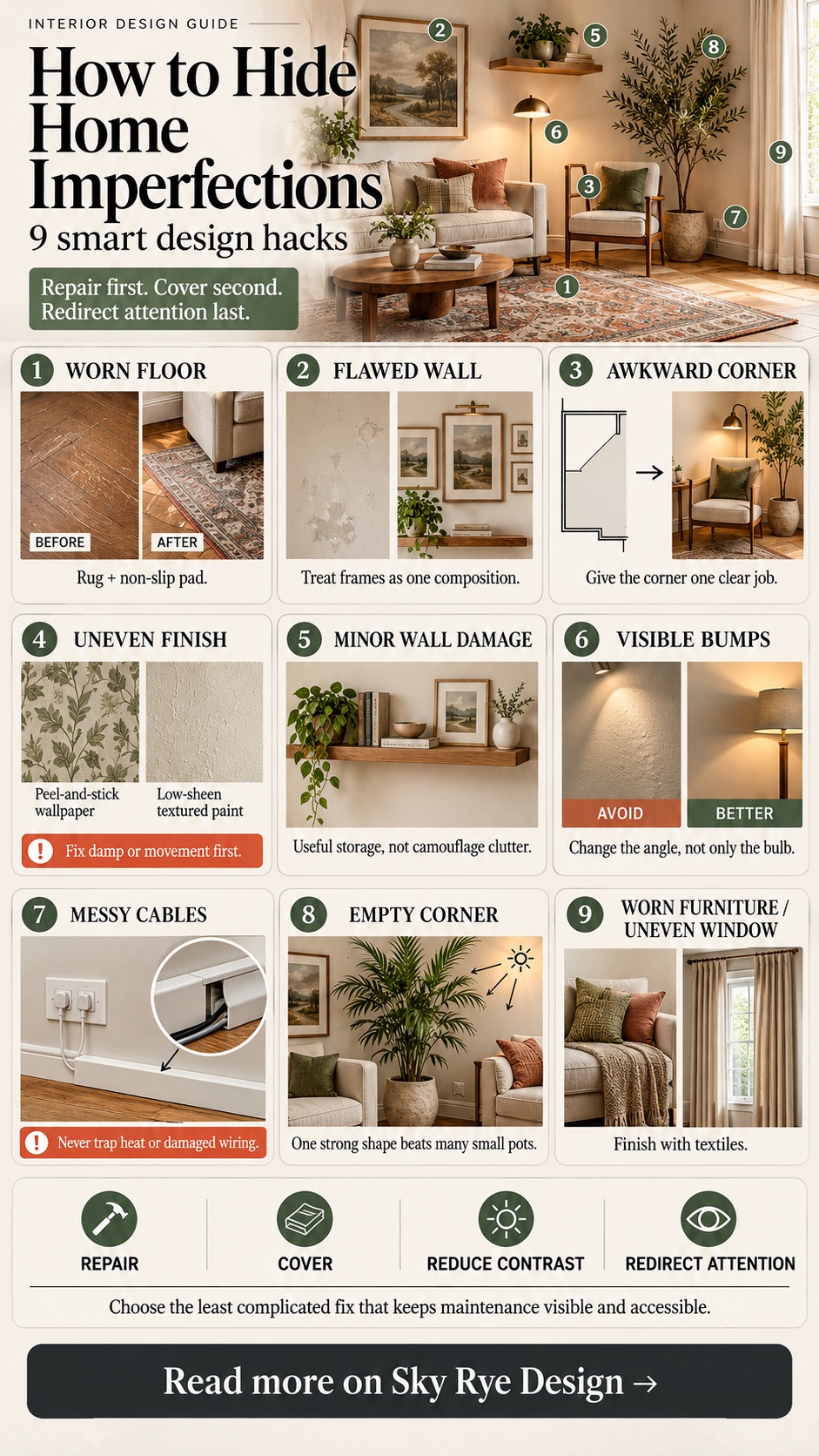
The best way to hide home imperfections is to decide whether the problem should be repaired, covered, or visually de-emphasized. A rug can disguise a harmless floor stain, art can balance a patched wall, and a tall plant can make an awkward corner feel intentional. None of those is a substitute for fixing moisture, movement, unsafe wiring, or structural damage.
My design rule is simple: first remove the cause, then reduce contrast, and only then add a focal point elsewhere. That order keeps a quick styling fix from becoming clutter. The nine ideas below work for renters and homeowners because each one has a specific job, a scale check, and a point at which you should stop decorating and call the right professional.
How to hide home imperfections at a glance
| Imperfection | Best design fix | Check first |
|---|---|---|
| Scratched or stained floor | Correctly sized rug and pad | Loose boards, moisture, trip edges |
| Harmless wall patch or old holes | Scaled artwork or gallery wall | Active cracks, dampness, crumbling plaster |
| Awkward corner or room shape | Furniture zone with a clear purpose | Door swings and walking routes |
| Uneven finish or faded paint | Wallpaper or low-sheen textured finish | Surface adhesion and moisture source |
| Small damaged wall area | Floating shelf with useful storage | Wall type, fixings, pipes, and wires |
| Visible bumps and waviness | Softer, indirect lighting | Need for task light and safe access |
| TV and desk cables | Rated raceway or cable-management route | Heat, plugs, pinching, and permanent wiring |
| Empty or visually uneven corner | One appropriately scaled plant | Light, pets, care, and ventilation |
| Worn upholstery or uneven windows | Throw, cushions, or full-height curtains | Fabric fit, fire sources, and ventilation |
1. Cover worn flooring with a correctly sized rug
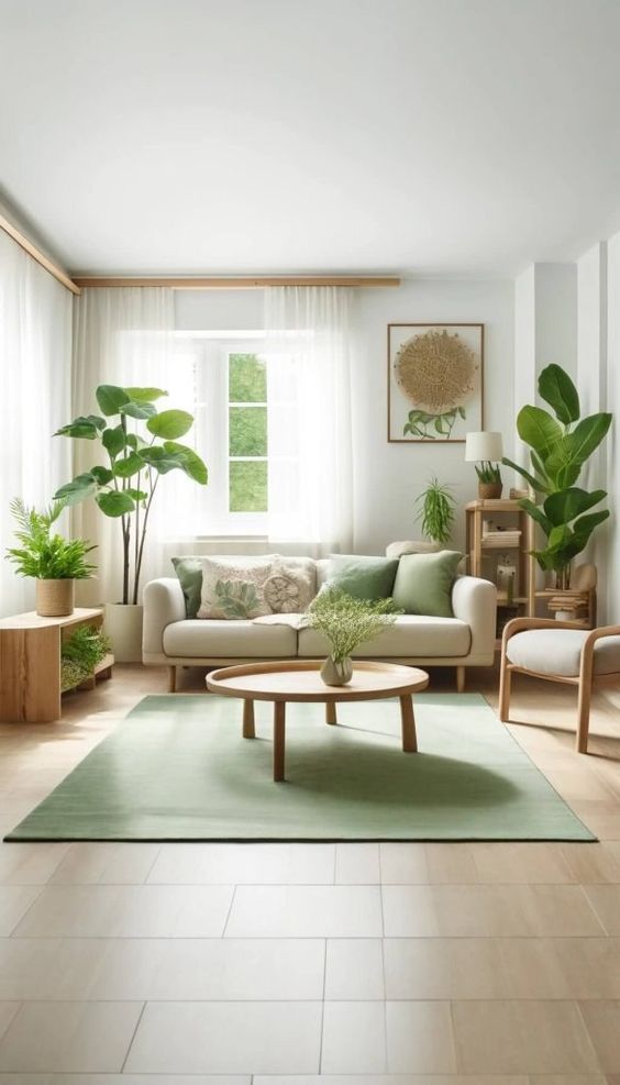
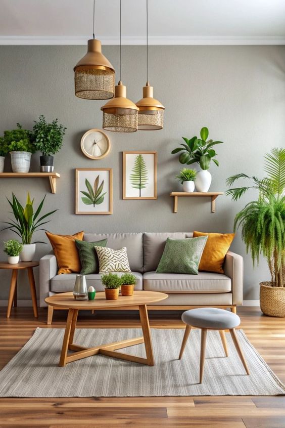
A rug works when it belongs to the furniture arrangement, not when it looks like a small patch placed over a stain. In a living room, choose a size that reaches under at least the front legs of the main seating. In a dining area, allow enough rug beyond the table for chairs to stay on it when pulled out. A non-slip pad keeps the edge flatter and protects the floor from grit trapped underneath.
Use pattern to break up visual evidence of minor wear, but keep the contrast related to the room. A large, quiet pattern is usually calmer than a tiny busy motif in a small space. Compare materials and proportions in our rug ideas guide. Do not cover dampness, buckled boards, loose tiles, or a raised transition that can become a trip hazard.
2. Use artwork to balance a flawed wall

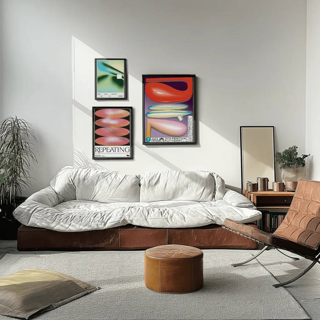
Artwork can conceal filled holes, a harmless patch, or a surface that looks visually empty. The piece still needs to be scaled to the furniture below it. Above a sofa or console, begin by testing an artwork or complete grouping at roughly two-thirds to three-quarters of the furniture width, then adjust from the doorway and normal seated view.
Map the outside boundary with painter’s tape before drilling. If several blemishes are spread across the wall, design the gallery as one composition rather than placing a frame over every mark. Use the wall art hanging guide for height and hardware, and the living-room canvas guide for scale and colour. Never cover a widening crack or damp patch before its cause is checked.
3. Give an awkward layout one clear function
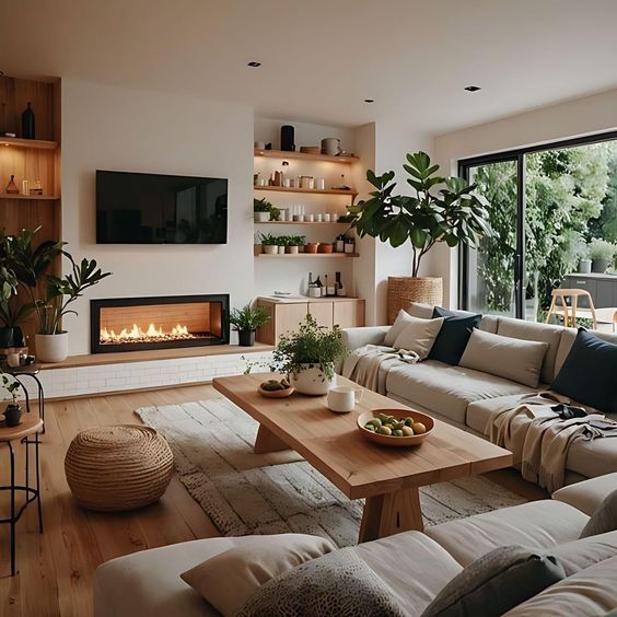
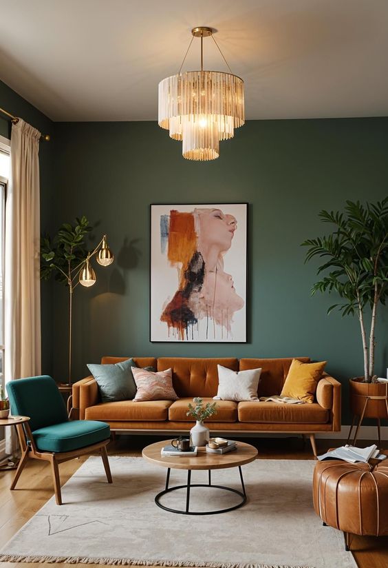
An odd corner becomes more noticeable when it has no job. Turn it into a reading seat, a narrow work zone, a closed storage point, or a display niche. Start with the walking route: keep the path between doors and the main seating clear, then place the largest useful piece. A chair and floor lamp can resolve a shallow corner; a bookcase can visually straighten a wall that steps back.
Avoid forcing a sectional or cabinet into the room just because it fills the gap. The cure should not reduce circulation or block natural light. If you are planning several zones, the room-arrangement guide explains how to test furniture placement before buying more pieces.
4. Treat uneven walls with texture carefully
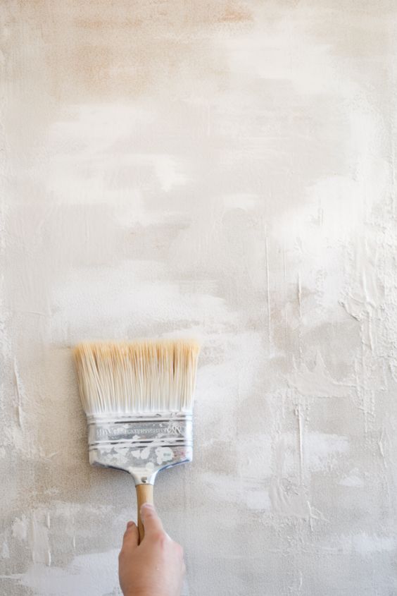
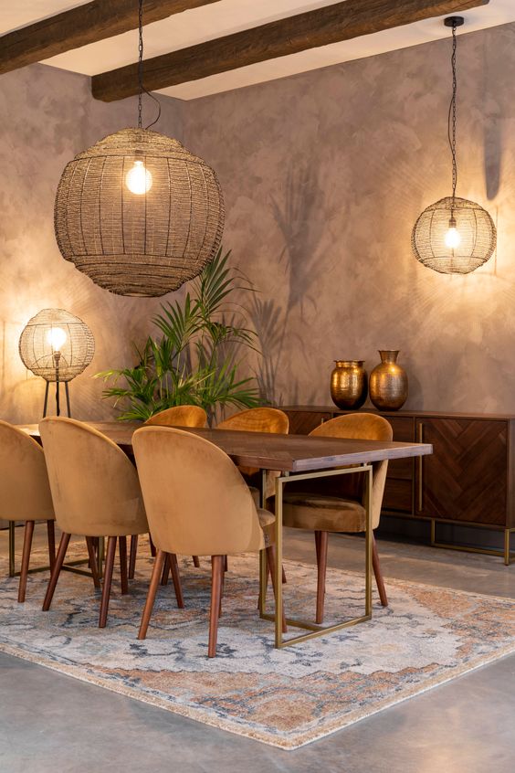
Peel-and-stick wallpaper can disguise colour variation and small cosmetic marks, especially in a rental. A matte or low-sheen textured paint can also soften minor waviness because it reflects less sharply than a glossy finish. Sample the material on the actual wall and view it in morning and evening light; texture that looks subtle in a shop can become dominant across a full wall.
Preparation matters more than pattern. Clean the surface, test adhesion in a hidden spot, and check the removal instructions before covering a large area. Wallpaper will not solve loose plaster, mould, persistent condensation, or movement cracks. Those need diagnosis first. Once the wall is sound, use one treated plane as a deliberate backdrop instead of applying different camouflage to every visible mark.
5. Add floating shelves only where they are useful
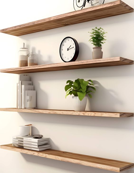
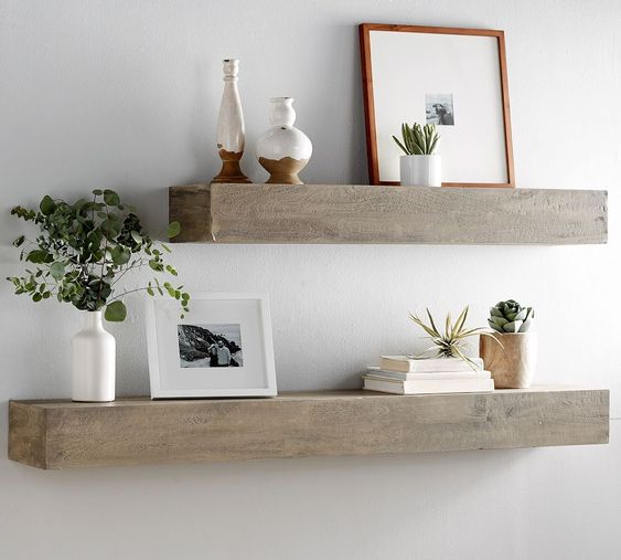
A shelf is a good cover for a small repaired area when the room also needs storage. Line the shelf with an existing architectural edge—such as a door head, cabinet top, or picture rail—so it feels planned. Keep the display edited: a few books, one framed object, and a plant usually look stronger than a row of unrelated small accessories.
Before drilling, identify the wall construction and check for concealed wiring or pipes. Match the fixing system to the wall and the loaded shelf weight, not just the empty shelf. If the damage is larger than the shelf or sits at an awkward height, repairing and repainting the area will often look cleaner than adding storage no one needs.
6. Change the lighting angle, not just the bulb
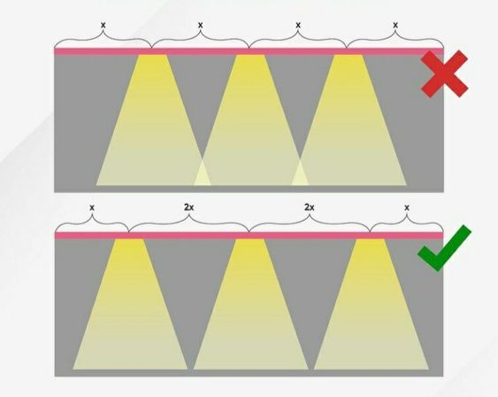
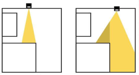
Light grazing sideways across a wall exaggerates every ridge and patch. Move a floor or table lamp so its beam washes the room more softly, or aim accent light at artwork, a shelf, or a textured object instead. A layered scheme—ambient, task, and accent light—lets you reduce contrast around an imperfect surface without leaving the room dim.
Do not trade visibility for camouflage. Desks, stairs, kitchen counters, and reading seats still need enough task light. The seven interior design principles show how lighting fits with purpose, balance, colour, and texture. Test the room at the time you use it most, because daylight can make a solution that works at night fail by noon.
7. Route visible cables as one clean line
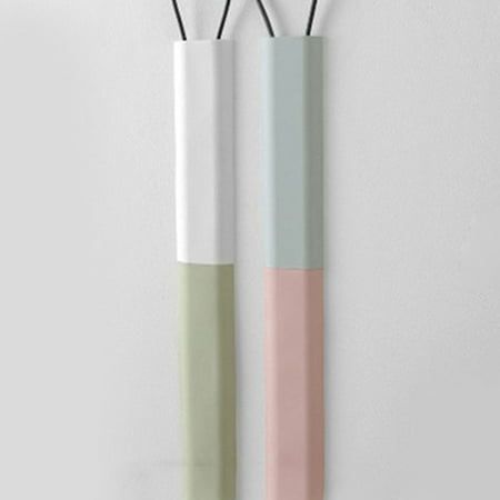
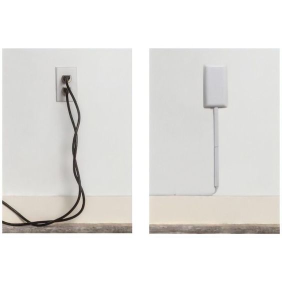
Cable clutter looks worse when several cords take different paths. Gather only compatible low-voltage leads, route them toward the nearest practical edge, and use a purpose-made raceway or cover that can be opened for maintenance. Paintable covers can follow a skirting board or door trim so the route reads as part of the architecture.
For a furniture-integrated option, some skirting profiles designed to conceal cables can create a neater edge. Do not pinch leads behind heavy furniture, trap power strips in unventilated boxes, wrap cords tightly in fabric, or conceal permanent mains wiring as a decorating project. Electrical faults and damaged cables need a qualified professional.
8. Use one large plant to correct visual balance
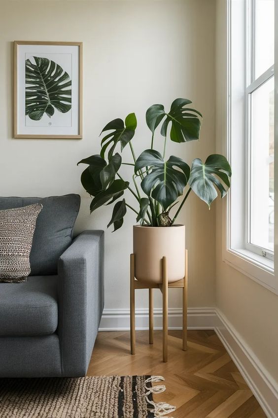
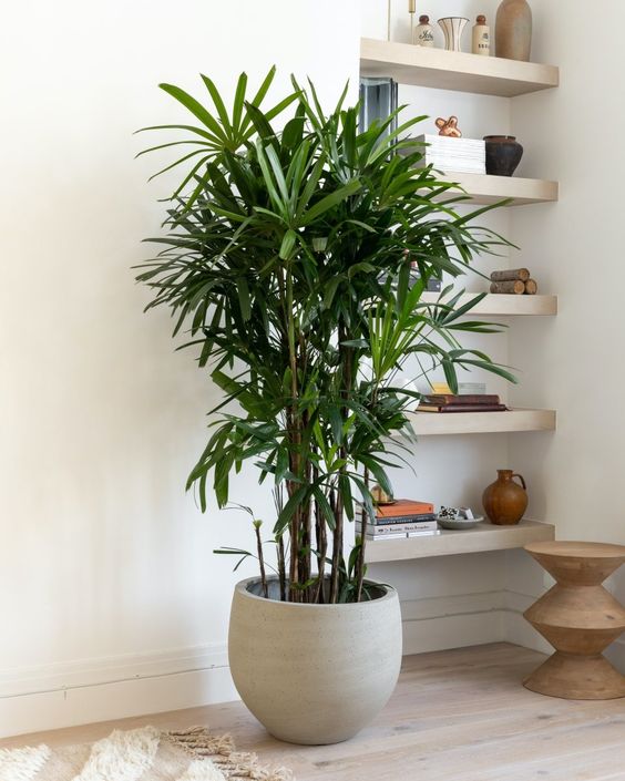
A tall plant can fill a dead corner, soften an abrupt wall return, or balance a heavy piece of furniture on the opposite side of a room. Choose the plant by the available light and mature size, then give its pot enough visual weight. One substantial plant generally looks more intentional than several small pots used as camouflage.
Leave ventilation, heating equipment, doors, and curtains unobstructed. If the corner is dark, select a plant that can cope with those conditions rather than rotating a struggling plant for photographs. For households with pets or children, check the suitability of the species and use a stable planter that cannot tip easily.
9. Refresh worn furniture and uneven windows with textiles
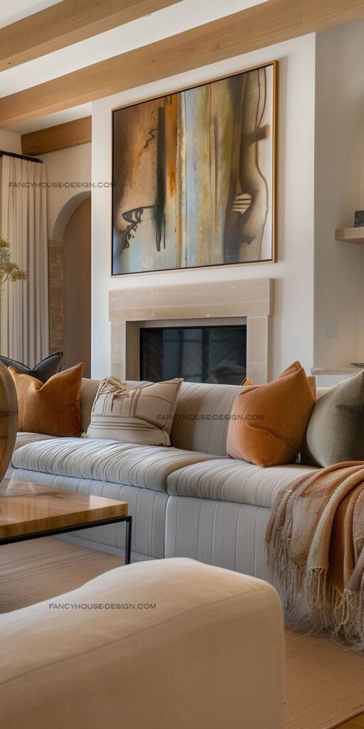
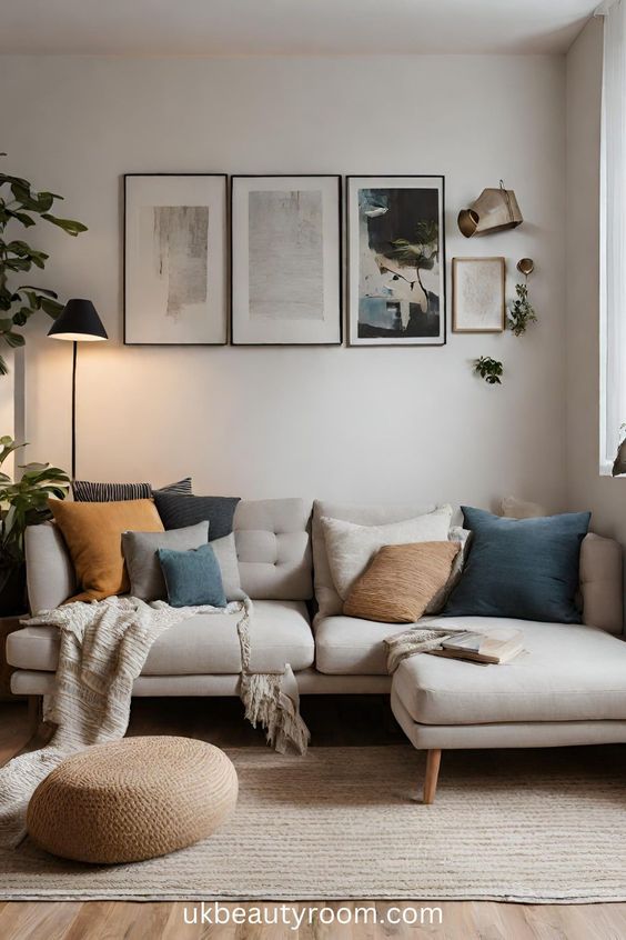
A fitted throw can extend the life of sound but visually worn upholstery. Keep the base fabric simple, repeat one colour already present in the room, and use cushions for controlled variation instead of covering the entire sofa with small patterns. If the problem is an uneven window reveal, hanging curtains close to the ceiling and slightly wider than the frame can create a cleaner vertical line.
Measure before buying: curtains should clear radiators, vents, and open flames, and a throw should not slide into a walkway. Textiles work best as the final layer after layout and lighting are settled. They soften the room; they should not be asked to hide broken furniture, damaged foam, a loose rail, or a window that does not close safely.
Choose the least complicated fix
| Approach | Use it when | Avoid it when |
|---|---|---|
| Repair | The flaw is active, unsafe, worsening, or affects function | You have not identified the cause |
| Cover | The issue is cosmetic and the cover also serves a real purpose | The cover blocks access or traps moisture or heat |
| Reduce contrast | Lighting or finish exaggerates a harmless irregularity | The room loses useful task light |
| Redirect attention | A better focal point can balance the room | Several focal points create more visual noise |
Stand at the main doorway and identify the first imperfection you notice. Fix only that one, then step back. Many rooms feel unsettled because several small “solutions” compete with each other. A single rug, correctly scaled artwork, and a clean cable route usually do more than another layer of decorative objects.
Common mistakes when hiding home imperfections
- Covering an active problem. Damp, movement, heat, damaged wiring, and structural cracks must be assessed before styling.
- Using an undersized cover. A tiny rug or frame makes the flaw more obvious because it reads as a patch.
- Blocking maintenance access. Keep valves, outlets, cable connections, vents, and service panels reachable.
- Adding clutter instead of composition. Use one strong focal point and repeat a limited palette.
- Ignoring the view from the doorway. Judge the whole room from its normal entrance, not from six inches away from the defect.
Related home design guides
Continue with the Sky Rye Design home hub, learn how to hang wall art at the right height, compare canvas scale and colour, or review the seven core interior design principles. The goal is not to make a lived-in home look flawless. It is to make every visible choice feel deliberate while real maintenance problems remain easy to find and repair.
- 2.0Kshares
- Facebook0
- Pinterest2.0K
- Twitter0
- Reddit0